When using the UploadWizard on Wikimedia Commons I received a warning dialog when interacting with the final "Next" before uploading the file.

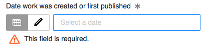
I filled out the three required fields (Title, Description, and Date) and then pressed "Next"
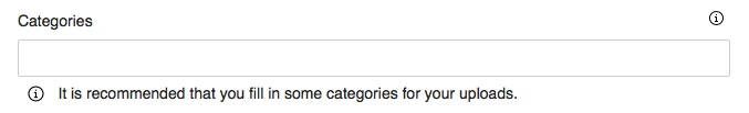
It is hard to see that there is now a small indicator that the "Categories" field is recommended. The Warning dialog overlays most of the form (and fades it out). The appearance of the field recommendation happens at the same time as the dialog appearing (where my focus is at), and the recommendation itself is not distinguished from other field labels (set in the same font, weight, etc. as other field indicators).
Steps to reproduce
- Visit https://commons.wikimedia.org/wiki/Special:UploadWizard
- Select media and press "Continue"
- Select a license and then press "Next"
- Fill out the Title, Description, and Date Fields
- Press "Next"
- Receive one confusing dialog
Expected behavior
If I fill out the required fields the form should submit. Having a 3rd state (recommended) adds an unclear response to submitting the form.
If an upload is missing a recommended field there should be a more obvious indication as to which field is being requested.
"We recommend you fill in the "X" field(s)."
See the dialog for one of the required fields as an example. The icon provides a clear indication that this is the field. The icon is different from the other 'information' icons on the form. (Note that we're reusing the "information" icon in this form - one that is consistent between fields (and interactive), one that is not.