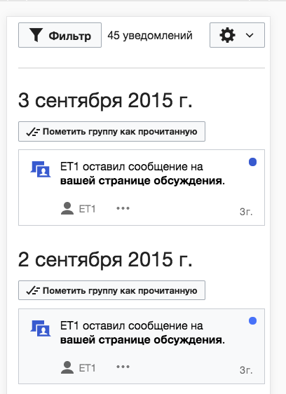
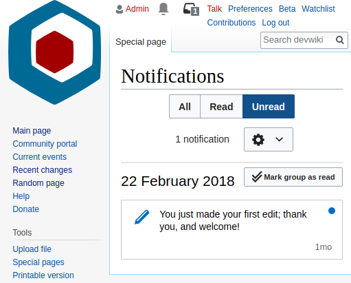
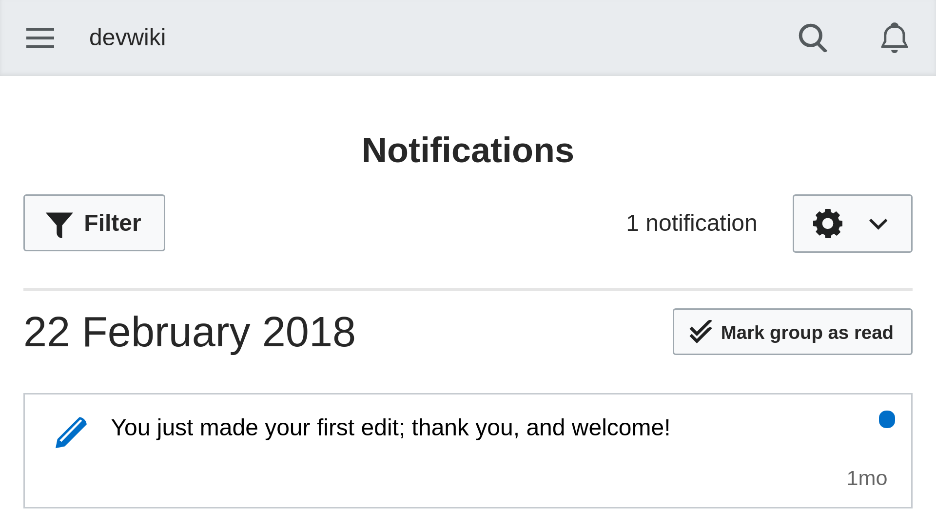
The date '1 September 2016' takes almost half of the screen (iPhone6s iOS 9.3.2)
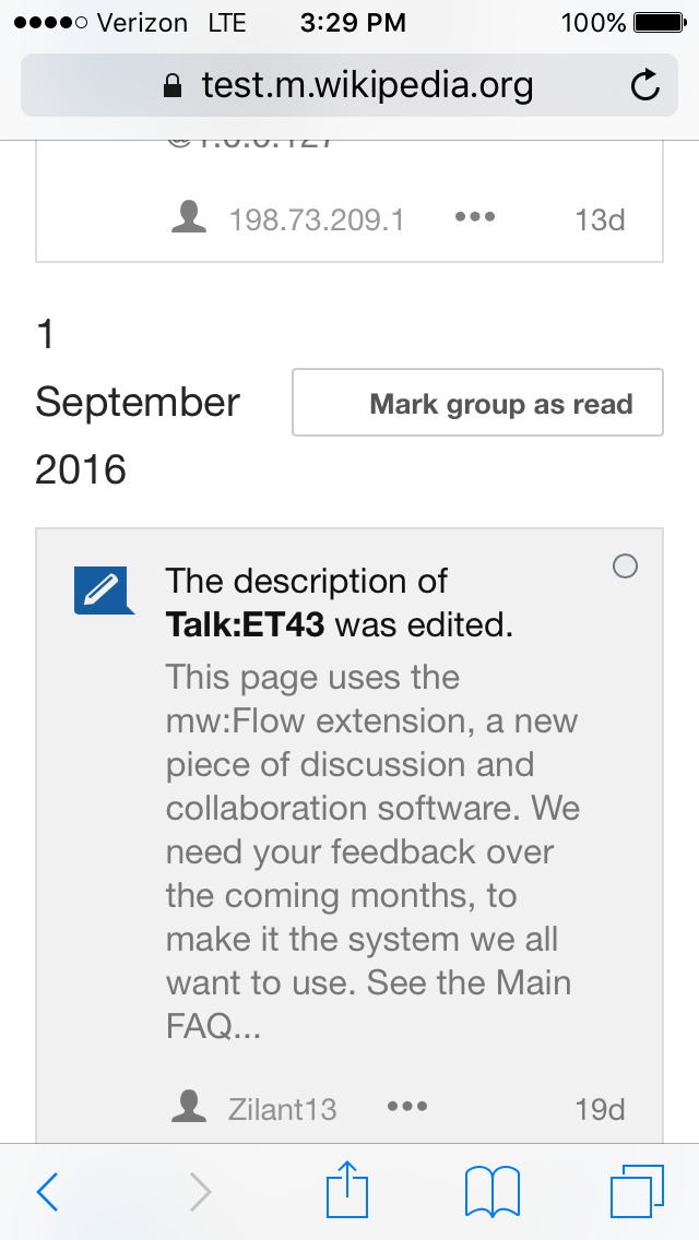
ruwiki will need a horizontal scrolling:
| Etonkovidova | |
| Sep 21 2016, 3:41 PM |
| F16957771: Screen Shot 2018-04-13 at 1.23.00 PM.png | |
| Apr 13 2018, 8:24 PM |
| F16064441: echo-specialnotifs-mobile-horizontal-fitscreen-title.png | |
| Mar 25 2018, 1:48 PM |
| F16064433: echo-specialnotifs-desktop-narrowscreen-title.png | |
| Mar 25 2018, 1:48 PM |
| F16064435: echo-specialnotifs-mobile-narrowscreen-title.png | |
| Mar 25 2018, 1:48 PM |
| F16064437: echo-specialnotifs-mobile-fitscreen-title.png | |
| Mar 25 2018, 1:48 PM |
| F4513981: IMG_1675.PNG | |
| Sep 22 2016, 6:46 PM |
| F4509010: IMG_1671.PNG | |
| Sep 21 2016, 3:41 PM |
The date '1 September 2016' takes almost half of the screen (iPhone6s iOS 9.3.2)
ruwiki will need a horizontal scrolling:
| Subject | Repo | Branch | Lines +/- | |
|---|---|---|---|---|
| Conditionally rearrange date and button in notif list | mediawiki/extensions/Echo | master | +60 -10 |
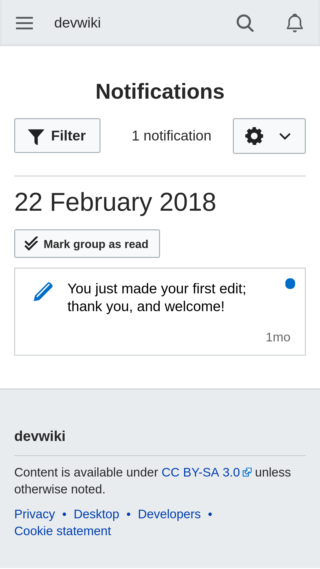
()The mark group as read icon is broken.) Anyway, we should look into shorter date format for mobile.
I'm not sure that will be enough - as the screenshots show, there are languages where month names will be longer, even the "short" version of them, by default.
We might want to consider displaying the button under the date or vise versa. Could probably use some input from design on this? Pinging @Pginer-WMF
If I recall correctly the proposal for mobile was to have the "mark group as read" to use only the icon not having a label.
I recall adding a mockup to the ticket about the mobile version of the Notification Page, but I don't see it connected to this ticket so it makes it hard to find. I'll try to find it later.
Moriel writes:
there are languages where month names will be longer, even the "short" version of them, by default.
It won't solve the whole problem, but would a numerical date help? The international standard, I see, is: YYYY.MM.DD. Is it acceptable to use YY.MM.DD?
Or, better yet, could we use MM.DD for all cases where the year is the current year? That would free up lots of digits (except in January... ).
I'd propose the following:
Change 421790 had a related patch set uploaded (by Mooeypoo; owner: Mooeypoo):
[mediawiki/extensions/Echo@master] [proposed] Conditionally rearrange date and button in notif list
It's really difficult to make moment (the library we use for time/date display) to conditionally change the way it formats the dates according to which language is chosen; as it is, each language has its own rules and those are set in moment's definitions -- setting it as overrides for smaller screens turned to be quite a challenge that touched multiple library files, and I wasn't sure how we can properly make it i18n consistent.
I could have the button work with the ellipses, but without changing the date format that can end up being pretty unreadable.
Instead, I can propose an alternative solution, if that works for you @Pginer-WMF: If the screen is too narrow for both the date and button to appear together in the same line, the code will "break" them and put the date on its own line, and the button on the line after.
This is a little more straight forward without too many conditionals (it will also work on resizing the desktop version, not just mobile view) and seems to be a relatively quick solution that works without too much code.
Also, this would mean that mobile view in horizontal mode will display both date + button on the same line if they fit, which can be a bonus here?
Screenshots from the proposed patch:
Desktop view (too narrow for both date and button)
Mobile view (too narrow for both date and button)
Desktop view (not too narrow)
Mobile view (landscape, not too narrow)
Does that work for you @Pginer-WMF ?
The proposed change seems an improvement over the current situation. I'm ok moving forward with it.
For the future, I'd consider also using the icon only version button for "mark group as read" (possibly showing a confirmation if there are more than just a few items affected). But that can be explored as a separate effort.
Awesome, I removed the 'proposed' tag on the commit and will get it reviewed.
For the future, I'd consider also using the icon only version button for "mark group as read" (possibly showing a confirmation if there are more than just a few items affected). But that can be explored as a separate effort.
Aye, we should take a look at that option -- but sometimes the button is still being pushed outside the line, it might not be always enough. Then again, if it only happens rarely in certain dates and certain languages, we might consider it an edge case?
Either way, if you want to change the behavior, having the button only use an icon when in mobile view shouldn't be a big issue to implement.
Change 421790 merged by jenkins-bot:
[mediawiki/extensions/Echo@master] Conditionally rearrange date and button in notif list