Page MenuHomePhabricator

Certain pages have reflows due to lazy loaded images (possibly due to downscaling via max-width: 100%)
Closed, DeclinedPublic

Description

When an article contains an image with a width greater than the viewport e.g. width 350px and height of 233px, this causes problems with lazy loading images. The placeholder inherits these dimensions, but when the image is loaded a CSS rule max-width: 100% rule kicks in to downsize it to fit into the constraints of the skin causing the reflow - 288px by 192px

It's not clear how we can avoid this. We can obviously add overflow:hidden+display:block to all .image's but this only solves the issue of horizontal reflow.. not vertical.

Examples

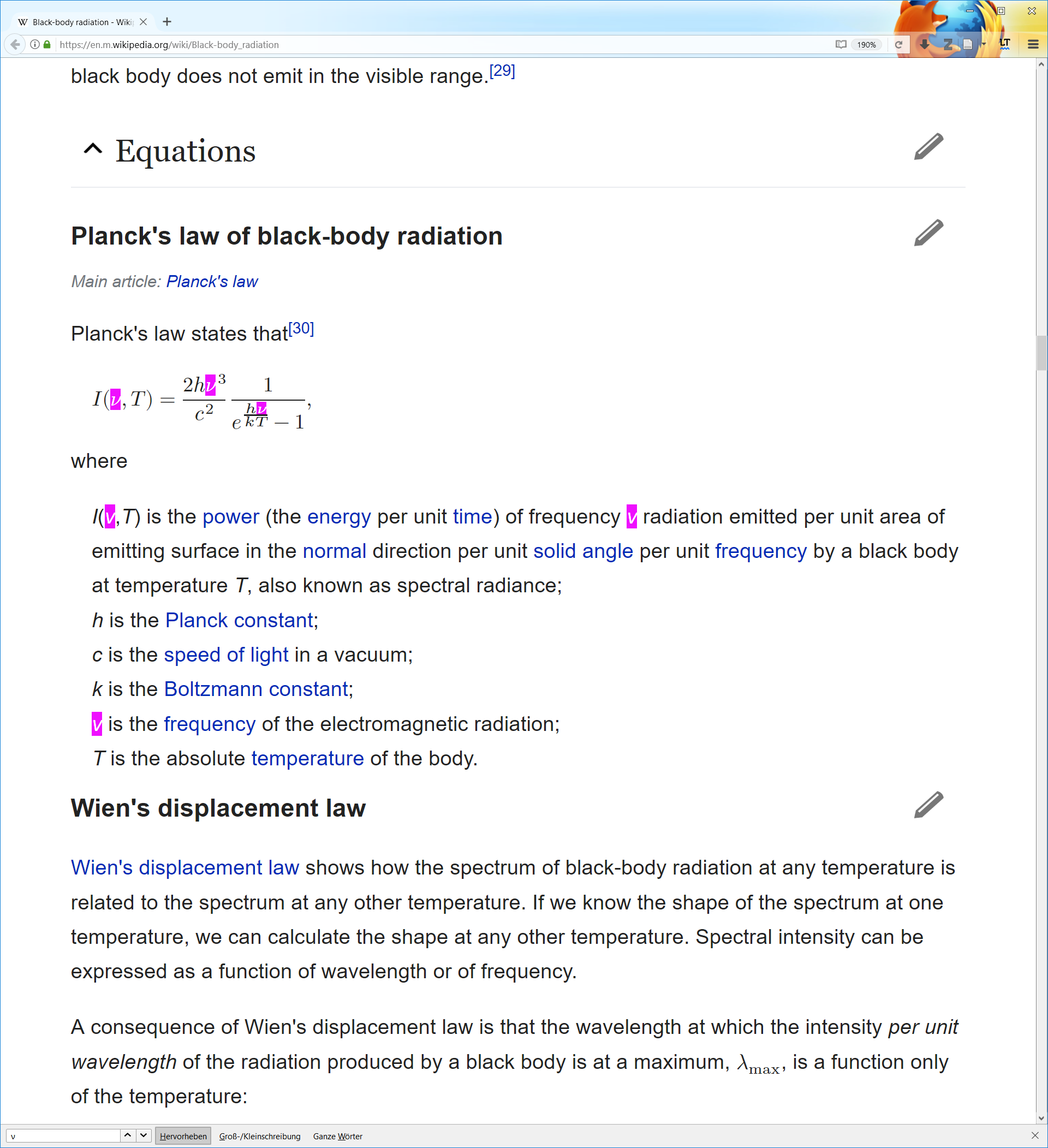
Seen on Black-body_radiation

freezy.gif (371×913 px, 1 MB)

Barack Obama:
lazy.gif (560×317 px, 114 KB)

Replication instructions

  • Load https://en.m.wikipedia.org/wiki/Black-body_radiation in mobile mode
  • Switch network conditions to offline
  • Open Equations
  • Scroll down so that Human body is touching the bottom of the display
  • Turn off throttling in network conditions
  • Run mw.mobileFrontend.require( 'skins.minerva.scripts/skin' ).loadImages() in console
  • Observe the text moves down the page considerably

Event Timeline

Jdlrobson renamed this task from Math causes reflows due to inappror to Math causes reflows due to inappropriately calculated dimensions.Sep 21 2016, 5:32 PM
Physikerwelt renamed this task from Math causes reflows due to inappropriately calculated dimensions to Fallback images of mathematical expressions cause reflows due to inappropriately calculated dimensions.Sep 21 2016, 8:46 PM

Sorry for being picky and changing the title... but it has to be pointed out that this is not a math problem as such but a problem with the fallback images that are required since not all browsers support HTML5 (i.e. the MathML part of it).

MBinder_WMF moved this task from Incoming to Triaged but Future on the Web-Team-Backlog board.

@mobrovac I have the impression that @Jdlrobson knows much more on web UI and performance than I do. While I see the pros of ex from a theoretical perspective, I would go ahead and replace ex with px. Technically this should be quite straight forward, if we just use the ex value from here. Do you agree?

I would use caution here. Personally, I'm for ex as it represents the actual correct size of the render. But switching to px could be a pragmatic solution. @Physikerwelt could you test lazy loading with px?

Hi @Jdlrobson,

Can you explain this a bit further. I see it too, but it's unclear to me what is causing this exactly. The dimensions should be known, so i suspect this has to do something with some side effect of block or content rules or something ?

It's been so long I've not sure any more....

There is definitely a reflow happening but whether it is because of ex's rather than px I'm less sure.

If I scroll so that "Black-body radiation becomes a visible glow of light if the temperature of the object is high enough." is touching the top of the window and hard refresh, it will move down by a line.
On 2G I see multiple reflows ... but these could be down to multiple things - not necessarily the Math images... for instance the height auto !important on images could be playing a part here.

Will need some more investigation.

@Jdlrobson I see one reflow, which is because the fallback image has a vertical-align offset, which is not copied into the style of the lazy loaded image. But there is also a width reflow, which I don't really understand. That has to do either with 'undeterminable' width, or because the style attribute is set 'late' or something. But it's indeed a bit hard to analyze.

Am I right in remembering that originally we didn't even copy the width and height style attributes at all ? That might explain the original description of this ticket a bit better, since indeed we did not have the pixels width/height attributes set, but only the css width/height attributes.

Jdlrobson changed the task status from Open to Stalled.Feb 10 2017, 7:38 PM

Until we work out what's going on here..

Change 350496 had a related patch set uploaded (by Jdlrobson; owner: Jdlrobson):
[mediawiki/extensions/MobileFrontend@master] Placeholders should not be block

https://gerrit.wikimedia.org/r/350496

Jdlrobson changed the task status from Stalled to Open.Apr 26 2017, 10:34 PM
Jdlrobson renamed this task from Fallback images of mathematical expressions cause reflows due to inappropriately calculated dimensions to Certain pages have reflows due to lazy loaded images (possibly due to downscaling via max-width: 100%).Apr 26 2017, 11:31 PM
Jdlrobson removed projects: good first task, Math.

This does not seem to be related to Math.

Copying from the patch:
Looks like the image being rendered has a width of 350px and height of 233px so the placeholder has a width of 350px and height 233px.
When the image is loaded a CSS rule max-width: 100% rule kicks in to downsize it to fit into the constraints of the skin causing the reflow - 288px by 192px
I'm not sure how we can avoid this. We can obviously add overflow:hidden+display:block to all .image's but this only solves the issue of horizontal reflow.. not vertical.
This seems to be the case with display: block and display: inline-block so I think the original bug fix was ill-informed, but it probably explains the remaining reflows we are seeing in T146298
The more general issue here is that we have to apply max-width: 100%; height: auto;
Ideally all thumbnails would be standardised to a mobile friendly width/height. We can do that in MobileFormatter.
What thoughts do you have @Krinkle?

Change 350496 merged by jenkins-bot:
[mediawiki/extensions/MobileFrontend@master] Placeholders should not be block

https://gerrit.wikimedia.org/r/350496

ABorbaWMF subscribed.

Tested a few combinations of devices and browsers using a simulator. I also tried on a few real devices running ios and android. I have been unable to reproduce the issue. Resolving...

Jdlrobson removed a project: Patch-For-Review.

Per https://phabricator.wikimedia.org/T146298#3216328 this one is still a problem although now it's not so obvious.

An image that is width 500 and height 200 with max-width: 100%, height: auto applied will downscale to 300x120.
A span that is width 500 and height 200 with the same rule will downscale to 300x[size of contents of span]

I'm investigating whether this can be fixed by using object-fit css rule.

{
    object-fit: contain;
    max-width: 100%;
}

Appears to be fixed. Tested on a few different ios and android devices.

2017-04-28.png (2×1 px, 353 KB)

By the way. There is no reflow/duplicated images in FF with MathML.

Jdlrobson updated the task description. (Show Details)

Change 351736 had a related patch set uploaded (by Jdlrobson; owner: Jdlrobson):
[mediawiki/extensions/MobileFrontend@master] Use transparent gif as lazy-image-placeholder

https://gerrit.wikimedia.org/r/351736

This is the only way I can think to solve this problem..

This is the only way I can think to solve this problem..

I'm not sure I understand. Are you saying that an image with width/height set and max-height applies will scale proportionally, but doing the same on a <span> will not?

@Krinkle hopefully this helps illustrate the problem:
https://codepen.io/anon/pen/jmLZQg

Notice how height auto works differently for img tags compared to div and how if it is applied to images the scaling respects the aspect ratio.

Notice how height auto works differently for img tags compared to div

Right. Once an image is loaded, you can override one side to auto, and one side to a specific length (e.g. 100% or 200px). At which point it'll be computed based on the image's native natural dimensions. But that only works once the image has been loaded.

But I don't think that works on a placeholder, regardless of whether it is an <img> or a <div>. Right? Because with a placeholder GIF, it will relate itself to the natural width and height of the transparent GIF, which is presumably a square, so the aspect ratio it uses will also use a square, not the specified width/height since those end up being ignored due to CSS overriding width and height.

See https://codepen.io/Krinkle/full/gWGqqe/.

Change 351736 abandoned by Jdlrobson:
Use transparent gif as lazy-image-placeholder

https://gerrit.wikimedia.org/r/351736

Sounds like this is not fixable...

Not possible to resolve this programatically. Only via editing the underlying content.