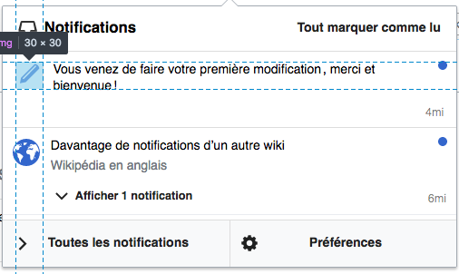
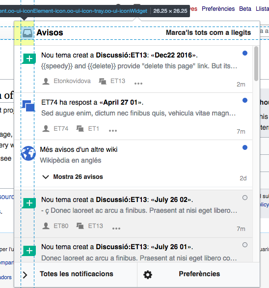
The vertical alignment of logos and text in Notification (Notices) popup seems not to follow a certain pattern.
Reference layout of the notification:
| Volker_E | |
| Oct 3 2016, 6:44 PM |
| F6010927: Screen Shot 2017-03-02 at 9.00.44 AM.png | |
| Mar 2 2017, 5:20 PM |
| F6010920: Screen Shot 2017-03-02 at 9.13.20 AM.png | |
| Mar 2 2017, 5:20 PM |
| F5998244: After.png | |
| Mar 2 2017, 6:38 AM |
| F5998245: Before.png | |
| Mar 2 2017, 6:38 AM |
| F3363922: notif-layout-spacing-reference.png | |
| Oct 14 2016, 7:17 PM |
| F4586307: Screen Shot 2016-10-11 at 9.47.33 AM.png | |
| Oct 11 2016, 5:35 PM |
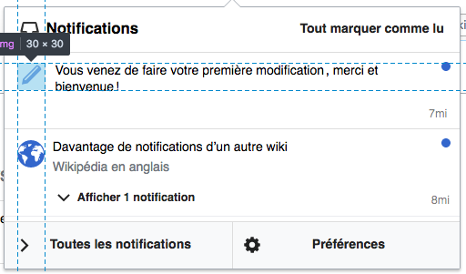
The vertical alignment of logos and text in Notification (Notices) popup seems not to follow a certain pattern.
Reference layout of the notification:
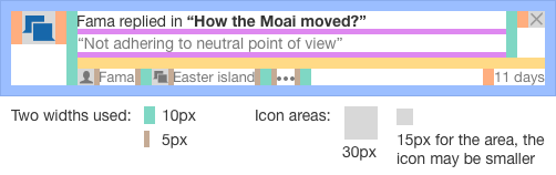
Do you have a screenshot with non-special things in it? All three things in this screenshot are special: the globe icon is a cross-wiki bundle, not a real notification, the W icon is a logo icon that changes from wiki to wiki, and the loudspeaker thing at the bottom is not a notification but a footer notice (which we should turn off BTW).
Still, point well taken, they should all align, but I suspect/hope that all other notification icons will be aligned with the globe and that it's just the W and the loudspeaker that are out of alignment.
Thanks for the remarks.
I've forgotten to draw a line on the right side. The timestamp is not aligned with the read marker nor the close icon as well.
Sorry, I should really dupe this in the other direction because this bug documents additional misalignments.
Also, let's check what the svg images actually are -- some of the SVGs have spacing already and some don't; the code can't recognize that, so while all icons of the notifications (including cross-wiki, theoretically, since it uses about the same style for the notification face itself) should be aligned - the differences that are marked with those lines may actually be the result of differences in the way the SVGs are defined.
I think some of our notification SVGs also have inconsistencies between when they have spacing and when they don't.
Change 315313 had a related patch set uploaded (by Catrope):
Align the cross-wiki icon with the other notification icons
@Pginer-WMF Have you set the reference layout also in correlation with the top of the popup anywhere? Is there a layout for the whole popup?
Change 317984 had a related patch set uploaded (by VolkerE):
Vertically-align icons and text in Notifications popup
The focus on the recent notification work was about organising the notification items, not the broader panel, but it would be good to have consistent margins there too.
Change 315313 merged by Catrope:
[mediawiki/extensions/Echo] Align the cross-wiki icon with the other notification icons
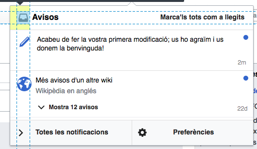
Checked in betalabs - the alignment seems to be corrected:
QA recommendation: Resolve.
Change 317984 abandoned by Esanders:
[mediawiki/extensions/Echo@master] Vertically-align icons and text in Notifications popup
Reason: