Page MenuHomePhabricator

Design of donation card for Explore feeds
Closed, ResolvedPublic

Description

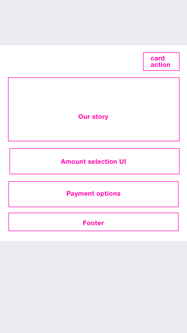
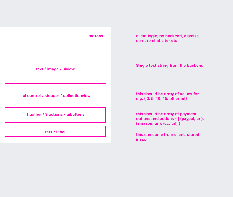
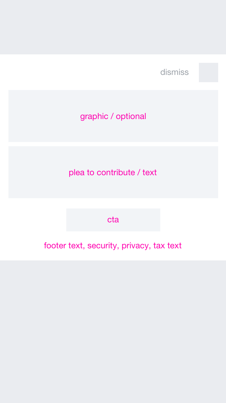
Per our chat, it would be helpful to have a wireframe concept for the feed donation UI.

Basically this is just to ensure the endpoint we develop matches up with what the front end will expect to display across platforms. No need for visual design, flows, etc. We will do platform specific designs later in the process.

See parent ticket for a discussion of the proposed endpoint and proposed data to be provided by Advancement and passed via the MCS: T145830

Event Timeline

This is is the basic anatomy for inline donation on mobile

iPhone 7.png (667×375 px, 13 KB)

iPhone 7 Copy.png (667×789 px, 50 KB)

@JMinor there is another format which takes over entire screen. if we are building a cross platform backend we might need two text strings. longform and shortform.

the inline donation (feedcard, article div on mobileweb) will have a shortform - smaller string (which is shown here). and if we ever do a modal view we need the longform. do you think it makes sense to provide both in the endpoint?

@Nizar for now lets limit it to the inline presentation. We can add more varieties on the next go round.

@JMinor sure. so is this enough information to move this card forward? cc @Fjalapeno

I was under the impression that the apps would only show some minimal text and a button, possibly a title string. If the user clicks on that it would transition to a web page which handles all the donation aspects (amount, currency, more copy, etc.). I'm surprised to see selection of amounts and payment options in here.

@bearND this is just for selecting what components we use. we can rearrange them on UI the way we want... + I'm taking cues from what has worked with FR in the past. but i see your point.. something we can do while designing the actual app flow

Oh i totally misread what you wrote

Here's a better response -

There are two ways to approach this -

  1. we take on the work for amount selection and payment method. this way the apps can play around with new techniques to improve conversion
  1. we just insert an entry point - and single cta to go to the web banner

@JMinor i think this is a product call. design recommendation is to have amount selection within the feed for better conversion rates and apps can own the conversion metric with shorter flow. but if as @bearND says we just want single CTA to go to the web banner then i will re-do this work

@Nirzar yeah, sorry to cut scope on you, but I think we should limit this backend providing a basic CTA URL, and limit the UI configuration options. Doing more variant testing and taking on purchase flows is more than the teams have committed to for this quarter.

cc @Dbrant

@JMinor sure, my bad, I didn't realize the engineering effort.
Here's a pretty basic structure

basic-donation.png (1×750 px, 43 KB)

Yeah, for a MVP I think we're happy to just have text, possibly a graphic, and a CTA button which leads to https://donate.wikimedia.org/

JMinor renamed this task from generic mock of donation card for Explore feeds to Design of donation card for Explore feeds.Nov 2 2016, 12:08 AM

@Nirzar sorry realized I hadn't chimed in, but the @bearND's comments and your changes all look good.

One last thing, the current intention is to use the same design for the donation card and the survey card - just with different content. Are you happy with this design being able to serve both purposes?

@Nirzar @Dbrant @JMinor
quick clarifying question - does that mean inclusion of "Remind me later" allowing the user to input their email for a reminder is out of scope this time as well?

Mobile web example:

pasted_file (988×1 px, 267 KB)

@RHo yep, out of scope for Android, at least.

@Nirzar @RHo We need a URL to the image in the banner.

Could you upload one? (We also need one for the survey card too if you could do that as well)

Do we have somewhere we normally place these types of assets? Or is this something we need to figure out real quick?

@JMinor @Dbrant could you add the copy for the text on this ticket?

@Fjalapeno

One last thing, the current intention is to use the same design for the donation card and the survey card - just with different content. Are you happy with this design being able to serve both purposes?

Yes. i think this will work on central notice provided "image/graphic" is a flag and it reflects correctly on frontend.

We need a URL to the image in the banner. Could you upload one? (We also need one for the survey card too if you could do that as well)

yeah we can do that. will the frontend take any dimension for the image? adjust the viewport based on backend?

and what format will be needed. svg is preferred from our side. I will ask someone from web team about hosting the asset.

Would it be possible to have two additional fields for each card type? It'd be great to be able to pass down a hex code to define the card background color and the CTA button color. This way donation appeals could have a stronger background color where as other notices could have a white background.

@cmadeo what if we pass down "Special" as an attribute and the apps decides what is the special treatment means. the special logic can sit in apps. then we don't have to specify all details like background, foreground, cta, alignment, font sizes, image etc.

special = dark bg, center aligned, bright cta, bigger type
default = just like another card, small type

Just for the record, the "special" or color fields were not added for v1. Clients will have to manage color and presentation on their end for now.