Overview
Summary of project
Create a new presentation for the In the news card, which highlights the most recent news story and visually distinguishes the card from other cards on the feed.
Why are we doing this?
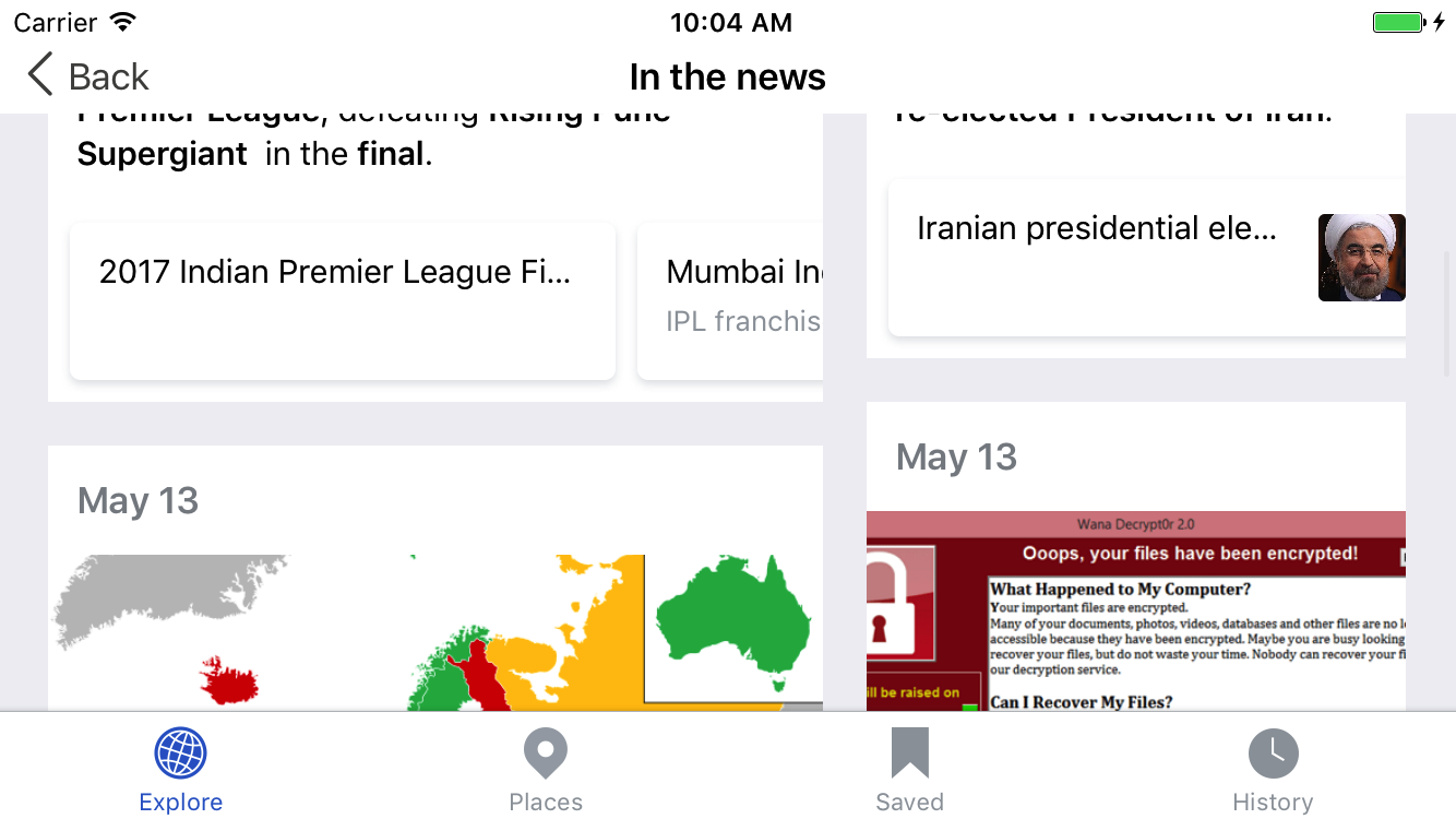
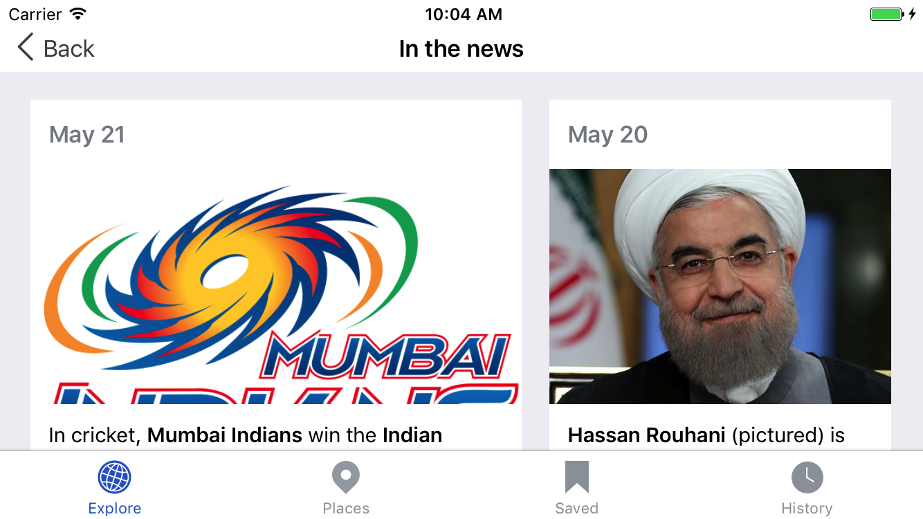
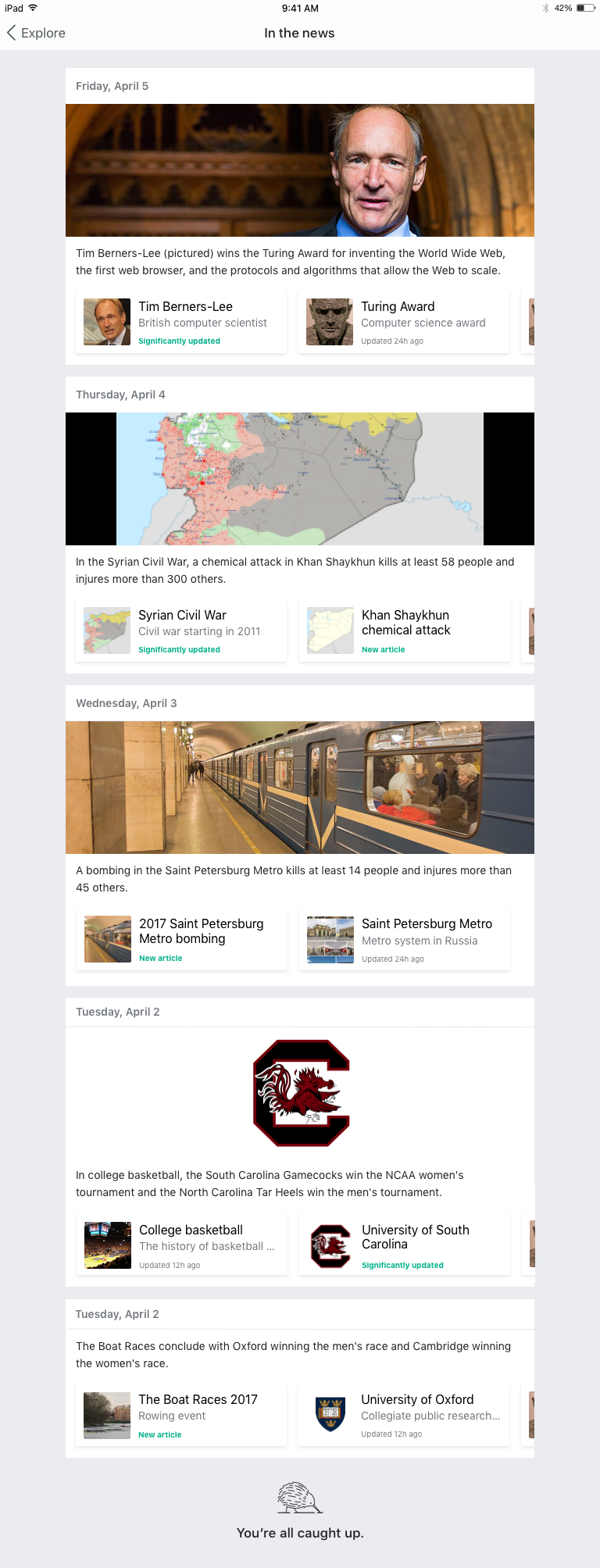
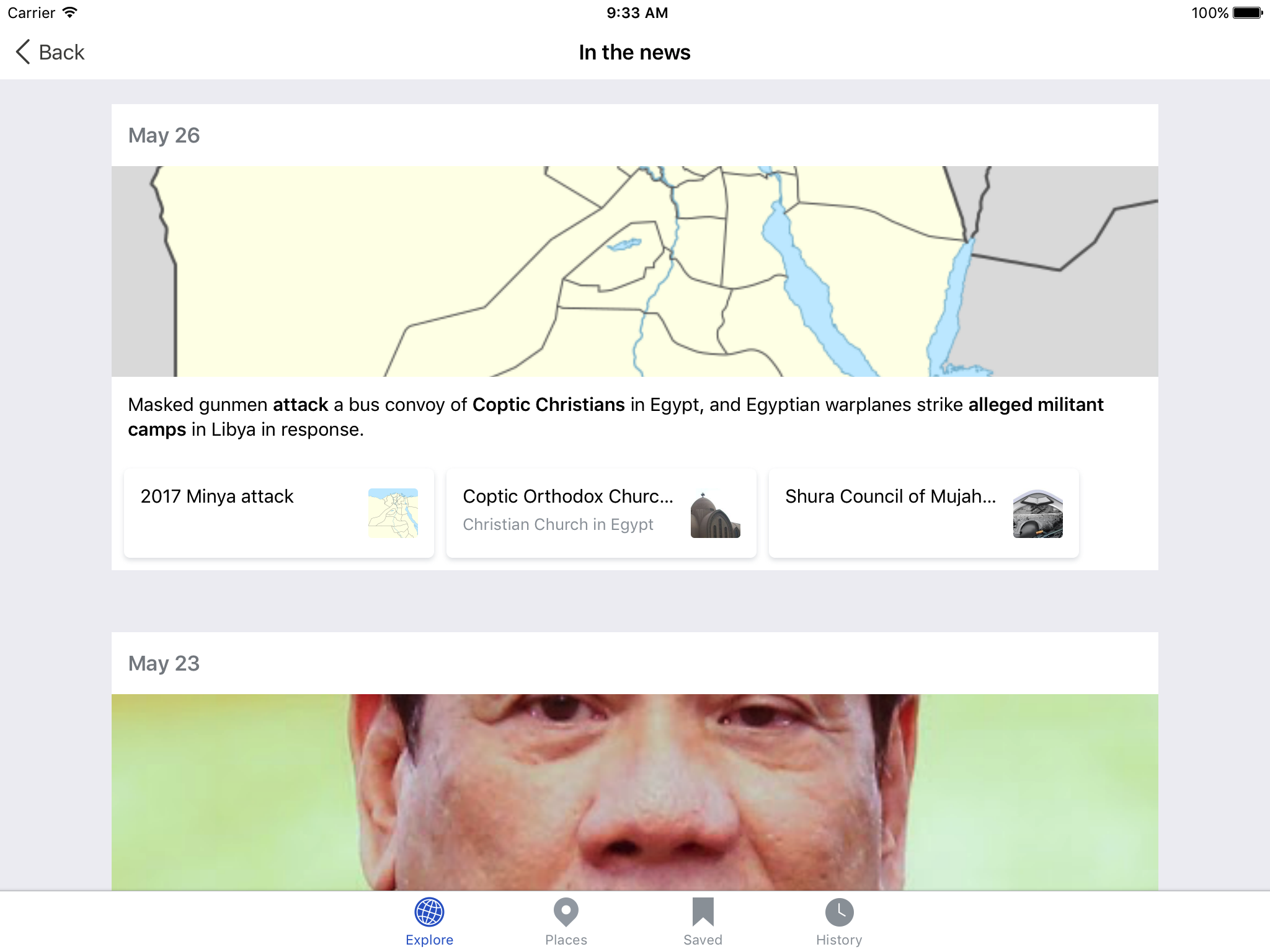
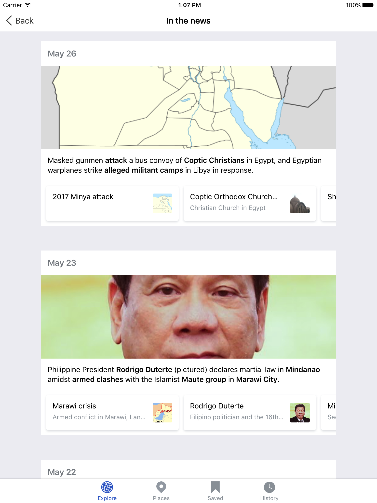
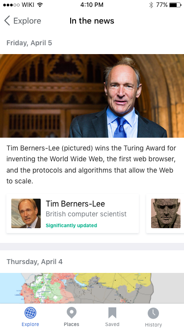
The In the news card currently features the five most recent news articles as a list. We've received some feedback from users that the content on this card can appear stale as stories may appear on the card for long periods of time. Additionally, the current presentation of the In the news card is visually similar to other cards on the feed (Trending, Because you read).
Feature success criteria
Higher clickthroughs on the In the news card
Design
Single story cards
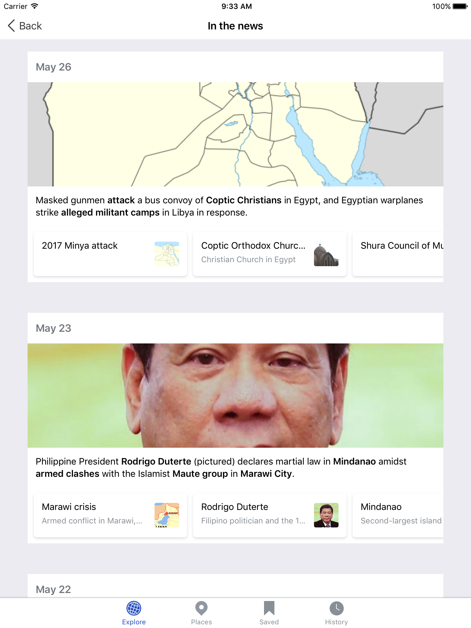
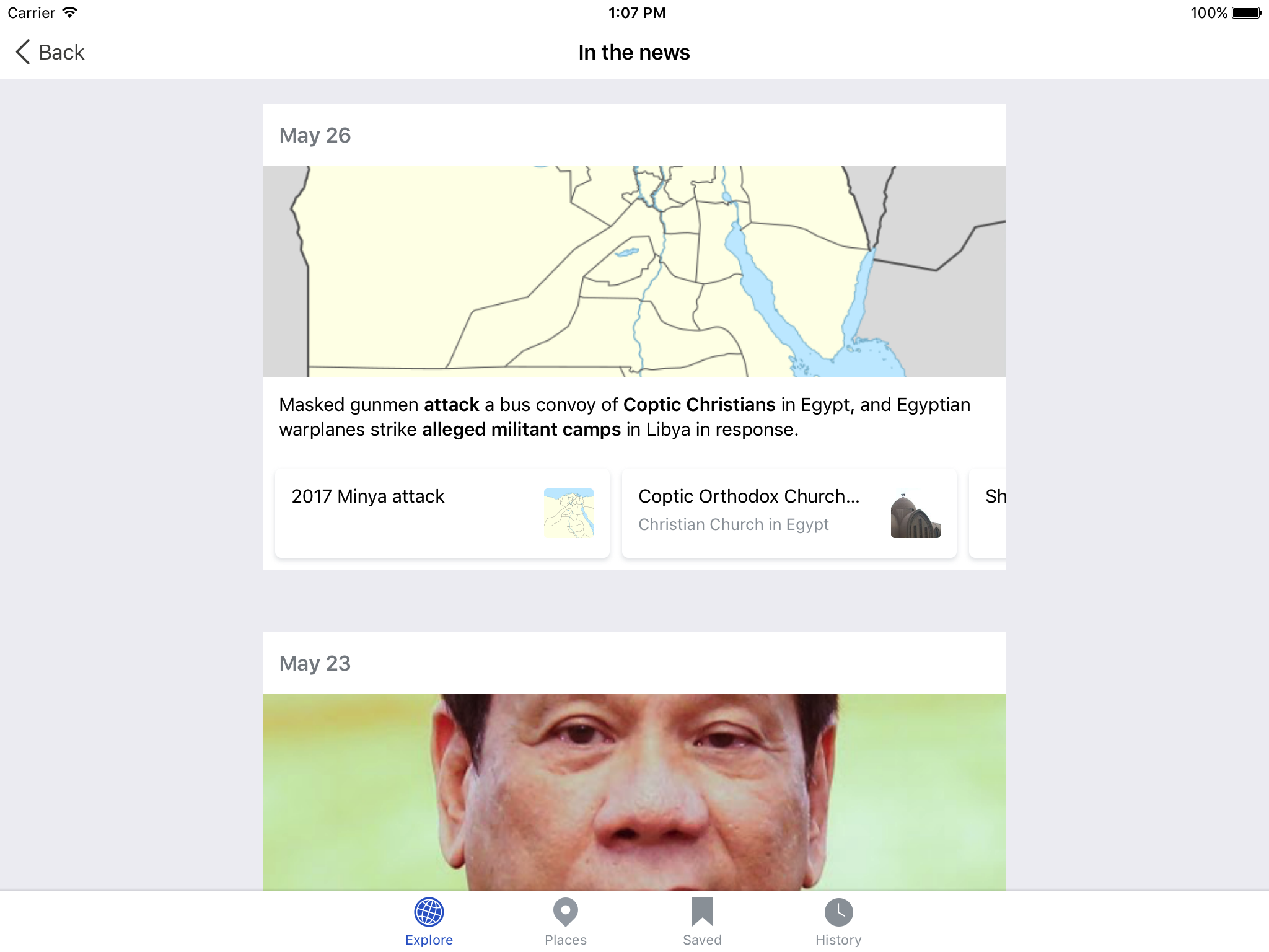
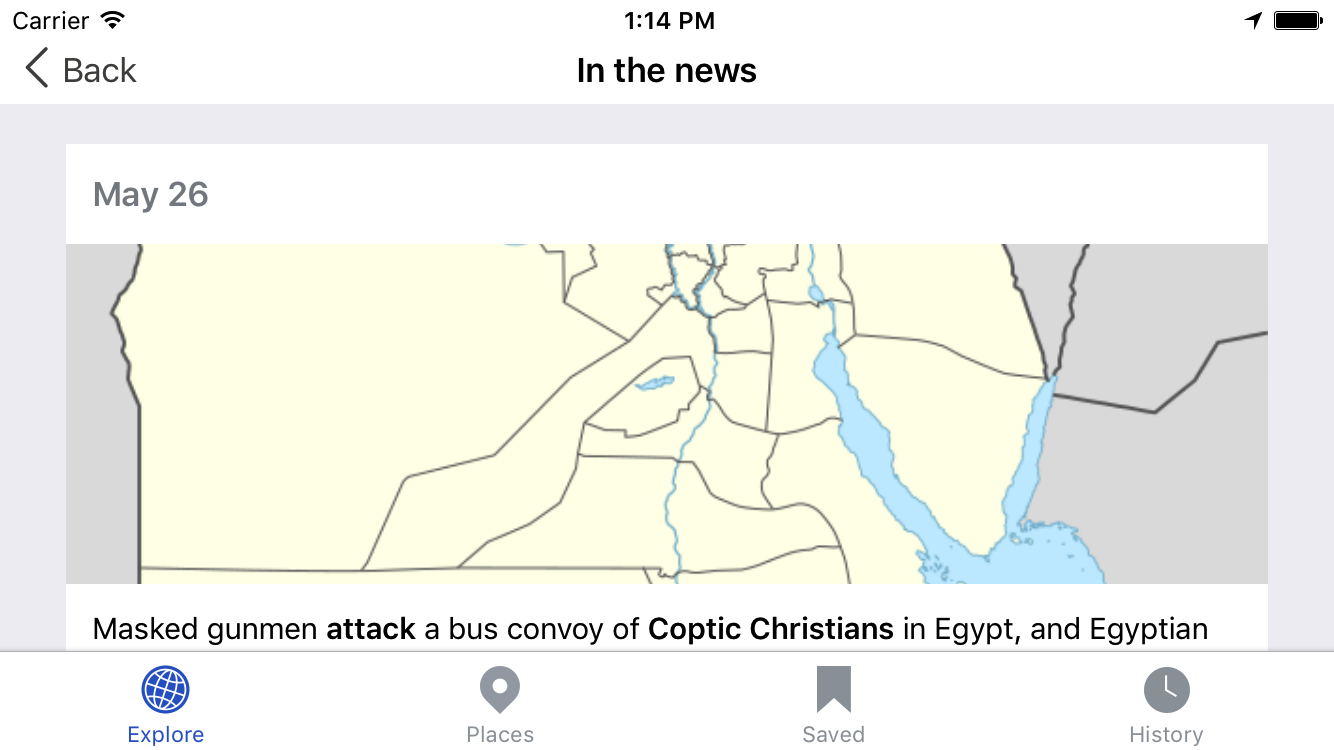
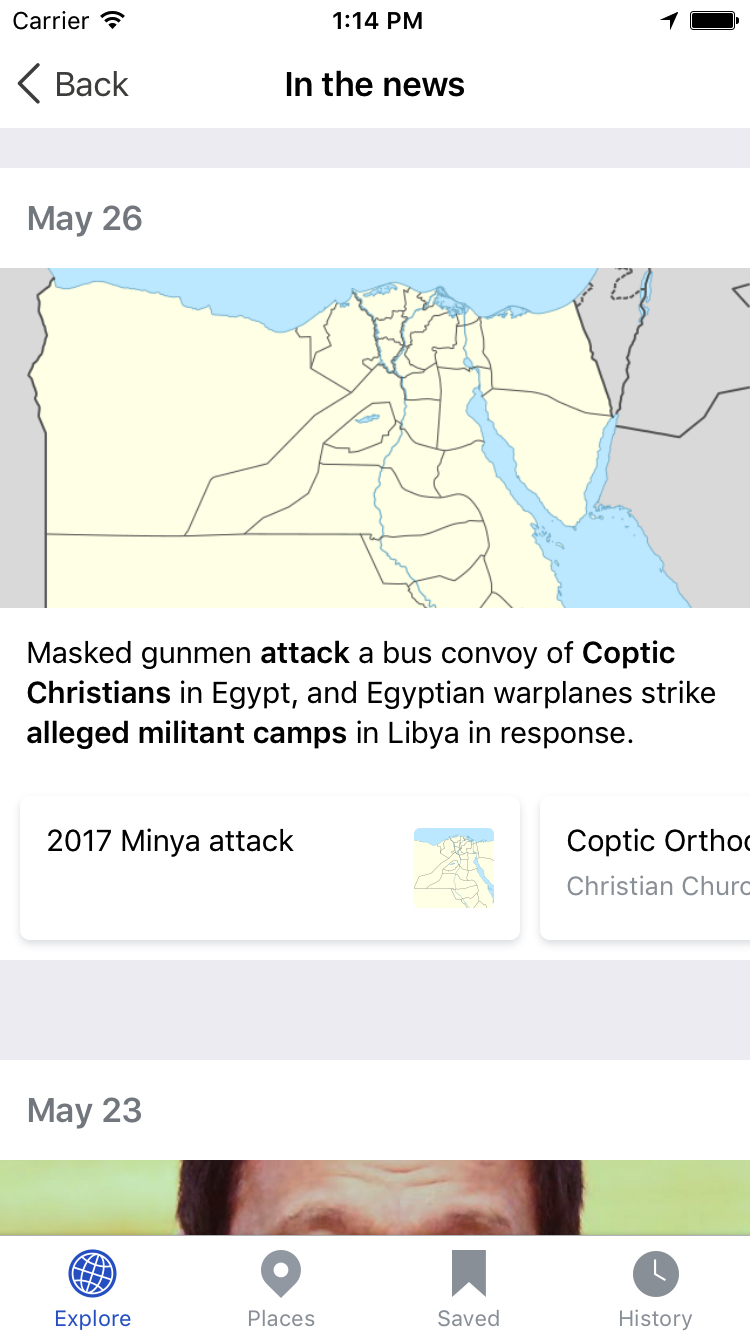
Single story, scrolling articles
In this design the most recent news story is the only story featured on the card. Below the header image and summary are small scrolling cards with related articles. At the bottom of the card is a link to a popover where the top five news articles are displayed along with their related articles.
Mocks and prototypes
InVision: Prototype with popover
| Feed card | Detail view |
 |  |
| Zeplin: https://zpl.io/1uLnB1 | Zeplin:https://zpl.io/ZgRyEK |
| Video: https://youtu.be/l_otLS27qvs | Video: Coming soon |
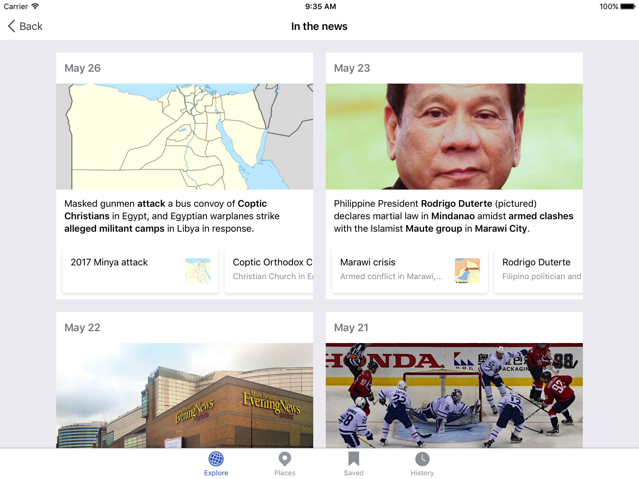
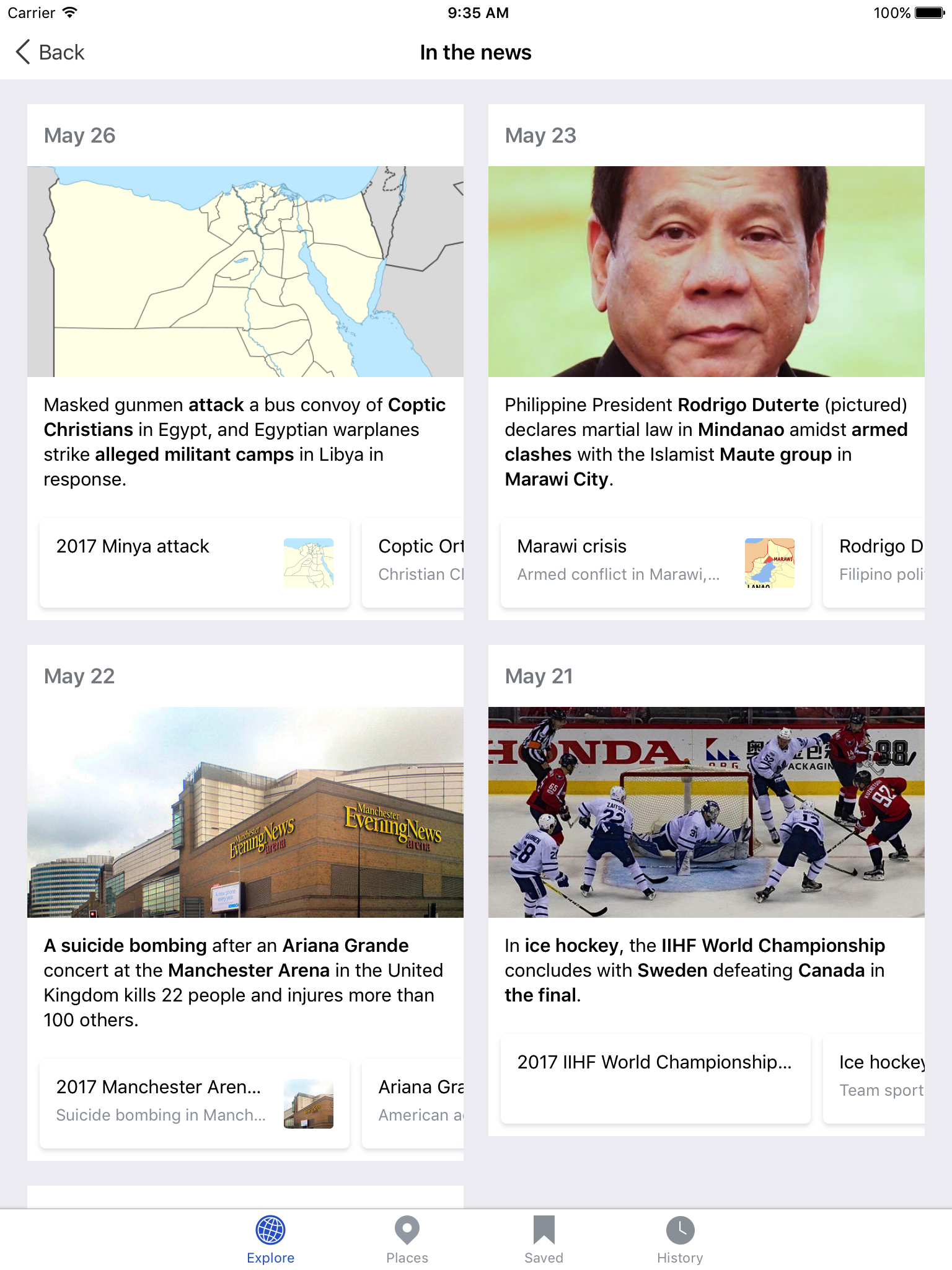
iPad designs
| Landscape | Portrait |
 |  |
| Zeplin: https://zpl.io/Z1FFhvr | Zeplin: https://zpl.io/Z2IoNq |
Design details
- On the horizontal cards all lines (title and description) should be truncated at one line with ellipses
- If the card does not have an image do not show a placeholder (expand text area to fill)
Feed card logic
- Only show card in feed when a new news story has been added (not daily)
- Feed card only shows the most recent news story