Page MenuHomePhabricator

Reduce the size of the hole in MapPin and MapPinAdd icons
Closed, ResolvedPublic

Assigned To
Authored By
JGirault
Nov 19 2016, 12:26 AM
Referenced Files
F8789420: Screen Shot 2017-07-17 at 10.56.58 AM.png
Jul 17 2017, 5:58 PM
F4901924: new-mapPinAdd-ltr.svg
Nov 30 2016, 1:45 PM
F4901463: pasted_file
Nov 30 2016, 1:45 PM
F4901923: new-mapPin.svg
Nov 30 2016, 1:45 PM
F4901925: new-mapPinAdd-rtl.svg
Nov 30 2016, 1:45 PM
F4744080: Screen Shot 2016-11-18 at 3.55.19 PM.png
Nov 19 2016, 12:26 AM
F4744082: Screen Shot 2016-11-18 at 3.54.21 PM.png
Nov 19 2016, 12:26 AM
Tokens
"Like" token, awarded by Jdforrester-WMF."Like" token, awarded by Volker_E.

Description

Hi !

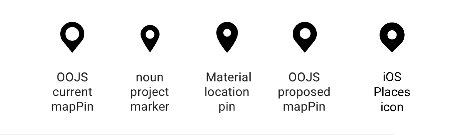
In T150924 we had feedback from the community that the mapPin icon may be confused with the letter Q.

We Maps (Kartographer) suggest to reduce the size of the hole in the MapPin icon and MapPinAdd (ltr) & MapPinAdd (rtl) icons.

See:

BeforeAfter
Screen Shot 2016-11-18 at 3.55.19 PM.png (160×800 px, 23 KB)
Screen Shot 2016-11-18 at 3.54.21 PM.png (160×800 px, 23 KB)

What do you think?

Event Timeline

Volker_E added subscribers: Pginer-WMF, RHo, matmarex and 2 others.

@Pginer-WMF @RHo I think we should follow the user feedback here without hesitating. What do you think?

This is interesting. Using stroke widths that align better with the text ones can help making the whole thing (icon + label) to be perceived more as a unity. However, it also increases the chances of confusion as being text.

The proposed design looks good to me since the pin seems still identifiable as such, but @RHo may have other considerations about the design of the pin (e.g., is it used elsewhere on mobile apps? does the change seem likely to break anything on those other places?).

(I based my comments on the screenshots above, which do not seem to match the usual 100% zoom scale users may face most often)

I think the smaller hole in the pin works fine and is better in keeping with the ratio of pin-to-hole size in some other pin icons as well.

pasted_file (346×1 px, 30 KB)

Android is using an different (older style) green pin on the Nearby map view which will be updated separately at some other point anyway so doesn't interfere with this change, and iOS doesn't have a map view yet so doesn't use any pin 'asset'.

+ @cmadeo to bear in mind the icon edit for upcoming iOS nearby visual treatment.

New map pins with smaller hole attached below:


Change 325438 had a related patch set uploaded (by VolkerE):
MediaWiki theme: Reduce MapPin* icons' hole for better recognisability

https://gerrit.wikimedia.org/r/325438

Change 325438 merged by jenkins-bot:
MediaWiki theme: Reduce MapPin icons' hole for better recognisability

https://gerrit.wikimedia.org/r/325438

Volker_E removed a project: Patch-For-Review.
Volker_E edited projects, added OOUI (OOjs-UI-0.18.2); removed OOUI.
Volker_E moved this task from Review to Done on the UI-Standardization-Kanban board.

@RHo thanks for the heads up!

FWIW The current iOS places icon has a smaller circle than the OOJS proposed map pin:

Screen Shot 2017-07-17 at 10.56.58 AM.png (431×1 px, 75 KB)