Page MenuHomePhabricator

Enable the first "edit" pencil to allow editing the description, as well as the first article section.
Closed, ResolvedPublic2 Estimated Story Points

Description

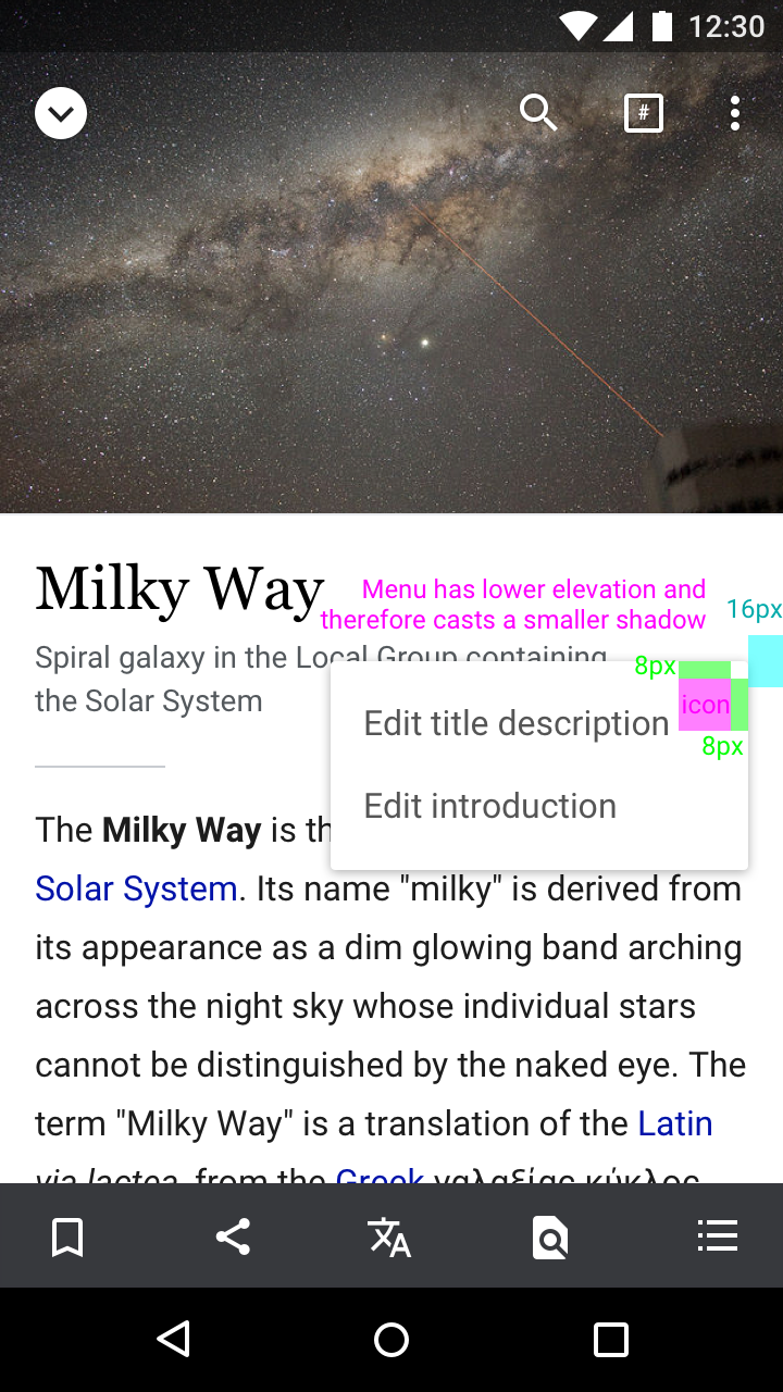
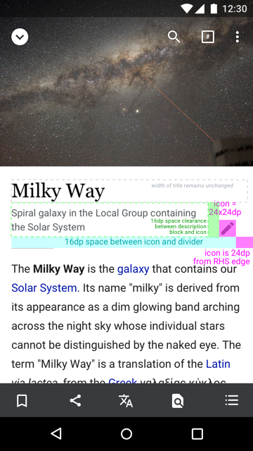
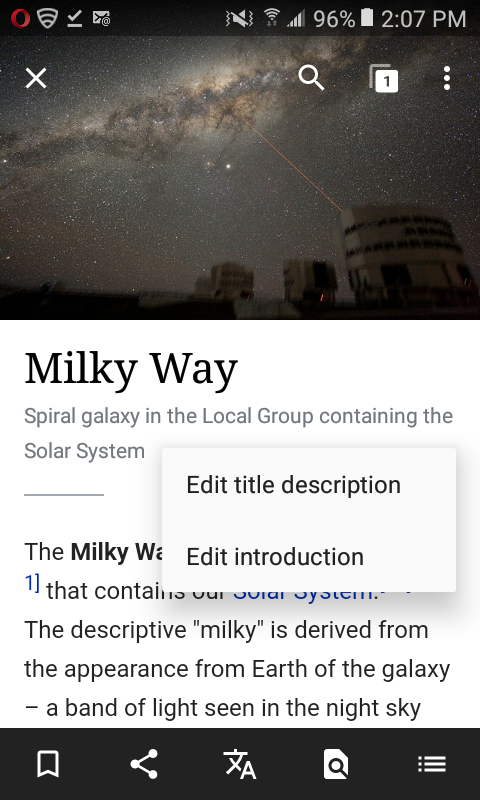
The first edit pencil at the top of the article should pop up a menu with options to "Edit title description" and "Edit introduction". If the article already has a description, it should no longer be clickable (it should be editable only via the edit pencil).

Mock:
https://zpl.io/1veAQl

Event Timeline

Change 323314 had a related patch set uploaded (by Dbrant):
Make the first edit pencil serve a dual purpose.

https://gerrit.wikimedia.org/r/323314

Change 323314 merged by jenkins-bot:
Make the first edit pencil serve a dual purpose.

https://gerrit.wikimedia.org/r/323314

Looking good @Dbrant – just noticed a few things:

1. Edit icon

Actual
Screenshot_20161205-174533.png (1×1 px, 252 KB)
Expected (with redlines)
Text selection menu.png (1×720 px, 776 KB)
Icon is ~28dpx28dpIcon is a smaller 24dp x 24dp
Icon is in line with the last line of the wikidata description text, which is 16dp from the horizontal divider line
More space (24dp) between icon and RHS edge of screen

2. Edit menu

Actual
Screenshot_20161205-174527.png (1×1 px, 278 KB)
Expected (with redlines)
B2. Edit overflow (new position).png (1×720 px, 778 KB)
Shadow cast is larger than expected (seem more like the shadow for a dialog)Menu should cast a smaller shadow
Background color is #FAFAFABackground color is #FFF
Menu is cut-off on the RHS edge of screenMenu animates from icon with 8dp spacing from edge of menu to corresponding sides of the icon, and 16dp from RHS edge of screen.

Hey @Dbrant – the above visual design feedback still applies on the latest alpha version 2.4.184-2017-01-31.

^ edit pencils for editing sections shall also be 24x24dp.

Picking this up for UI polish updates.

One tricky issue I've noticed with moving the (floating) edit pencil up within the header view as shown in F4992934 is that, on some articles on some devices/configurations, this puts it up where it's in danger of obscuring description text:

Screen Shot 2017-02-22 at 3.42.54 PM.png (634×386 px, 131 KB)

Its current placement on master overlaps the description TextView only marginally so that this isn't an issue.

I'm not sure how best to handle this. I don't think there's any viable way to get the description text to wrap around the separate, floating view. I guess we could switch things up so that the description textview and edit pencil are neighbors within a LinearLayout, though I'm not sure how straightforward that will be to make RTL-friendly.

Change 339327 had a related patch set uploaded (by Mholloway):
Update section edit pencil styles

https://gerrit.wikimedia.org/r/339327

One tricky issue I've noticed with moving the (floating) edit pencil up within the header view as shown in F4992934 is that, on some articles on some devices/configurations, this puts it up where it's in danger of obscuring description text

Sorry the mock wasn't clear, but the intention is that the block for the description text should end before the icon:

Artboard.png (640×360 px, 235 KB)

Change 339428 had a related patch set uploaded (by Mholloway):
Update page header view edit pencil/popup menu styling

https://gerrit.wikimedia.org/r/339428

Thanks, @RHo. I imagined we'd have to do something like that. It took a bit more rearranging than it would appear from the outside but ended up being pretty painless.

Questions for @RHo:

  • The drop-shadow under this menu is the standard (default) for all apps, including Google apps. Is it correct to change it here? And if so, should this change be applied app-wide, or just here?
  • The same for the background color of the menu.

Sorry @Dbrant, we can leave the menu as default shadow and color – I think I mixed up shadow and color with the default card style.

Change 339428 merged by jenkins-bot:
[apps/android/wikipedia] Update page header view edit pencil/popup menu styling

https://gerrit.wikimedia.org/r/339428

Change 339327 merged by jenkins-bot:
[mediawiki/extensions/MobileApp] Update section edit pencil styles

https://gerrit.wikimedia.org/r/339327

Change 341012 had a related patch set uploaded (by mholloway-shell):
[apps/android/wikipedia] Update section edit pencil styles

https://gerrit.wikimedia.org/r/341012

Change 341012 merged by jenkins-bot:
[apps/android/wikipedia] Update section edit pencil styles

https://gerrit.wikimedia.org/r/341012

Hi @Mholloway - looks like the Description is still going all the way to edge into the pencil icon area, and is still sitting below rather than adjacent and bottom aligned to the title description text:

main-MainActivity-03162017140554.png (1×1 px, 866 KB)
main-MainActivity-03162017140513.png (1×1 px, 1 MB)

Occurring on: 2.5.190-alpha-2017-03-16
Device: Pixel
Android Version: 7.1.1

Hi @RHo, thanks for looking over the changes. We ended up merging something of a compromise patch[1] because making a layout completely faithful to the mock requires RTL layout support that isn't present in the platform until API level 17 (currently, we're supporting down to 16). OK to revisit when we drop API 16 support?

[1] Discussion here: https://gerrit.wikimedia.org/r/#/c/339428/

no worries @Mhholloway – I just created a separate ticket to track the display issue, and this is ready for QA.

Steps to reproduce

  1. Open an article not protected from editing (eg., Milky Way)
  2. Tap on the first edit pencil icon in the article (below the article title)

Expected
Overflow menu should appear with options to "Edit title description" and "Edit introduction"

Testing on Samsung Galaxy Express 3 (J120A) with Android 6.0.1 and Wikipedia Alpha app 2.5.190-alpha-2017-03-21. This is fixed according to @RHo steps leading to the Expected result as shown in the screencap

T151468.png (800×480 px, 308 KB)

ABorbaWMF subscribed.

Tested on a Pixel with Android 7.1.1 and the Alpha App 2.5.190-alpha-2017-03-22

Looked at locked, unlocked, long, short, and no description. Everything appears to work properly

There is something problematic about the Milky Way example. In some cases, when I view this article the description is on one line and it looks very similar to the screenshot in @RHo added above.

main-MainActivity-03162017140513.png (1×1 px, 1 MB)

But other times I see the description on two lines like this.
Screenshot_20170322-094212.png (1×1 px, 1 MB)

So far I have been unable to find another article that exhibits this behavior.