Page MenuHomePhabricator

Have Show preview and Review your changes more directly accessible in the New Wikitext Editor
Open, MediumPublic8 Estimated Story Points

Assigned To
None
Authored By
Amire80
Dec 15 2016, 11:42 AM
Referenced Files
F17325351: vesmile.png
Apr 26 2018, 5:06 PM
F17325285: Screen Shot 2018-04-25 at 4.53.23 PM.png
Apr 26 2018, 5:06 PM
F14978491: image.png
Mar 14 2018, 2:03 PM
F7635912: VE-switch-preview.png
Apr 19 2017, 1:03 PM
F7336409: Screenshot from 2017-04-07 10-21-14.png
Apr 7 2017, 8:31 AM
Tokens
"Love" token, awarded by Seddon."Love" token, awarded by saper."Love" token, awarded by Kpjas."Love" token, awarded by RodrigoTavares."Love" token, awarded by Liuxinyu970226."Love" token, awarded by He7d3r."Love" token, awarded by Gryllida."Love" token, awarded by Kghbln."Love" token, awarded by Charlie_WMDE."Love" token, awarded by Quiddity."Love" token, awarded by Jan_Dittrich."Love" token, awarded by thomaskuntzz."Like" token, awarded by Juandev."Love" token, awarded by Johan."Love" token, awarded by MichaelSchoenitzer."Like" token, awarded by Pearli123."Love" token, awarded by KartikMistry."Like" token, awarded by Arrbee."Love" token, awarded by Ltrlg."Love" token, awarded by Lluis_tgn."Love" token, awarded by Raymond."Like" token, awarded by Alsee."Love" token, awarded by Guycn2.

Description

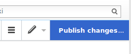
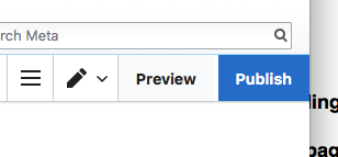
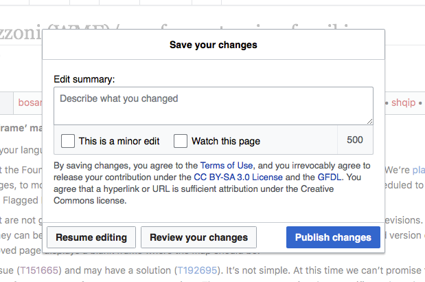
The announcement about the New Wikitext Editor in the Hebrew Wikipedia received several replies that asked for more direct access to diff and preview. Having these two actions "hidden" after the Save button confused people.

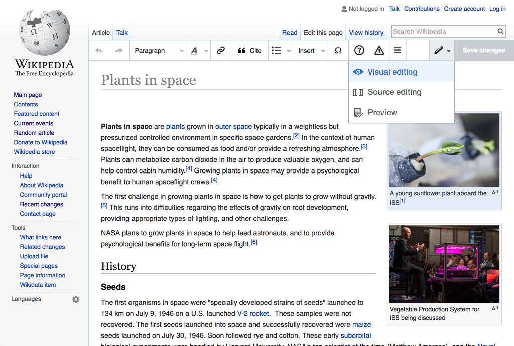
Preview, in particular, is not available at all if the article wasn't edited because the Save button is inactive (this also means no null edits). While this could be worked around by opening the "Read" link at the top in a new tab, this requires some extra effort in comparison to the regular wikitext editor, where a preview can be shown upon the first loading of the editing page (it's a preference), making the current content of the article more directly accessible.

Workaround: for those that are interested, the access keys (alt+shift+p / alt+shift+v) will still take you directly to show preview/changes.

Related Objects

Event Timeline

There are a very large number of changes, so older changes are hidden. Show Older Changes

i'd say that for wiki text,, we should actually encourage people to always go through preview. Maybe we could make that the default for the 'Save' button, and have the button behave as a dropdown, like on the editor switcher as well ?

[Preview]

  • [Save]
  • [Preview]
  • [Show changes]

Seems like an interesting experiment to me.

A very typical wording for the save button would be "Review and save" (or "Review and publish"). It shouldn't be merely "Save" or "Publish", since the page is not immediately saved when pressing it.

IMHO the Preview panel should have its own separate button rather than being available in a dropdown (thus requiring two clicks).

A very typical wording for the save button would be "Review and save" (or "Review and publish"). It shouldn't be merely "Save" or "Publish", since the page is not immediately saved when pressing it.

"Publish" is already too long in English, and interferes with the functional design especially for users with mobile devices or with eyesight issues. In other languages, like Polish, it's even worse. The principal functionality of this button needs to be briefly communicated. It's exceptionally unlikely that we would make the label multiple words.

IMHO the Preview panel should have its own separate button rather than being available in a dropdown (thus requiring two clicks).

If we were to take over (even) more room on the toolbar, we would have to demote other features from the toolbar for space (we're currently at the limit for space for the average desktop user, at 1000px wide at normal zoom on Vector).

Which do you propose to make this work? Should we get rid of the Cite button? The link and menu buttons? Fundamentally, preview is not more important thank anything already in the lists, I fear.

If there are problems of space, why not move the Preview button to the bottom of the screen, where there would be enough room for separate Preview and a Save buttons?

The standard placement in web design for submit buttons is below the form they are sending, anyway; and, as an added benefit, it would be more consistent with the placement in the old editor. I never understood why the submit button was placed at the top right in the new editors.

For people accustomed to writing wikicode directly, Preview is way more important than any helper button to insert code; having a look at the final result before submitting is essential and can't be accomplished by any other means, but conversely any wikicode could be written by hand without a button. The old editor has direct buttons for Save, Preview and Show changes, so it's way better than the new editor in that regard.

Having these two actions "hidden" after the Save button confused people.

"Save" can be a sort-of-sensitive action: After you saved, your changes are public.Thus, some people I know say they always preview etc. (especially, if they work in a kind of conflict prone context in WP). Problematic is not the additional click imho but that the button indicates it will save right away.

This is not a new problem, and in desktop applications there is the useful standard of suffixing "…" to items that yield an additional dialog to say "The action will not be executed now, but you will get a dialog before and then be able to do it". I know it is still extra space, but it would use an established standard and would not require huge shifts.

Screenshot from 2017-04-07 10-21-14.png (109×264 px, 2 KB)

@Jan_Dittrich This is also discussed in task T44138

As part of T44138: VisualEditor: Toolbar "Save page" button is confusing as it merely opens the dialog to save the page I'm thinking of re-organising the toolbar's terminal control into a split button:

[ Save changes | v ]

Clicking on "save changes" would open the save dialog, as now; clicking the 'v' would open a menu of save-related controls like "preview", "Show my changes", "switch editors", "cancel", etc.. Does that seem reasonable?

If we want to make preview more independent from the save process, we can also present "preview" as another mode at the same level of visual and source editing. I have illustrated the idea below.

VE-switch-preview.png (690×1 px, 498 KB)

Keyboard shortcuts can be shown as part of the menus if we want advanced users to have a quick way to switch modes.

@Pginer-WMF I don't think this is a good idea to hide preview into editor switch. It is like trying to sell a painting between blank papers. On top of that preview is crucial for wikitext mode, but for visual mode it is not necessary so much.

Maybe we should first find out, how users behave when editing in wikitext editors and then think how to make it easier to them. Preview is certainly one of the most important features of textual editors, maybe we could get an inspiration from some markdown or HTML editors.

I think every user sometimes adds some markdown not sure about the result, then previews it if it is ok and return back to continue in work.

Aklapper renamed this task from It would be nice to have Show preview and Review your changes more directly accessible in the New Wikitext Editor to Have Show preview and Review your changes more directly accessible in the New Wikitext Editor.Jun 26 2017, 5:20 AM

Maybe we should first find out, how users behave when editing in wikitext editors and then think how to make it easier to them. Preview is certainly one of the most important features of textual editors, maybe we could get an inspiration from some markdown or HTML editors.

I think every user sometimes adds some markdown not sure about the result, then previews it if it is ok and return back to continue in work.

That's my workflow when I am unsure, which is when I most want to preview a page. When I am certain of the result I skip previewing and go straight to save.

It might be reasonable to consider a second row of commands indeed. Someone suggested such a row at the bottom--I'm not really enthusiastic about that since I hate scrolling my mouse down. You could also have a column down the right or left hand sides with actions, rather than the wikitext manipulation toolbar (PageCuration comes to mind), or a second row at the top--one for actions and one for wikitext manipulation

Edit: And some stuff more about T155732: Provide a Preview panel that doesn't obscure the wikitext box and maybe the skin's sidebar (?).

https://www.mediawiki.org/w/index.php?title=Topic:U5iudcxe6c8r1346&action=history

"I really like the new editor but I quite confused about the 'publish changes' dialogue. The first thing I want to do after editing is to have a preview. I would like to have a preview button next to publish. The publish dialogue itself has a confusing layout. Two button on top with 'resume' and 'publish', the edit comment area in the centre and 'preview' and 'review' at the bottom. 'Resume' is nothing else than closing the dialog, normally called 'cancel'. This can also be achieved with an X on the right top like in a normal dialogue. The UXD team has to decide if the want button on top or on the button of the dialogue, splitting the up is strange. The first time I opened this dialogue I didn't find the preview button because there is the edit summary beneath the 'resume' and 'publish' buttons and I didn't expect more button below the summary. The same applies to the 'Review your changes dialogue'. I think publish without preview shouldn't be so easy because editing the source code is always error prone."

Adding another complaint reported at Mediawiki 2017 wikitext editor/Feedback.

I second this. I find it vexing that the options to preview and review changes are only available after pressing a button that says "Publish changes", not in the least because in other viewing modes (e.g. from the preview or review changes modes) pressing the button "Publish changes" will actually and immediately publish your changes. It's disturbing that the user has to click a button saying "Publish changes" to get to a function that's essential to use *before* publishing changes. It always makes me hesitate, fearing that pressing it may not allow me to make changes before it's final.

This may be no biggie to users who edit several articles each day, but to occasional editors it's confusing and off-putting.

Adding another complaint reported at Mediawiki 2017 wikitext editor/Feedback.

Change 418591 had a related patch set uploaded (by Esanders; owner: Esanders):
[mediawiki/extensions/VisualEditor@master] Create show preview/changes tools to show next to save button

https://gerrit.wikimedia.org/r/418591

Screenshot of the above patch

image.png (204×397 px, 25 KB)

If the wikitext mode is not enabled by the user, only 'review your changes' will be shown.

If this is deployed as in the above screenshot there will be an unending stream of complaints that the preview button needs to be more directly accessible.

Preview is the second most important button, after only the the Save button. If you strip the interface down to two buttons and one menu containing everything else, the Preview button needs to be directly accessible next to Save.

@Esanders : Is this the only change? If yes: Where does "Show preview" lead to? If it's the same page as today, I would have no chance to add an edit summary / comment between checking the preview and publishing the change. :-(

@Esanders : Is this the only change? If yes: Where does "Show preview" lead to? If it's the same page as today, I would have no chance to add an edit summary / comment between checking the preview and publishing the change. :-(

Both the show preview and show changes pages link to the save form at the bottom. These are already accessible directly using the keyboard shortcuts shown above. I'm sure there are other changes that we can make to the save workflow, but they would be beyond the scope of this ticket.

If this is deployed as in the above screenshot there will be an unending stream of complaints that the preview button needs to be more directly accessible.

Preview is the second most important button, after only the the Save button. If you strip the interface down to two buttons and one menu containing everything else, the Preview button needs to be directly accessible next to Save.

There was already a discussion, that there is no space in the edit bar for two buttons. This dropdown button is maximum we can add to the edit bar.

@Dvorapa, the proposed change doesn't fix the problem. You're still going to have an unending stream of people filing the same bug report.

Number one, the biggest hurdle for new users is making a first edit. As a non-serious proposal, you could reduce the edit bar to ONE button that says preview. The single most important thing is for a new user to know that they are 100% safe, that can give that they can experiment, that they can screw up, and they're not saving or breaking anything. They need an obvious button telling that that they can just play with the editor and merely preview whatever random garbage they type in. For years everyone has been saying that the on-ramp for new users is a top priority. Presenting new users with an explicit preview button is the simplest and most critical part of a successful on-ramp.

Two, for many or most editors, preview is not part of the save process. Preview is part of the edit-preview-edit cycle. Not only do they want a direct one-click button, people are reporting an active aversion to tying this function to the publish button. I've been experimenting with the 2017Editor on-and-off since the prototype was first released. When in the middle of an edit-preview-edit cycle, the last thing I want to do is click on a save button. Every time I want to preview in the 2017 Editor, I still have to consciously repress a physical hazard-response every time I'm forced to put the mouse over the save button in order to reach preview. My gut physically winces a bit, and a tiny surge of adrenaline shouts "No, that's dangerous, that's the wrong button!" Adding a little tiny "v" box as part of the save button isn't going to fix that.

As for space on the edit bar, there are all sorts of options. Use vertical space, split things into two bars, make buttons smaller (smaller icons/font), have less whitespace between buttons, eliminate/merge/move one or more of the less important buttons (do we really need a button for bullet lists). Or anything else.

I'm not convinced that this idea makes the problem any better. With this change, it would still take the same number of clicks to get from an edit to a preview—click dropdown and click "Show preview", rather than click "Publish" and click "Show preview"—so the preview hasn't really been made any more accessible. Additionally, there is already some confusion sometimes about what the "Publish changes" button does (see T44138), and adding a dropdown with other options is likely to make less clear, which feels like a step in the wrong direction.

@Pginer-WMF How do you feel about this?

@Alsee Your catastrophising isn't helping.

Additionally, there is already some confusion sometimes about what the "Publish changes" button does (see T44138), and adding a dropdown with other options is likely to make less clear, which feels like a step in the wrong direction.

I agree this solution isn't perfect, but along with T44138 I think it reduces the scariness of the 'Publish changes' button.

it would still take the same number of clicks to get from an edit to a preview

True, although the reduced mouse travel makes it considerably less annoying. Plus it exposes the keyboard shortcut, which many users are not aware works in VE.

When editing particularly complicated edits I frequently go between preview and edit multiple times. I would like to not have Yet Another Dropdown to perform a frequent editing action. A poorly mocked up suggestion, if I may.

Screen Shot 2018-04-25 at 4.53.23 PM.png (143×308 px, 12 KB)

With the previous editor I could quickly scroll to the bottom of a page when editing and see the "Show preview" and "Publish changes" buttons consistently located next to one another. I do like that the new toolbar is stacked at the top of my viewport though!

With the new editor (and VE in general) I now have to interact with the "Publish changes..." button,* remember which of the three buttons I want ("Resume editing" in the top left, "Review your changes" in the bottom left, "Show preview" next to it, and "Publish changes" in the top right). Then I click "Show preview" to see a preview. There are too many buttons and remembering their location in the modal is difficult.

I can't scroll up/down to see the wikitext to correct (say if I need to make multiple fixes where I consistently goofed some syntax) and have to return via the "Resume editing" button, make the edits I noticed/remembered, and repeat this process for consequential edits. These are extra interactions that make using the editor feel slower and more cumbersome.**

The "Resume editing" button, along with the other buttons in that modal also shift in my mental map of where they were a minute ago. I relate the current "Show preview" action to that of maximizing the window. This is different than I expect a modal window to operate. (Edit: This also results in more mouse travel as I have to hunt down the button I want, now flung to the corners of my viewport) I realize previewing the page in as full of a viewport as possible is logical, but perhaps the button layout could be addressed regarding that concern. Group them together like we do the main editor toolbar. Top/bottom, doesn't really matter. Actions are next to one another in a logical order. Resume>Preview>Publish.

Again, another poorly mocked and thought out suggestion:

vesmile.png (410×619 px, 74 KB)

Imagination cap time: You could even put them at the top of the modal, under the "Save your changes" title.

Please consider this in refining this interface. I like much of the new editor (and VE in general), but these finer points are frustrating.

*Which doesn't actually publish changes. But I digress.
**Yes, I am aware of keyboard shortcuts. I like buttons and there are a myriad of reasons others use them as well. :p

matmarex subscribed.

In T85470: Users are requesting a "Cancel and exit without saving" option, it was proposed to also stick a "Cancel" button into this hypothetical dropdown, if it were to become reality.

After trying this for a first time (due to reports on plwiki) I second what @CKoerner_WMF and @Alsee are saying. Edit->preview->edit->preview->edit->preview->submit flow should be natural and not interrupted with modals, animations and hidden buttons. In this regard I am pretty happy with a current "live preview" feature of the 199x/2010 wiki editors. Can we get rid of modals altogether?

Change 418591 had a related patch set uploaded (by Esanders; author: Esanders):

[mediawiki/extensions/VisualEditor@master] Create show preview/changes tools to show next to save button

https://gerrit.wikimedia.org/r/418591

In provided patchDemo, in visual mode, “Show preview” button is visible but disabled. That seems me counterproductive.
In my opinion, we should:

  • remove it to make the interface lighter;
  • or keeping it enabled, to let users display a real preview which is actually (but unfortunately) different from visual editor rendering because of legacy parser, slugs, new French armories…