Page MenuHomePhabricator

Incorporating the webfonts into style guide
Closed, ResolvedPublic

Description

Currently the webfonts (Charter and Lato) are defined, but not loaded in https://wikimedia.github.io/WikimediaUI-Style-Guide/

We should incorporate them:

Event Timeline

Some notes of mine from the January 19 meeting with @Pginer-WMF, @Volker_E, @JGirault, @Jdrewniak, @Jdlrobson

Drawbacks:

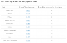
  • (Timo) We can't subset fonts because of our content is highly localised. This leads to our fonts likely being 10x larger than the typical size of web fonts recommended by industry leaders like Google.
  • (Timo) Our current critical path only consists of 1 main stylesheet. As soon as that is arrived (or cached) content will progressively render as the browser continues to download the page HTML content. All JS and images are loaded asynchronously and don't block rendering or layout. (Image dimensions are reserved). Adding web fonts may add a significant delay to critical path rendering.

Compromises:

  • (Pau) Targeting secondary page views only seems reasonable given most users visit Wikipedia multiple times. The first (uncached) page view would have a tight timeout on font load (e.g. 0ms or 50ms), and would populate the cache for subsequent page views.
  • (Volker): First invisible instead of swap (fallback->web font) is preferable (less distracting) during the timeout.

Potential trial grounds for web fonts before considering MediaWiki pages:

Alternatives:

  • (Timo/Pau) Various sites have moved their font policy from "identity consistent" concerns to "legibility-driven" approaches. The rising of new native fonts on various platforms has also motivated this effort. Aside from various good fonts available on most platforms by default, there's also various articles on how to specifically use the operating system's default font (e.g. "San Francisco" on iOS and macOS, "Roboto" on Android, etc.). This also makes web pages feel more like native apps on mobile, which have the same behaviour. Note that this is different from the "browser default" font, which is typically something like Arial for sans-serif.
    • Facebook: -apple-system, BlinkMacSystemFont, '.SFNSText-Regular', sans-serif;
    • GitHub: -apple-system, BlinkMacSystemFont, "Segoe UI", Helvetica, Arial, sans-serif, "Apple Color Emoji", "Segoe UI Emoji", "Segoe UI Symbol"; - (Hacker News, Designer News)
    • Medium: -apple-system,BlinkMacSystemFont,"Segoe UI",Roboto,Oxygen,Ubuntu,Cantarell,"Open Sans","Helvetica Neue",sans-serif; - "body default and UI-only, still a webfont for main content area" (Medium.com article, Smashing Magazine article)
  • (Timo) However, for standalone sites such as the Annual Report and Policy site, a consistent identity with offline publications can still be beneficial (they already use different fonts compared to our wiki content). And can be done with fairly good performance given that the content is tightly controlled (font subsetting, single variation, invisible first, short timeout, etc.).
Volker_E assigned this task to JGirault.
Volker_E triaged this task as High priority.
Volker_E moved this task from Stalled / Waiting to Done on the Wikimedia Design Style Guide board.