The HTMLFormField parameters help/help-message and the HTMLCheckMatrix parameter tooltip serve a similar purpose but look and behave very differently. (It's even worse in traditional HTMLForm but that's being replaced anyway...)
| help | tooltip |
 |  |
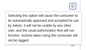 | 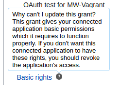 |
help is positioned to the very right (see T155186 about that); tooltip is right after the label. help is an "i" icon, tooltip is a question mark. help shows up on click, tooltip sows up on hover. help opens above, tooltip opens below. (They also look different since help uses OOUI and tooltip uses tipsy.) There is no UX purpose for those differences as they both tend to be used for help messages; they should be unified.