The info icon button for help-messages in htmlform is taller than the usual label text, apparently causing extra spacing between label and input. Or this may just be due to the styling around the added oo-ui-fieldLayout-header div, which acts as a container, but was apparently only added to some elements outside of where help-messages are used.
Basically it's inconsistent:
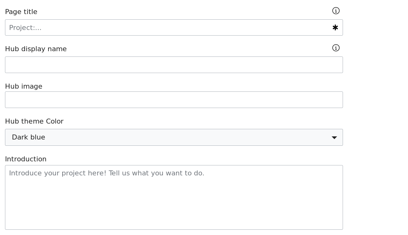
See how the spacing between the page title and display name labels and their inputs differs from that between the image and introduction labels and inputs. Image, display name, and page title are all the same kind of input (text).
Introduction, a textarea input, also differs.
- Text label and input distance: 9px
- Textarea label and input distance: 12px
- Select label and input distance: 17px
- Text label and input distance with helm-message icon: 17px
(Numbers based on a hidpi screen with various random rendering settings, but you get the idea.)