First I just wanna say, the work so far on the guide is great :) However, I want to ask: Why was the font-weight lightened? I personally find it hard to read, and this can make it harder for people who have visual impairments; content should be easily accessible by everyone. I suggest the font-weight should be changed back to normal font-weight (400).
Description
Description
Related Objects
Related Objects
- Mentioned In
- rRLP9a5757d15557: Typography update
Event Timeline
Comment Actions
@Iniquity I'd like to make sure, that your idea is aligned with the same issue. As GitHub issue you've filed
Hello, I think new site' font (base one) is really tall, and it is hard to read.
Please clarify “tall”…
Comment Actions
Agreed that it’s too thin. I’m afraid too many designers are wrongly using lightweight faces for body text due to the “fattening” effect of their macOS renderers…
Comment Actions


Designers shouldn’t punish non-Retina users…
You don’t really need a screenshot, and the OS I use doesn’t really matter; it’s common sense to use text weights/faces for body text and display/light weights for display settings. Unfortunately, using thin, small text has become yet another moronic trend in web design. Sorry for being blunt. Anyway, here are some screenshots of a couple of sites I’ve visited within this hour that have this issue…


Designers shouldn’t punish non-Retina users…
Comment Actions
The styleguide is an early work in progress. Input is really helpful for us. Regarding fonts and other visual elements, screenshots are definitely helpful to be sure everyone is viewing the same as ourselves do.
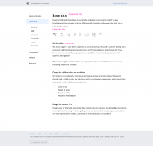
In this particular case, I agree the current weight is probably too thin for users on all devices. I tried to play with the CSS and when applying the 400 weight to the styleguide it looks like having a higher weight than expected. Interestingly, applying the 400 weight to other pages (where Lato is not delivered through web fonts but using the local font in my machine) it looks like a "regular" width, which I think we should go with for the regular text. I included the examples below in case it helps to identify where the issue is:
| Styleguide current (webfont) | Styleguide with 400 font width (webfont) | Another page with 400 font width (local font) |
|---|---|---|
 |  |  |
Comment Actions
@SamanthaNguyen It's my bad, it was in one of the mockups as i was revising typography. We will fix it. it's not supposed to be Thin
Comment Actions


Here's updated typography for styleguide
https://zpl.io/BYA5m < spec here
@SamanthaNguyen I would like to invite you to our zeplin board. so you can leave comments and feedback directly. need email to add you.
Comment Actions
@Nirzar: No worries! Mistakes happen :) My email can be found on Phabricator profile here (just updated it)
Comment Actions
@Fito @Pginer-WMF I agree what you Pau said about higher weight than expected (for me on OS X), that's the reason I was changing over the early mockup by @Nirzar and font-weight: 300;. On a Windows or a Linux OS, like pointed out by @Fito, Lato Light (300) has legibility weakness as well. Therefore I think it makes sense to switch back over to Lato and font-weight: 400 as long as we don't have any better solution. :/
Comment Actions
This got fixed in https://github.com/wikimedia/WikimediaUI-Style-Guide/commit/9a5757d155570f6c686907bd5dc21606a1ee996a
Thanks @Nirzar for the design inputs.