Page MenuHomePhabricator

RCFilters: Implement 'subset' property for filter items
Closed, ResolvedPublic

Description

Some filters are defined as being a subset of another filter; for example, ORES filters ORES "likely good faith" contains "very likely good faith", so the filter "very likely good faith" is a subset of "likely good faith".

If a user selects both (or one that is the 'superset') they have an indication that toggles the greying-out of the filter item in the list and in the capsule item area. We need to make sure the model understands this property and can analyze it properly for the UI.

More specifically, the behavior includes:

  • Filter list:
    • Filters that are a ‘subset’ of another selected filters are displayed as inactive/grey in the list (but can STILL be selected!)
  • Capsule items:
    • Filters that are a ‘subset’ of another selected filters and are in the capsule item list (meaning the filter is also selected) are displayed as inactive/grey
    • Tooltip text states the greyed out filter is included in the results by name of the other filter whos the superset

And in the data model:

  • FilterItems: Must store a list of “subsets”, which it will get from the backend definition (see T152754: Configure filters in a single extensible place for that definition)
  • ViewModel: The viewmodel should be able to produce a combined list of anything that includes filterX as a subset, and should answer the question “isFilterAlreadyIncluded” (or something like this) for any given filter, to make sure the UI can represent its state correctly (both in tooltip and in the visual 'active' / 'inactive' capsule state)

Event Timeline

Change 335951 had a related patch set uploaded (by Mooeypoo):
[wip^n] Define interaction states for filters

https://gerrit.wikimedia.org/r/335951

Change 335951 merged by jenkins-bot:
RCFilters UI: Define interaction states for filters

https://gerrit.wikimedia.org/r/335951

Change 342165 had a related patch set uploaded (by Catrope):
[mediawiki/core] RCFilters UI: Change tooltip for subsetted/included filters

https://gerrit.wikimedia.org/r/342165

Change 342165 had a related patch set uploaded (by Catrope):
[mediawiki/core] RCFilters UI: Change tooltip for subsetted/included filters

https://gerrit.wikimedia.org/r/342165

This patch implements this in the UI, but I have two concerns.

First, the popups get pretty big (and tall), because the text is so long. It's 4 lines for one redundant filter, and 5 lines for two:

rcfilters-subset-popup-1.png (155×366 px, 19 KB)
rcfilters-subset-popup-2.png (163×339 px, 19 KB)
.

Second, when the viewport is scrolled down so that the top of the Active Filters Display Area is at the top (per spec), there isn't enough space for the popups:

rcfilters-subset-popup-3.png (118×361 px, 14 KB)

Since there's only about 1.5 lines worth of vertical space, this is not just an issue with the verbose subset popups, but also with some of the others:

rcfilters-subset-popup-4.png (76×379 px, 8 KB)

@jmatazzoni: I think we need to make the subset text shorter; and @Pginer-WMF: I think we need to do something about the popups getting cut off, either by making them wider, or adding more vertical space, or having them pop down instead of up, or some combination of those things.

Second, when the viewport is scrolled down so that the top of the Active Filters Display Area is at the top (per spec), there isn't enough space for the popups:

rcfilters-subset-popup-3.png (118×361 px, 14 KB)

Since there's only about 1.5 lines worth of vertical space, this is not just an issue with the verbose subset popups, but also with some of the others:

rcfilters-subset-popup-4.png (76×379 px, 8 KB)

If only popups could adjust the position they're opening from depending on how much space they have on the screen...

If only popups could adjust the position they're opening from depending on how much space they have on the screen...

If only... (context: T158934)

@jmatazzoni: I think we need to make the subset text shorter; and @Pginer-WMF: I think we need to do something about the popups getting cut off, either by making them wider, or adding more vertical space, or having them pop down instead of up, or some combination of those things.

Regarding the text, I think we should consider making it shorter. For example: "Has no effect because its results are already included in broader filters: X, Y..."

Regarding the tooltip positioning, if we cannot make them adjust their position based on the space available, we can adjust the point at which we scroll automatically to make sure there is room for tooltips in most of the cases.
I'd not make the tooltips much wider since they would look too wide, especially taking into account that those cases displaying few words also get the same width.

I can certainly shorten the tooltip, but:

  • The illustration above shows that the user gets to view only 1 line of copy without scrolling. So I can't shorten these enough to make them fit. I.e., length is not really the issue here.
  • Users can simply scroll the page down to view the whole tooltip. I tried it and it's quite easy and natural. So this infelicity is not a point of failure.
  • These tooltip messages are not really required at all. Their whole purpose is to educate on how to use the tools more effectively. So, for example, I might be tempted to shorten the redundant filter message by cutting the tip about using highlighting, since it's not strictly required. But that is useful info.

So, as I say, I can make the messages a few words shorter if we think it's worthwhile, but I can't make them short enough to fit without negating their whole purpose.

BTW, filternames are meant to be displayed in quotation marks. (I can see how that's ambiguous in the tickets.) This is because of our extremely misguided IMHO convention of not capitalizing the names of things, which I am seriously considering just unilaterally starting to ignore because it introduces so much ambiguity.

BTW, filternames are meant to be displayed in quotation marks.

Fair enough, I can make that happen.

  • The illustration above shows that the user gets to view only 1 line of copy without scrolling. So I can't shorten these enough to make them fit. I.e., length is not really the issue here.
  • Users can simply scroll the page down to view the whole tooltip. I tried it and it's quite easy and natural. So this infelicity is not a point of failure.

As Pau said (and I agree), we should scroll up a bit farther so there is space for 2 or 3 lines. Right now there's not enough space even for exceedingly reasonable lengths. The current messages are 4-5 lines though.

As requested, I shortened these messages somewhat. See T149385

(1)
[WIP] testing for subset coverage - the following selections of filters are displayed as superset/subset combos:

SupersetSubsetDisplay
May have problemsLikely have problems, Very likely have problems
Screen Shot 2017-03-15 at 5.09.12 PM.png (85×587 px, 21 KB)
May have problemsLikely have problems
Screen Shot 2017-03-15 at 5.08.43 PM.png (92×392 px, 17 KB)
May have problemsVery likely have problems
Screen Shot 2017-03-15 at 5.08.56 PM.png (83×408 px, 17 KB)
Likely have problemsVery likely have problems
Screen Shot 2017-03-15 at 5.09.32 PM.png (86×417 px, 17 KB)
May be bad faithLikely bad faith
Screen Shot 2017-03-15 at 5.09.49 PM.png (89×311 px, 17 KB)

(2)
See not implemented representation of the states of subsets in T149452: Build user interface for the Dropdown Filter Panel

  1. Behavior for the ORES filters (and potentially other filters where some options are a sub-set of one another) [...]

Bringing it back to 'needs review' for implementing the conflict/coverage/subset popups.

Change 342165 merged by jenkins-bot:
[mediawiki/core] RCFilters UI: Create tooltips for filter states

https://gerrit.wikimedia.org/r/342165

Checked in betalabs enwiki - all specs are in place.

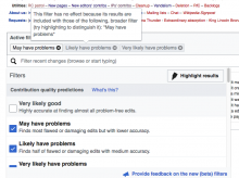
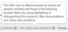
The screenshot shows the subset filter with a tooltip:

Screen Shot 2017-03-21 at 6.04.37 PM.png (566×756 px, 133 KB)

QA recommendation:Resolve