Page MenuHomePhabricator

Make translation dashboard layout responsive to adapt to small screens
Closed, ResolvedPublic

Assigned To
None
Authored By
Pginer-WMF
Feb 5 2017, 10:56 AM
Referenced Files
F9804418: Screen Shot 2017-09-25 at 9.26.49 AM.png
Sep 25 2017, 7:47 PM
F9804423: Screen Shot 2017-09-25 at 12.45.24 PM.png
Sep 25 2017, 7:47 PM
F9671976: cx-dashboars-small-width copy.png
Sep 20 2017, 2:16 PM
F6557909: cx-dashboard-reviewed.png
Mar 14 2017, 10:34 AM
F6557915: cx-dashboard-medium-width.png
Mar 14 2017, 10:34 AM
F6557922: cx-dashboars-small-width.png
Mar 14 2017, 10:34 AM
F5492301: cx-dashboars-small-width.png
Feb 5 2017, 10:56 AM
F5492296: cx-dashboard-full-width.png
Feb 5 2017, 10:56 AM

Description

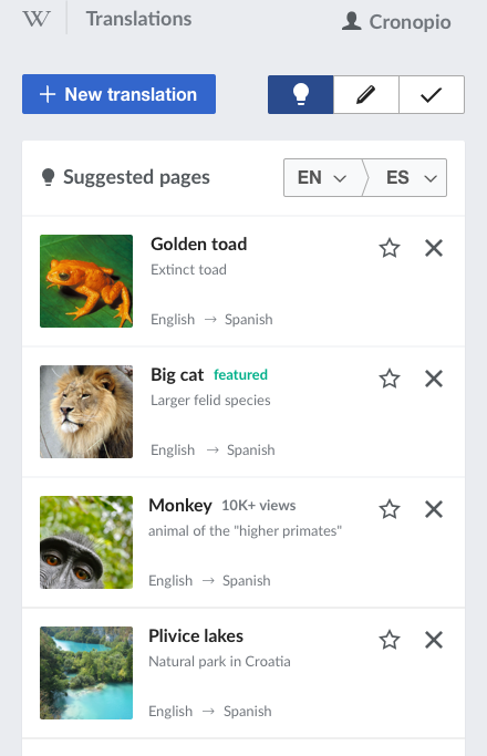
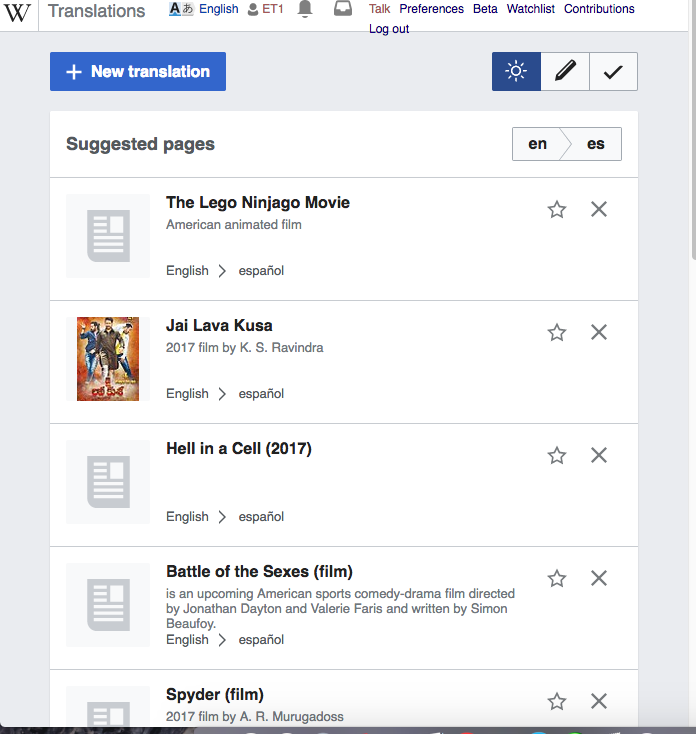
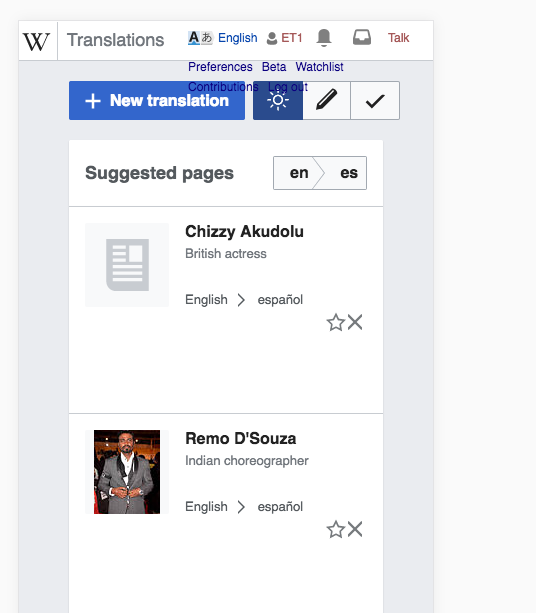
Content translation dashboard is not working optimally in smaller screens. A responsive approach would allow to adjust the layout based on the available screen size. The general idea is to reposition the sidebar components and make use of more compact selectors according to the space available.

WideMediumNarrow
cx-dashboard-reviewed.png (768×1 px, 165 KB)
cx-dashboard-medium-width.png (1×621 px, 159 KB)
cx-dashboars-small-width.png (1×440 px, 149 KB)
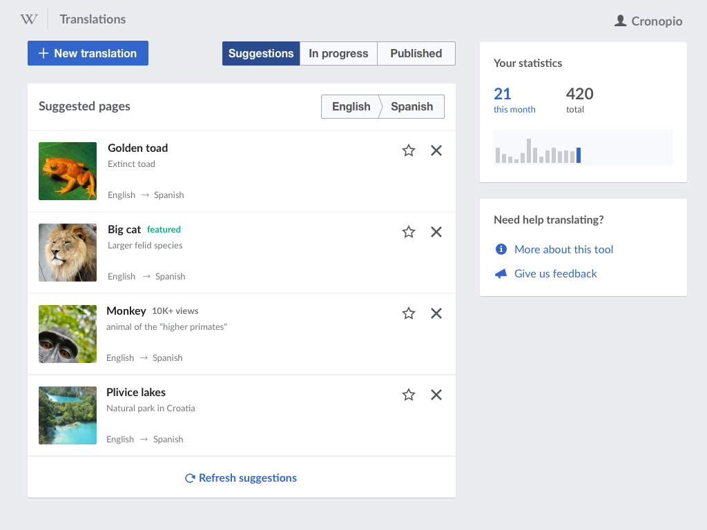
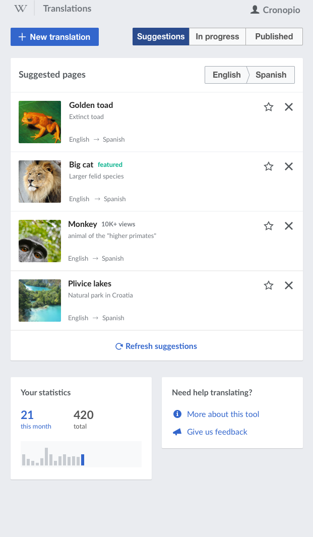
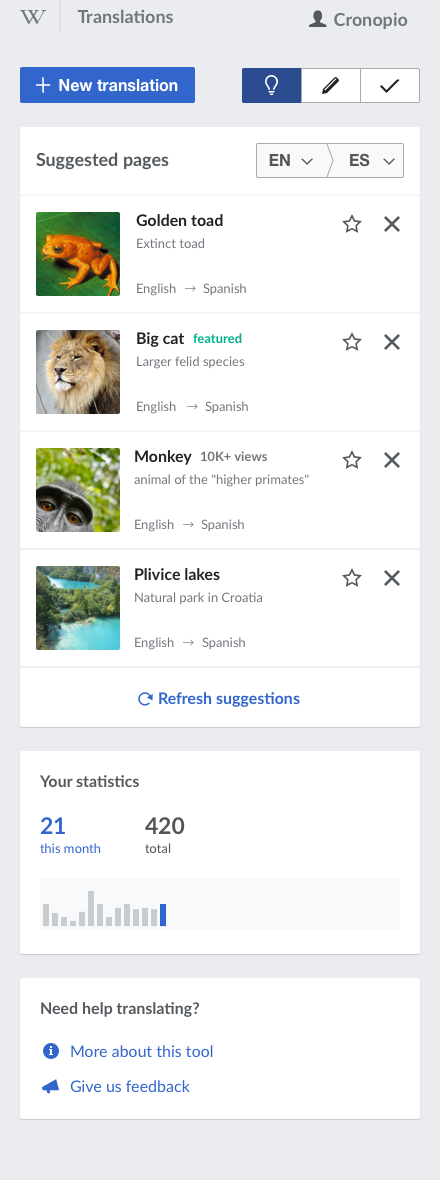
Stats and help shown as a sidebar. Selectors display the full text.Stats and help shown side by side as a card after the main list. Margins around the content reduced.Stats and help shown one after the other. Section and language selector presented in a compact way.

Some thoughts:

  • The specific break points need to be adjusted to make sure that the selectors do not break as they used to (T133256).
  • The compact version of the language selector uses the ISO codes, but a truncated version of the language can be used instead if we consider that there is enough room to show a significant part. Note that as part of the selection, the user will see the full name in the selector panel.

Mockups

Small width

cx-dashboars-small-width.png (1×440 px, 149 KB)

Medium width

cx-dashboard-medium-width.png (1×621 px, 159 KB)

Large width

cx-dashboard-reviewed.png (768×1 px, 165 KB)

Event Timeline

Change 376042 had a related patch set uploaded (by Petar.petkovic; owner: Petar.petkovic):
[mediawiki/extensions/ContentTranslation@master] Make CX dashboard responsive

https://gerrit.wikimedia.org/r/376042

The design has the language codes capitalized, but there is in fact a standard that defines the way language tags should be formatted. Some examples: en, en-US, zh-Hant. I would like to make sure that this has been considered.

The design has the language codes capitalized, but there is in fact a standard that defines the way language tags should be formatted. Some examples: en, en-US, zh-Hant. I would like to make sure that this has been considered.

Following the standard sounds good to me.

Change 376042 merged by jenkins-bot:
[mediawiki/extensions/ContentTranslation@master] Make CX dashboard responsive

https://gerrit.wikimedia.org/r/376042

Wouldn't it be better to show labels and icons in the wide version, that way users can become familiar with the meaning of the icons should they then go on to use a smaller screen size?

Wouldn't it be better to show labels and icons in the wide version, that way users can become familiar with the meaning of the icons should they then go on to use a smaller screen size?

I agree that it makes sense to help users to make the connection between the visual concepts and their meaning. However we cannot guarantee that a user reaching the small version has seen the larger one before. Keeping the connection across different sizes as you proposed is worth considering, but I think it may be more effective to do so on the small size version itself. For example, showing the icon next to the main list header on small sizes as I illustrated in the mockup below:

cx-dashboars-small-width copy.png (683×440 px, 125 KB)

Checked in cx-testing for small screens both desktop and mobile - the specs have been implemented

  • the reposition of the elements happen smoothly and the UI is fully funcitonal
  • as per @Nikerabbit ISO codes for languages are used as non-capitalized
  • the different picture is used - not the lightbulb.

Desktop view

Screen Shot 2017-09-25 at 12.45.24 PM.png (734×696 px, 115 KB)

Mobile view
Screen Shot 2017-09-25 at 9.26.49 AM.png (613×536 px, 66 KB)

However, there are some problems for mobile UI that need to be addressed separately, so T176663: Adjustments for mobile UI is filed.

The different picture is used - not the lightbulb.

Original idea was to use bright icon from OOjs UI icons, until T175006: Create an icon for suggestions: 'lightbulb' gets resolved.

However, there are some problems for mobile UI that need to be addressed separately, so T176663 is filed.

I have answered about this one on the ticket itself.