As a follow up to @Pginer-WMF notes
(1) The "Recent changes options" label and line around the old filters should be removed and replaced by a simple divider (horizontal line) at the bottom of the whole group of filters, as illustrated in https://www.mediawiki.org/wiki/Edit_Review_Improvements#/media/File:Recent-changes-step1-initial.png
(2) Hovering a tag should show the "hand" (pointer) cursor. Currently the text cursor is shown instead. Look at the the current prototype
(3) Tooltips for the tags should have a small delay. Currently they appear immediately.
(4) Tooltips currently have a disproportionate margin.
Note: The color of the font is also different
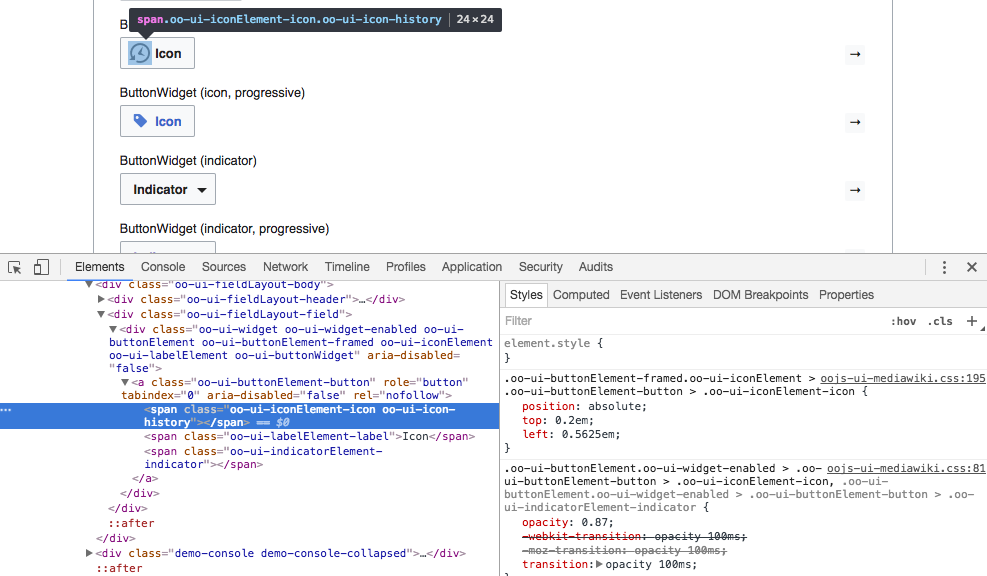
(5) The "Restore default filters" icon is bigger than expected. The icon in the prototype is 24x24 vs 26.25x26.25 in betalabs.
(6) Removing a tag by clicking the "X" icon should not result on the search bar getting focus or the panel being opened. Currently the panel gets opened when removing a tag.
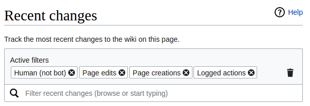
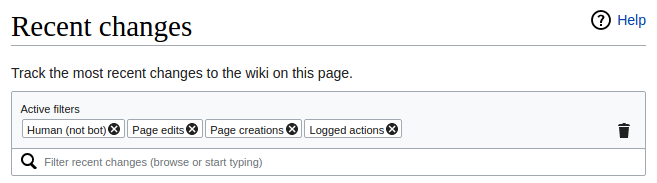
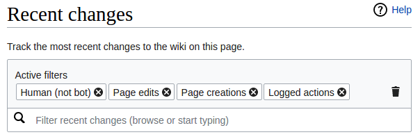
(7) Greyed-out tags are not using the right colors. Background should be #EAECF0 and text #72777D. More details in https://phabricator.wikimedia.org/F4680134