Page MenuHomePhabricator

MediaWiki theme: SelectFileWidget (with drop target): Align with WikimediaUI color palette and provide smoother UI pattern when dropping files
Closed, ResolvedPublic

Description

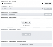
SelectFileWidget with drop target as of v0.19.1 is (https://gerrit.wikimedia.org/r/#/c/337534/ & https://gerrit.wikimedia.org/r/#/c/337540/ currently under way) the last widget using a color (#eee) not part of the WikimediaUI color palette M82.

v0.19.1proposed
T158027 SelectFileWidget to align with color palette _ OOjs UI Demos 2017-02-13.png (798×654 px, 92 KB)
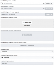
T158027 SelectFileWidget to align with color palette _after OOjs UI Demos 2017-02-13.png (587×661 px, 59 KB)
Video beforeafter

Expected solution:
Align SelectFileWidget with drop target to the color palette and to UX patterns elsewhere and finalize turning fixed color values into variables in MediaWiki theme.

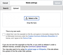
Another take of the widget in proposed action at the Media Upload dialog.
T158027 SelectFileWidget Media Upload Dialog VE - Wikipedia 2017-02-13.png (434×500 px, 56 KB)

Event Timeline

Restricted Application added a subscriber: Aklapper. · View Herald Transcript
Volker_E triaged this task as Medium priority.Feb 14 2017, 3:51 AM
Volker_E updated the task description. (Show Details)
Volker_E moved this task from Unsorted to OOUI on the UI-Standardization board.

Change 337542 had a related patch set uploaded (by VolkerE):
MediaWiki theme: SelectFileWidget drop target aligned to UX patterns

https://gerrit.wikimedia.org/r/337542

In the proposed solution the drop area is not greyed out, but a normal background similar to a TextInputWidget. On drop it turns light blue similar to :active menu item on a soft transition.
Feedback welcome!

The highlight works well.
My only concern was the area being less noticeable, but with the more realistic example (F5627908) seems it may still work.

@Pginer-WMF Thanks. I was a bit concerned about it as well, due to the button in the center, the distinct dashed border-style and somewhat similarity to other widgets like TextInputWidget, I'm pretty convinced it's sufficient. Let's revisit in case of opposing voices.

One minor thing, that we could consider, is if we gonna change the cursor (on desktop) on drop target :hover to pointer as clicking is bound to action of opening the upload file dialog and it might be clearer that there is an action bound when the cursor is set to pointer.

Change 337542 merged by jenkins-bot:
MediaWiki theme: SelectFileWidget drop target aligned to UX patterns

https://gerrit.wikimedia.org/r/337542

Volker_E moved this task from Reviewing to OOjs-UI-0.19.3 on the OOUI board.
Volker_E edited projects, added OOUI (OOjs-UI-0.19.3); removed OOUI.
Volker_E removed a project: Patch-For-Review.
Volker_E removed a subscriber: gerritbot.