Page MenuHomePhabricator

Adjust the visual style for cards
Closed, ResolvedPublic

Description

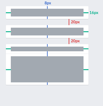
Currently the cards shown in the tools column of the Content Translation editor use a fake 3d shadow style that was deprecated.

current-cards.png (309×594 px, 19 KB)

Cards should be updated in the following aspects:

  • Remove the border and the fake shadow at the bottom.
  • Use a 1px shadow with 1px blur based on 15% opacity black color.
  • Adjust the spacing inside and outside the cards.

I created a code pen illustrating the intended style and mockups below with the spacing specification and the final expected result:

CX-translation-cards-spec.png (341×333 px, 7 KB)

CX-translation-cards.png (341×304 px, 12 KB)

Adjusting the grey color used as background is also needed but it was filled as a separate ticket (T158401)

Event Timeline

Change 340714 had a related patch set uploaded (by Santhosh):
[mediawiki/extensions/ContentTranslation] Adjust the visual style for cards

https://gerrit.wikimedia.org/r/340714

@Pginer-WMF We've been using a tad darker box-shadow as default in M101 and in OOjs UI (also to be found in for a while in WMUI Base), as 0.15 is too hard to imply the 3D impression in low-contrast environments or badly calibrated screens. It's been set to 0 2px 2px 0 rgba( 0, 0, 0, 0.25 );
Please provide feedback how to proceed: Follow the general way or if we need to think about special treatment here (that might be generalizable differently)?

This is not intended to be a special case. We should use the shadow parameters you proposed (I created an updated codepen for comparison).

I think I was following a previous approach we discussed with @Nirzar and I was not aware on it being updated. If this can use the standard the better. It would be good to document it in the styleguide, and maybe provide a style mixin named ".shadow" for developers not having to care on the specific values when creating new components.

I tried to adjust the patch myself but got scared by the Git warnings:

Screen Shot 2017-03-03 at 08.54.09.png (483×569 px, 86 KB)

I have updated the patch https://gerrit.wikimedia.org/r/340714 as per the above suggestion about box-shadow

@Pginer-WMF Thinking through it again, that might be a special case, as all our normal box-shadows are so far on white background. Anyways, increasing the contrast like outlined above seems the right direction.

To your point of using a mixin, I've went an even simpler way in WMUI Base (linked to the line).
When the base stylesheets are used, as dev you just have to write (in Less, CSS would be a tad different):

.cx-card {
    box-shadow: @box-shadow-dialog; // using the pre-defined Less variable for box-shadows across codebases
}

Currently there's no -card alias defined, but that is just a small request away.
Answering the Git problem per email.

Change 340714 merged by jenkins-bot:
[mediawiki/extensions/ContentTranslation] Adjust the visual style for cards

https://gerrit.wikimedia.org/r/340714

@Pginer-WMF Thinking through it again, that might be a special case, as all our normal box-shadows are so far on white background. Anyways, increasing the contrast like outlined above seems the right direction.

If I had to choose in isolation, I may go with something intermediate for this case. But I think it is totally fine to start with the standard and see how everything fits together.

With the current adjustments, I think the ticket can be closed.