Page MenuHomePhabricator

Show a message on the RC page introducing the new features
Closed, ResolvedPublic

Description

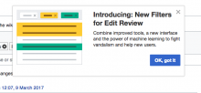
When a user who has opted in to the beta feature gets to the updated Recent Changes page for the first time, an introductory message is provided. This applies to: 1) new users who opt in, 2) users who previously opted in to the ORES beta, on the first time after beta release that they visit RC page, 3) everyone, should the beta become standard. This feature is particularly important for existing ORES users, who won't have explicitly seen information about the RC page features and may not connect the new filters with their previous ORES opt in.

  • The user dismisses the message by clicking the "OK, got it" button.
  • This message should not be shown to that user after that. Ideally, showing it only once for any wiki, but at a mimimum showing it no more than once per wiki (if the lack of cross-wiki settings makes the former too complex technically).
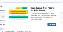
  • See a screenshot of the introductory message below.

introduce-the-filters.png (768×1 px, 267 KB)

  • The image used in the panel will be animated. A non-looping animated Gif for the animation is available at F5053416

The text for the notice should read as follows:

Introducing: New Filters for Edit Review (beta)
Combine improved tools, a new interface and the power of machine learning to fight vandalism and help new users.
Event Timeline

Catrope added a subscriber: Mattflaschen-WMF.

@Mattflaschen-WMF This seems like something that GuidedTour can do pretty easily, am I right?

@Mattflaschen-WMF This seems like something that GuidedTour can do pretty easily, am I right?

What a good idea :)

If we don't have a tour, at least we should provide a "know more" link on that pop-up message, linked to the quick tour. That would void the "okay, and now what? " effect.

If you add a definition of the steps ("windows" / where they point to on the screen) and the language, we can use Guided Tour fairly easily.

@SBisson Pointed out that GuidedTour is an extension, and our code is in core. So maybe we put the GuidedTour code in WikimediaEvents or somewhere?

@jmatazzoni has also expressed that he wants to have a multi-step tour (that is actually a tour) later, when the feature is launched more broadly.

@SBisson Pointed out that GuidedTour is an extension, and our code is in core. So maybe we put the GuidedTour code in WikimediaEvents or somewhere?

@jmatazzoni has also expressed that he wants to have a multi-step tour (that is actually a tour) later, when the feature is launched more broadly.

The BetaFeature is already in WikimediaMessages, so it can go there. We've done similar stuff using a user preference, IIRC. It should all be pretty straightforward (except the optional, "Ideally, showing it only once for any wiki"), assuming there's some flexibility in how the tour popup appears (so it looks like a tour popup).

@Pginer-WMF, what do you think about including a "Learn more" link to RC page help on the panel? Include in your design?

@Pginer-WMF, what do you think about including a "Learn more" link to RC page help on the panel? Include in your design?

If we think it is needed, I won't oppose adding it. However, I don't think it adds much value:

  • We want people to get to the feature, not away. Especially when they have not seen the new filters yet, I'd prefer them to view what we introduced and play with it and get contextual help rather than read a documentation page.
  • The page includes a "Help" menu for those interested in getting to the general documentation.
  • The filter panel includes more specific "what's this?" links on ORES-specific filters and help on the highlighting aspects which covers the big new aspects.

Overall, I'd encourage the in-the-tool learning experience rather than directing to the docs in the initial step.

Change 341860 had a related patch set uploaded (by Sbisson):
[mediawiki/extensions/WikimediaMessages] RC Filters: guided tour for beta feature

https://gerrit.wikimedia.org/r/341860

Do we want to message to close when the user clicks on the page, outside of it? If so, should it dismiss the message forever or come back next time until the user clicks "OK, got it"?

The BetaFeature is already in WikimediaMessages, so it can go there. We've done similar stuff using a user preference, IIRC. It should all be pretty straightforward (except the optional, "Ideally, showing it only once for any wiki"), assuming there's some flexibility in how the tour popup appears (so it looks like a tour popup).

I also mentioned looking like a standard tour popup on the patch. I'd prefer we stick to the design conventions except where there's a reason to depart. E.g. do we need to remove the X, change the font color?

Do we want to message to close when the user clicks on the page, outside of it? If so, should it dismiss the message forever or come back next time until the user clicks "OK, got it"?

Make them click on the button, I think—so we know they've seen it. (Otherwise they'll do what I do and just dismiss it without reading, then get annoyed when it keeps coming back.) Then dismiss forever.

@SBisson, please note that I've changed the text. In particular, I wanted to use the word "Introducing," to signal that we're telling them about something new.

Do we want to message to close when the user clicks on the page, outside of it? If so, should it dismiss the message forever or come back next time until the user clicks "OK, got it"?

Make them click on the button, I think—so we know they've seen it. (Otherwise they'll do what I do and just dismiss it without reading, then get annoyed when it keeps coming back.) Then dismiss forever.

I talked to James because I wasn't sure about my opinion here. He says we should also let them just click away to dismiss the message forever. He's probably right, and I'm fine with that. So let's go that way.

I've updated the text and allowed it to be dismissed by clicking anywhere on the screen (outside the popup).

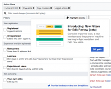
This is what it looks like with minimal styling (only to deal with the image)

Screen Shot 2017-03-09 at 07.07.17.png (285×614 px, 43 KB)

And with a bit more styling

Screen Shot 2017-03-09 at 07.07.56.png (337×664 px, 52 KB)

@SBisson, sorry I didn't think of this sooner, but this morning's meeting made me want to clarify something in this message, particularly for the existing ORES users who, because they get signed up for the beta automatically, will likely learn about it here for the first time.

And that something is, precisely, that NFFER is a beta feature. That's important to know, in case they want to go and turn it off. Anyway, the change is a small one. Can we please just add the parenthetical "(beta)" after the title. So the title will read:

Introducing: New Filters for Edit Review (beta)

Can we please just add the parenthetical "(beta)" after the title. So the title will read:

Done.

This is what it looks like with minimal styling (only to deal with the image)

Screen Shot 2017-03-09 at 07.07.17.png (285×614 px, 43 KB)

And with a bit more styling

Screen Shot 2017-03-09 at 07.07.56.png (337×664 px, 52 KB)

I don't see the difference between "a bit more styling" and all of the styling. I think the duplication between the "x" close button and the "Got it!" button is bad, and that it looks a bit nicer overall. I'll merge the patch with the full styling, and if we think that some of the rules are unnecessary or bad then we can remove them later.

Change 341860 merged by jenkins-bot:
[mediawiki/extensions/WikimediaMessages] RC Filters: guided tour for beta feature

https://gerrit.wikimedia.org/r/341860

I've tested this message on Beta, and it seems to be in English only.
This message may be the only message seen by some users who enabled the ORES beta and work on RCs, but who don't go to the VPs or other community boards. If that's not the case for the moment, i18n is needed.

I've tested this message on Beta, and it seems to be in English only.
This message may be the only message seen by some users who enabled the ORES beta and work on RCs, but who don't go to the VPs or other community boards. If that's not the case for the moment, i18n is needed.

This was merged only yesterday that's probably why it's still not translated.

Is there anyway we can help translation so it's available it all our target languages for launch?

I've tested this message on Beta, and it seems to be in English only.
This message may be the only message seen by some users who enabled the ORES beta and work on RCs, but who don't go to the VPs or other community boards. If that's not the case for the moment, i18n is needed.

This was merged only yesterday that's probably why it's still not translated.

I've checked this morning to have the "translation code" (the thing you have when you use uselang=qqx) and get nothing but the sentence in English. I don't manage to have the popup back. :/

Is there anyway we can help translation so it's available it all our target languages for launch?

Have one group on translatewiki with all new items translations would help a lot. But we are making changes on MediaWiki's core and on particular elements as well, so that's not possible. I plan to have a page somewhere with all translations units that need a review to avoid painful and time-loss search for translators.

I've created a new account to have the pop-up back and, my bad, it is already i18n-ed :

  • eri-rcfilters-tour-welcome-title
  • eri-rcfilters-tour-welcome-description

Sorry for the disturbing.

The message works as expected

  • displayed for ORES enabled users when they visit RC page
  • displayed for all user who has "Automatically enables all features new beta" checkbox checked ( "New filters for review edit" will be displayed automatically if the box is checked)
  • the message is dismissed by clicking on 'Ok, got it' or just outside the popup
  • the message is displayed again only if a user disables and re-enables the "New filters for review edit" feature

@jmatazzoni - please review the following

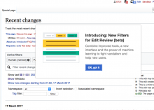
  • There are small deviations in the final image from the image used in the description: the placement of 'Ok, got it' is different - it's on the right instead of the left; the order of colors (from left to right) differs in the original image.

Screen Shot 2017-03-16 at 3.27.38 PM.png (672×826 px, 144 KB)

  • "Automatically enables all features new beta" setting, when checked and saved, will immediately activate the "New filters for review edit" feature. This is unusual behavior - other beta features won't be activated upon selecting "Automatically enables all features new beta" setting.

QA recommendation: Resolve.

Moving this back to In Dev. @SBisson, please align the Got It button to the left of its column, as in the design at top (and below). If that is hard, for some reason, then we can let it go.

introduce-the-filters.png (768×1 px, 267 KB)

Moving this back to In Dev. @SBisson, please align the Got It button to the left of its column, as in the design at top (and below). If that is hard, for some reason, then we can let it go.

That's not where that button normally is in GuidedTour dialogs, and Matt was already complaining about the (in his view) excessive overrides of GT's default style.

the order of colors (from left to right) differs in the original image.

Screen Shot 2017-03-16 at 3.27.38 PM.png (672×826 px, 144 KB)

That seems to have happened because the image Pau gave us is inconsistent with the mockup he made earlier.

Moving this back to In Dev. @SBisson, please align the Got It button to the left of its column, as in the design at top (and below). If that is hard, for some reason, then we can let it go.

That's not where that button normally is in GuidedTour dialogs, and Matt was already complaining about the (in his view) excessive overrides of GT's default style.

There is a more philosophical question here: is this a one step guided tour or is it an introduction dialog we are implementing by reusing those guided tour pieces that meet the dialog needs?

Guided tours take advantage of the back (left) and forward (right) associations with position. However, for a single step (or the introductory one) that may not be needed. In practical terms, I think that users will be able to find their way to close the panel in either position (although aligning it to the left in this case makes the layout more clean in my opinion).

In any case, we should also have more clear guidelines about dialog design, and I'll bring the point as the design styleguide topics are discussed.

the order of colors (from left to right) differs in the original image.

Screen Shot 2017-03-16 at 3.27.38 PM.png (672×826 px, 144 KB)

That seems to have happened because the image Pau gave us is inconsistent with the mockup he made earlier.

The changes were intentional. As I was creating the animated version, I realised that it worked better when the color of tags and the color of rows appear following the same sequence. So using F5053416 (as it's currently done) is ok. I didn't thought that it was needed to update previous mockups, but @Etonkovidova did a very good job in catching the differences!

Change 343269 had a related patch set uploaded (by Sbisson):
[mediawiki/extensions/WikimediaMessages] RCFilters tour: align Got It button to the left

https://gerrit.wikimedia.org/r/343269

Change 343269 merged by jenkins-bot:
[mediawiki/extensions/WikimediaMessages] RCFilters tour: align Got It button to the left

https://gerrit.wikimedia.org/r/343269

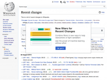
The correction of the button placement is aligned to the left. All functionality is in place.

Screen Shot 2017-03-17 at 2.50.23 PM.png (606×848 px, 113 KB)

QA recommendation: Resolve.