| Subject | Repo | Branch | Lines +/- | |
|---|---|---|---|---|
| ComboBoxInputWidget: Use icon instead of indicator for dropdown button | oojs/ui | master | +11 -4 |
Details
Details
| Status | Subtype | Assigned | Task | ||
|---|---|---|---|---|---|
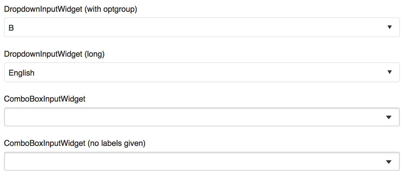
| Open | None | T150071 Why do we allow indicator-only buttons? | |||
| Open | None | T159204 OO.ui.ComboBoxInputWidget: Use icon instead of indicator for the dropdown button |
Event Timeline
Comment Actions
Change 340282 had a related patch set uploaded (by Prtksxna; owner: Prtksxna):
ComboBoxInputWidget: Use icon instead of indicator for dropdown button
Comment Actions
In the mediawiki and apex the proportions of the down triangle as an indicator and as an icon are different.
| Icon | Indicator | |
|---|---|---|
| Mediawiki | ||
| Apex | ||
In both themes, the icons are the same but the indicators differ. Is this intentional?
Currently the patch does this:
| Mediawiki | Apex | |
|---|---|---|
| Without patch (indicator) | 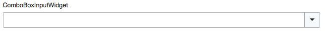 | 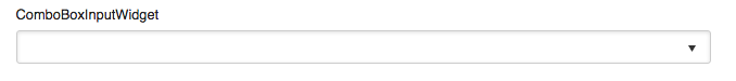 |
| With patch (icon) | ||
The increased width of the button in Mediawiki is unintentional.
Comment Actions
Well, it was intentional for the MW indicator to be wider to fit in with the overall theme, but it wasn't a problem because you were only ever meant to use the indicator for this kind of control. I guess the Apex icon should be made narrower.
Comment Actions
Change 340282 abandoned by Prtksxna:
ComboBoxInputWidget: Use icon instead of indicator for dropdown button