Problem:
iPhone 6 Plus is considered a tablet.
Expected behavior:
It's a phone.
Root cause:
In resources/mobile.browser/browser.js:
isWideScreen: memoize(function() {
    var val = parseInt(mw.config.get('wgMFDeviceWidthTablet'), 10);
    return window.innerWidth >= val || window.innerHeight >= val;
})
wgMFDeviceWidthTablet is '720px'
The height of iPhone 6 Plus is 736.
Since we check both portrait and landscape mode, the threshold should be the long edge instead of width. Adding one more config variable called wgMFDeviceLongEdgeTablet or wgMFDeviceHeightTablet might make sense. Or just derive from wgMFDeviceWidthTablet * 4/3 (aspect ratio).
According to http://mydevice.io/devices/, 800px looks like a good threshold for the long edge measure.
This issue is discovered in https://bugs.chromium.org/p/chromium/issues/detail?id=647667#c14 because section collapsing is determined by whether it's a phone or tablet.
Acceptance criteria
- From now on we should only check the width of the device.
isWideScreen: memoize(function() {
    var val = parseInt(mw.config.get('wgMFDeviceWidthTablet'), 10);
    return window.innerWidth >= val;
})- Add some documentation explaining that we do not check the height to avoid situations where tablet and mobile modes differ.
- Ensure any JS specific media queries match the definition of "widescreen" ie. if isWideScreen is false AND media rules apply the UI should continue to be functional.
QA steps
Use an iPhone XS in browser stack in portrait mode.
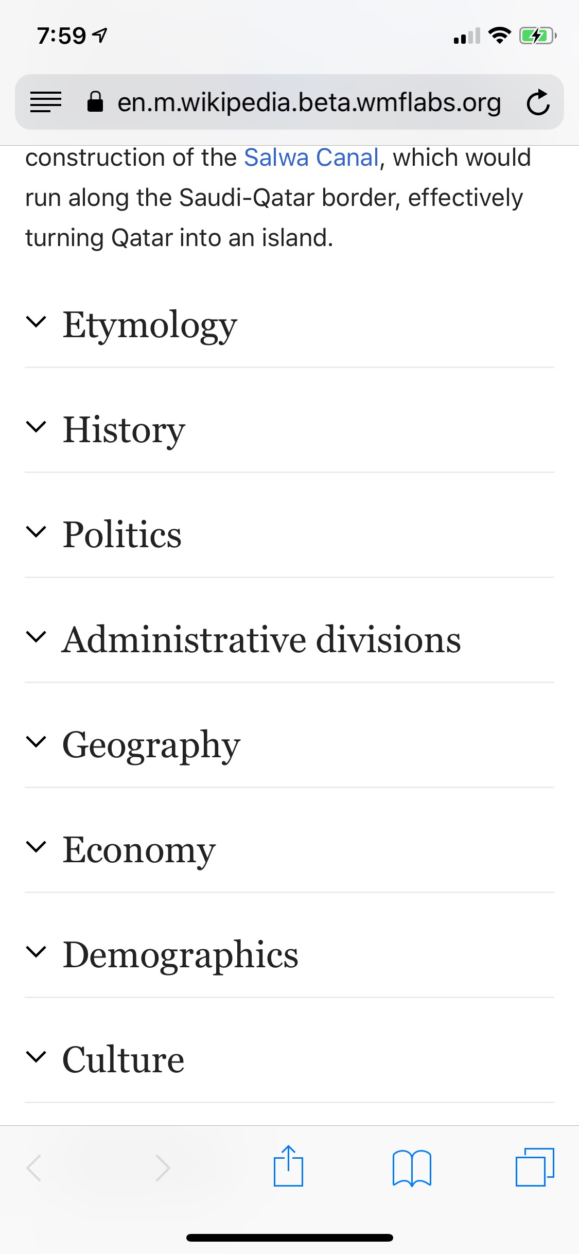
Load an article e.g. https://en.m.wikipedia.beta.wmflabs.org/wiki/Qatar
Verify that the sections are collapsed by default
Switch to landscape
Refresh the page
Verify the sections are expanded by default
QA Results
| AC | Status | Details |
| 1 | ✅ | T159475#5083960 |
| 2 | ✅ | T159475#5083960 |