Page MenuHomePhabricator

[minor] RC filters - the highlight color selection box is not fully displayed at the bottom of viewport
Closed, ResolvedPublic

Description

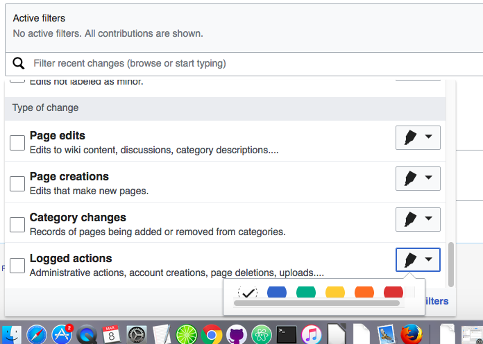
  1. Select filters that give very few results or no results.
  2. With the result area small, the drop-down filter area will reach to the very bottom of the page.
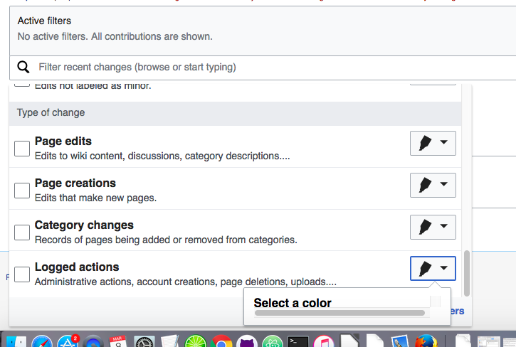
  3. Clicking at the highlight selection box placed at the bottom will display a limited view:

Screen Shot 2017-03-08 at 11.14.16 AM.png (488×725 px, 101 KB)

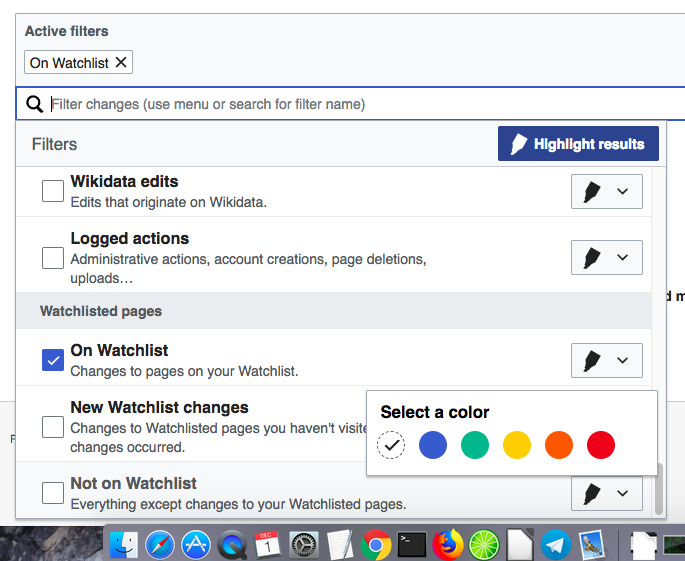
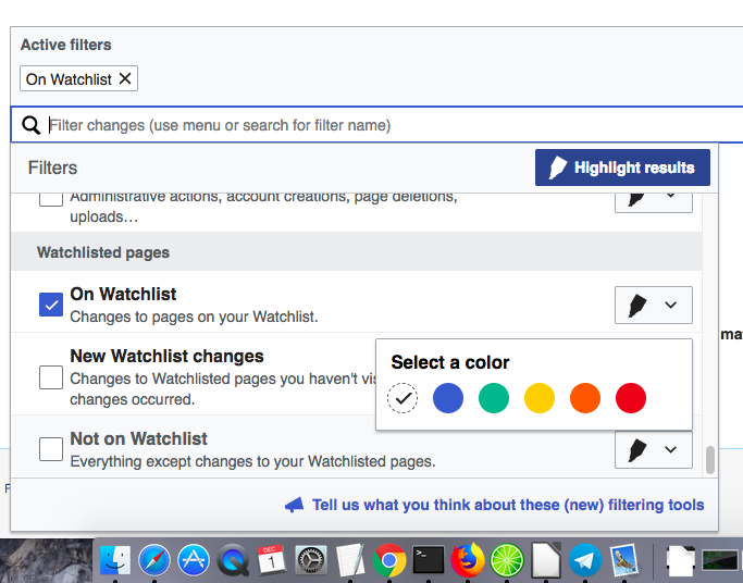
  1. However, the selection of a color can be made - some vertical scrolling is present (though a scrollbar is not presented) when the highlighting box will be clicked.

Screen Shot 2017-03-08 at 11.14.01 AM.png (496×696 px, 115 KB)

Event Timeline

Normally max-height: 70vh ensures that this can't happen, but only because the "Active filters" widget is scrolled to the top when the filter list opens. When there are no results, the page can't be scrolled, so this doesn't happen, and the max-height rule does not prevent the popup from extending to the bottom of the screen.

One way to address this would be to fix T158934: Automatically change popup direction if there is no space, which would make the popup automatically pop up instead of down when there's not enough space below. We could also look into having the popup keep away from the edge even in these unscrollable situations, but that would probably require either making ClippableElement's 7-pixel buffer configurable, or a dirty hack like making the footer overflow: visible; and adding a spacer with height: 30vh to the bottom of it.

Petar.petkovic lowered the priority of this task from High to Low.Nov 28 2017, 4:24 PM
Petar.petkovic subscribed.

Now that the patch for T158934: Automatically change popup direction if there is no space is approved, I suggest we wait until OOjs UI v0.24.3 is used on MediaWiki and move this ticket to QA for recheck.

OOjs UI is updated to v0.24.3, and the popup now displays above the button when there is no room below.

Moving to QA for @Etonkovidova to check.

EDIT: You can check my observations commented on the other ticket - T158934#3798565.

Checked in betalabs. Now we have some extra space at the end of the drop-down filter menu - for Advanced filters - it's a little bit tricky to check if the fix does work.
I checked it by removing div for Advanced filters and the feedback:

Screen Shot 2017-12-01 at 11.54.08 AM.png (561×685 px, 139 KB)

When only the feedback is present:

Screen Shot 2017-12-01 at 11.44.05 AM.png (536×683 px, 136 KB)