Page MenuHomePhabricator

Make revision slider pointers more user-friendly
Closed, ResolvedPublic

Description

Motivation
Currently, pointers of the revision slider can be positioned anywhere. If they are put behind the other pointer, their change color and flip, so that the left pointer always indicates the left revision and the right pointer always indicates the right revision. In user tests, this has turned out to be confusing.

Task
Change the look of the pointers as follows:

slider_buttons.png (249×581 px, 5 KB)

Spec

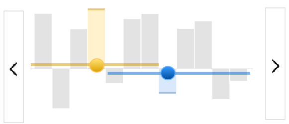
  • Revisions are changed by moving pointers (round in the mock) on sliders (lines in the mock)
    • Pointers can be moved by Drag and Drop
    • Pointers can be moved by clicking on the slider
    • Pointers cannot be moved further than where the other pointer is. This means that the yellow slider does not extend to- or beyond the blue pointer to the right, and that the blue slider does not extend to- or beyond the yellow pointer on the left. This means yellow and blue pointers cant be switched, the blue pointer is always the most right, the yellow always the most left one.
  • Clicking on the bars does not move the slider anymore, except if bars are overlayed by the slider (see next point)
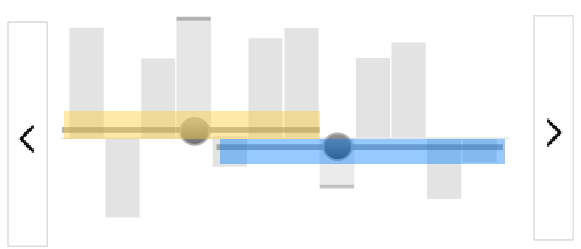
  • The area of the slider that reacts to clicking (and thus moves the pointer) can be larger then the line itself; The blue slider’s click-sensitive area can extend to the bottom for 10 more pixel, the click sensitive area for the yellow slider can extend to the top 10 more pixel. For the click sensitive area see the following mock, where these arease are highlighted:

image.png (249×581 px, 8 KB)

Mouse behaviour:

  • When hovering over the click sensitive area, a "click mouse"
  • When hovering over the pointers, a "drag mouse"
  • When hovering over the bars outside of the click sensitve area, no changed mouse

Deployment details
Only deploy the change for users who use the revisionslider as a beta feature. This does not include any wikis where the revisionslider is a default feature, even if users originally turned it on as a beta feature.

Event Timeline

QEDK renamed this task from Make revision slider pointers more understandable to Make revision slider pointers more user-friendly.EditedMar 14 2017, 2:27 PM
QEDK updated the task description. (Show Details)
QEDK subscribed.

I agree, personally I used it for a while and while I certainly liked it, this ticked me off at times and when I just started out using it, it was actually pretty awful, since I could only tinker around to grab its proper usage.

Regarding edits: Make title easier to get and some copy edit here and there.

Lea_WMDE updated the task description. (Show Details)
Lea_WMDE changed the task status from Open to Stalled.Mar 15 2017, 6:25 PM

Still testing the feature...

Lea_WMDE changed the task status from Stalled to Open.Mar 21 2017, 9:08 PM
Lea_WMDE moved this task from Proposed to Todo on the WMDE-TechWish board.
Lea_WMDE updated the task description. (Show Details)

Change 346135 had a related patch set uploaded (by WMDE-Fisch):
[mediawiki/extensions/RevisionSlider@master] [WIP] Introduce alternate SliderView

https://gerrit.wikimedia.org/r/346135

After playing around a bit with the new version, I generally like the new design but at least for me it has one big issue: the click-area for the bars is now much smaller which makes it hard to find the correct spot to click for moving the pointers. Especially for the revisions that are in between the two pointers this is hard because there are now two tiny click-areas for moving the sliders and it's hard to get the correct one.
I can't remember exactly anymore, what was the orginal issue with just keeping the whole bars clickable? @Lea_WMDE @Jan_Dittrich @Bmueller

I can't remember exactly anymore, what was the orginal issue with just keeping the whole bars clickable?

My reasoning was along the line of:

  1. Sliders use to have a not-so-big-space you need to hit to move by click – and it seems to work well in most interfaces.
  2. Making everything clickable would possibly weaken that we use a slider paradigm but highlight a non-standard approach to the UI
  3. Also, by keeping the bars/revision area clickable we can easily provide reactions on tap on tablets and phones to show the tooltips instead of having strange workarounds for not having hover on touch devices.

@Tobi_WMDE_SW I share the same concern, but the WMDE-Design team has already planned to test the current click area.
We omitted the ability to click the whole bar, because of the difficult space between the two pointers: If bars were clickable, in this area clicking above the line would still move the upper pointer and the clicking below the line the lower pointer, which may or may not be intuitive.

Change 346135 merged by jenkins-bot:
[mediawiki/extensions/RevisionSlider@master] Introduce alternate SliderView

https://gerrit.wikimedia.org/r/346135

Change 346966 had a related patch set uploaded (by WMDE-Fisch):
[operations/mediawiki-config@master] Enable alternate RevisionSlider slider on beta

https://gerrit.wikimedia.org/r/346966

Change 346966 merged by jenkins-bot:
[operations/mediawiki-config@master] Enable alternate RevisionSlider slider on beta

https://gerrit.wikimedia.org/r/346966

Change 347583 had a related patch set uploaded (by Addshore):
[operations/mediawiki-config@master] Enable alternate RevSlider slider on group0

https://gerrit.wikimedia.org/r/347583

Change 347583 merged by jenkins-bot:
[operations/mediawiki-config@master] Enable alternate RevSlider slider on group0

https://gerrit.wikimedia.org/r/347583

Mentioned in SAL (#wikimedia-operations) [2017-04-11T22:22:46Z] <addshore@tin> Synchronized wmf-config/InitialiseSettings.php: [[gerrit:347583|Enable alternate RevSlider slider on group0 T160410]] (duration: 00m 45s)

Mentioned in SAL (#wikimedia-operations) [2017-04-11T22:22:46Z] <addshore@tin> Synchronized wmf-config/InitialiseSettings.php: [[gerrit:347583|Enable alternate RevSlider slider on group0 T160410]] (duration: 00m 45s)

Now deployed on group0 (testwikis)