Page MenuHomePhabricator

Add 'View Newest Changes' option into the Integrated Filters
Closed, ResolvedPublic8 Estimated Story Points

Description

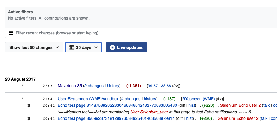
When users start reviewing recent changes new contributions are generated. Currently pages such as Recent Changes provide a "Show new changes starting from [date and time the page was loaded]" link that loads the new changes only (see F6006902 for an example). However, that functionality is not very clearly communicated and does not anticipate whether there are new changes to display.

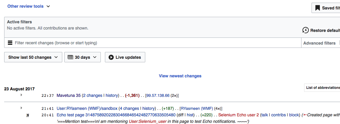
We can provide the access to the new changes when it is relevant instead. This prototype illustrates the idea. More details are provided below:

view-newest.png (582×846 px, 213 KB)
RC-update-completed.png (582×846 px, 159 KB)
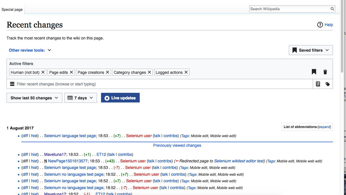
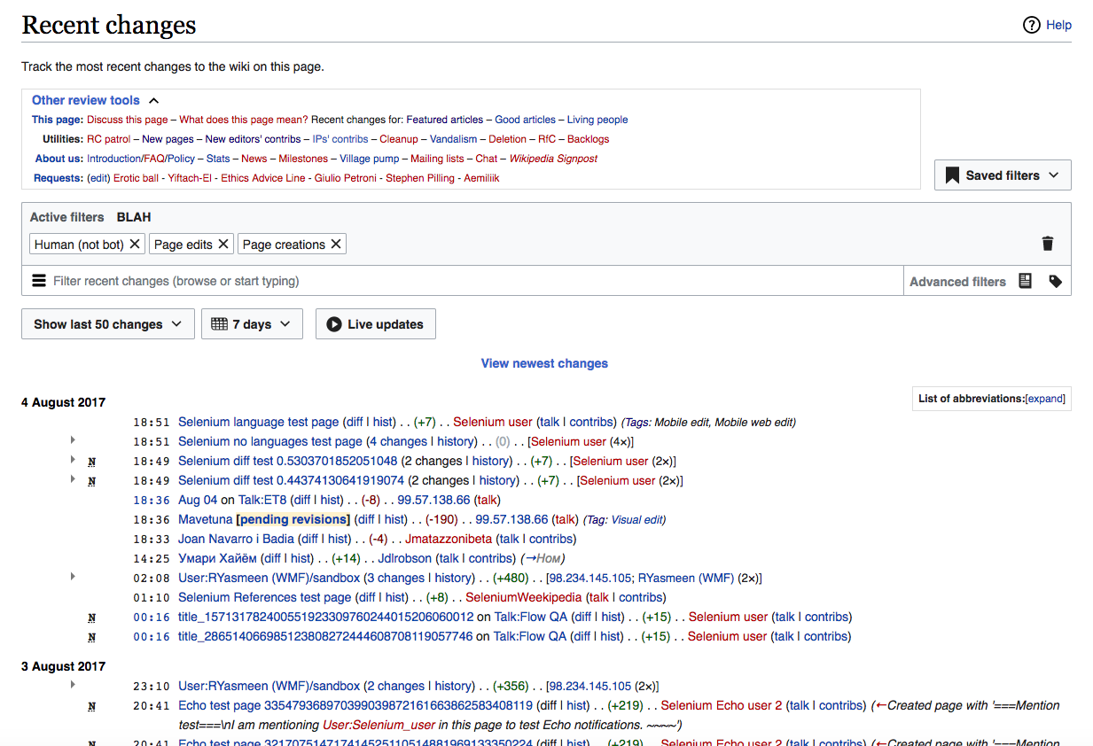
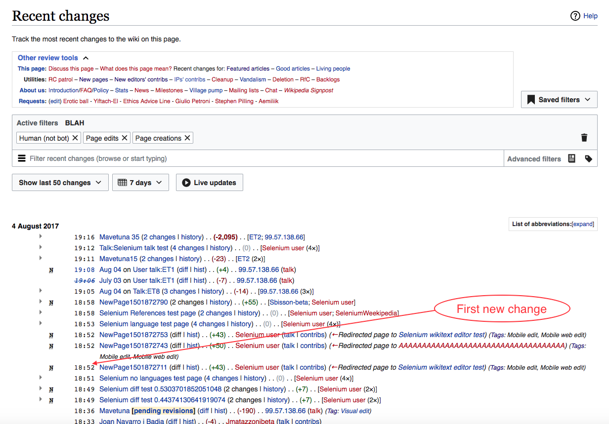
  • When the user is viewing the most recent set of contributions, if there are new contributions that have been produced since the user got the list, a "View newest changes" link is displayed
    • The indicator will have the required space reserved. In this way, showing it won't push down the list. Otherwise, the jumping of content could disturb users when reviewing.
    • The link will appear with a transition to integrate it gradually into the list.
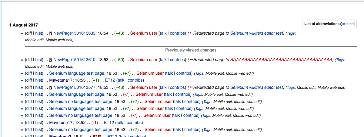
  • When the user clicks on "View newest changes" the list will be updated to include the new changes, with a separator that identifies when the previous ones begin.
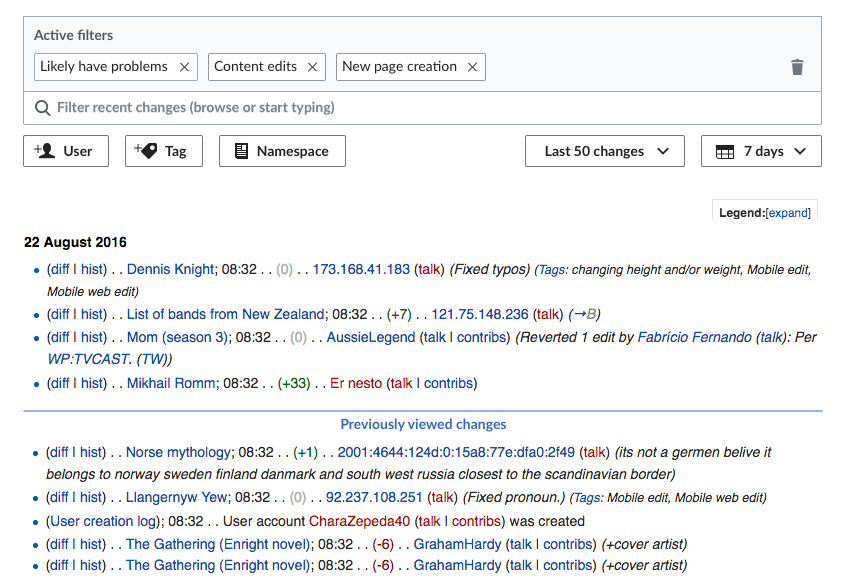
    • The separator will be called "Previously viewed changes."
    • Only one "Previously viewed changes." separator will be displayed at a time. I.e., we don't have to keep track of all the places where the user asked for more changes. If, after new changes have arrived, the user clicks View Newest Changes a second time, the existing separator will disappear and reappear in its new position.
    • Hovering the separator will turn it grey (base30: #72777d) , and clicking on it will make it disappear.
  • The system will load changes up to the number of changes selected by the user in the "Show x" (number of changes) control. E.g., if that is set to 100, then 100 new changes will load.
  • The new changes will start from the most recent change and count back X number of changes. I.e., they are the "Newest" changes.
  • When the user has chosen to view changes in "Oldest first" mode, the View Newest Changes link will not be displayed (because, theoretically, it is at the very bottom of the queue). [moved to T172240]
  • Similarly, if a user in Oldest First mode gets to the "last" page in the queue (i.e., the one with the newest results), View Newest Changes is not shown. (Also, the "Newer" button is grayed out—and it stays grayed out. We do not offer the user the option to keep paging in to the future in Oldest First mode.) [moved to T172240]
  • View Newest Changes appears only when the user is on the top page of results. If the user has used the "Older x >" button to load a previous screenful of results, View Newest Changes does not appear on that page. [moved to T163429]

Interaction with Live Update

  • Live Update (T167743 ) and View Newest Changes are incompatible. When Live Update is active, the View Newest Changes link is not displayed.
    • If Live Update is inactive, and the user clicks to activate Live Update, then the View Newest Changes link should disappear until Live Update is turned off.
  • The Previously Viewed Changes separator is displayed only in combination with and after the user has clicked View Newest changes.

Event Timeline

There are a very large number of changes, so older changes are hidden. Show Older Changes
jmatazzoni subscribed.

@Pginer-WMF I have some questions about how this will work:

Question #1 Say the user has selected to see 100 changes, so up to 100 changes will load at a time if the Newest Changes feature is clicked. If there are fewer than 100 changes waiting to be displayed, then the "Old Changes" line/indicator make sense and is useful. But if there are more than 100 changes available to display, the system will show only the newest 100. Which means that a gap—of perhaps many thousand edits—would exist between the previous 100 displayed and the new 100 that get loaded. But the "Old Changes" line as designed now would seem to indicate that the user was looking at an unbroken list. It seems to me that the obvious solution is to not show the Old Changes demarkation in cases where the available changes are greater than the number displayed, but to simply load the new 100 and say so long to the old. This is basically what happens now. (The alternative is to somehow indicate the gap, but I think that could get a little complicated and isn't worth it...).

Question #2: In cases where the available new changes are fewer than the number of changes the user wants to show per page load (so that the "Old changes" demarcation makes sense), we need a spec that will allow the new and old changes to exist on the page. I.e., in our example, the user is loading up to 100 changes with each refresh. So, if we want to show the new and old changes together, then we have to do one of two things: 1) either load fewer than 100 at a time, so as to make room on the page for a small set of old changes, or 2) allow the page to show more than 100 changes. E.g., we could show 90 new changes and 10 old ones (for a page total of 100), or we could show 100 new changes and 10 old ones (for a page total of 110). The latter makes more sense to me, but either way we need to specify what we want.

@Pginer-WMF I have some questions about how this will work:
Question #1 Say the user has selected to see 100 changes, so up to 100 changes will load at a time if the Newest Changes feature is clicked...

In your example, for cases where there are 100 or more new changes available to display, the "old changes" separator will not be visible after the user clicks on "view new changes". In the case where the user can move through the larger list of results using navigation controls (T163429), the user can move though more pages of results reaching a page where new results end and old results begin, and the separator will be there.

Question #2: In cases where the available new changes are fewer than the number of changes the user wants to show per page load...

In your example, if the new changes are less than 100, we'll display all of the new changes plus the number of old changes we need to reach a total of 100 results. For example, if there are 60 new changes available to display, when you click on "show new changes" you will see a page with the 60 new changes and 40 old changes (with a separator between both groups).

I'm not sure I understand this question. If we are thinking on the scenario where the new changes are less than the page size, I'm not sure why we need to figure out how to make room for having new and old changes.

Two refinements:

  1. "Previously viewed" I think we should rename "Old changes" to "Previously viewed changes." In the first place, they're not really "Old." But the other thing I'm thinking about is that I don't want to suggest in any way that there is continuity between the newly loaded changes and the previously loaded changes. In any case, it's just accurate: what we can say for sure about the changes is that they were previously viewed.
  2. Show continuity: What I was trying to get at above (very confusingly, if I do say so myself) is this: on busy wikis, like en.wiki, you will NEVER see the "Previously viewed" indicator—unless you page backwards, at which point it would be at the top of the page. If we think there is value in demarcating the break, then I think we should ensure that it is visible when the page reloads. We'd do this by always showing the number selected +3 or +5. E.g., if the user has selected to see 100 changes, when you click View newest changes," you'll see those 100, the dividing line, and three more results.

@Pginer-WMF, what do you think of these 2 ideas? Also, please update the images above with the new language, so we don't confuse the developers.

on busy wikis, like en.wiki, you will NEVER see the "Previously viewed" indicator

Well, not unless you either click "view newest" reasonably quickly (I don't think the edit rate is even as high as 100 per minute, or even 50 per minute), or you have a restrictive set of filters (e.g. edits by unregistered users in the Wikipedia talk namespace, there are about a dozen of these per day on enwiki). But the general point stands that it's very easy to end up in a situation where there are more than 100 (or even 50, which is the default result size right now) newer results on a busy wiki.

—unless you page backwards, at which point it would be at the top of the page. If we think there is value in demarcating the break, then I think we should ensure that it is visible when the page reloads. We'd do this by always showing the number selected +3 or +5. E.g., if the user has selected to see 100 changes, when you click View newest changes," you'll see those 100, the dividing line, and three more results.

I don't think this is necessarily true: the number of new entries could be more than 100, or much more. If I open the RC page, go out for lunch, come back an hour later, and click "View newest", there will probably be somewhere between 1000 and 2000 new edits during that hour. If would be inaccurate to draw the dividing line after 100 edits in this case.

However, if you want the user to be able to find the dividing line by paging backwards (i.e. clicking "Older 100") repeatedly, it'd be reasonably easy to remember where that line should be placed and make it appear in the right place. (This is maybe not that useful for the 1000+ new edits case, but it could be useful if the number of new edits is something like 130.)

@Pginer-WMF, what do you think of these 2 ideas? Also, please update the images above with the new language, so we don't confuse the developers.

That's OK, the new text is already highlighted in the task description anyway, we can handle that :)

  1. "Previously viewed" I think we should rename "Old changes" to "Previously viewed changes." In the first place, they're not really "Old." But the other thing I'm thinking about is that I don't want to suggest in any way that there is continuity between the newly loaded changes and the previously loaded changes. In any case, it's just accurate: what we can say for sure about the changes is that they were previously viewed.

"Reviewed" is a tricky term. "Previously reviewed" can be misleading if the user interprets that those edits were actually reviewed by other users. Would "Previous changes" or "Previously shown" work instead?

"Old" seemed a natural contrast to "new" for users to connect both concepts. Would "older changes" make it more relative to avoid not-so-old changes to be misclassified as just "old"?

  1. Show continuity: What I was trying to get at above (very confusingly, if I do say so myself) is this: on busy wikis, like en.wiki, you will NEVER see the "Previously viewed" indicator—unless you page backwards, at which point it would be at the top of the page. If we think there is value in demarcating the break, then I think we should ensure that it is visible when the page reloads. We'd do this by always showing the number selected +3 or +5. E.g., if the user has selected to see 100 changes, when you click View newest changes," you'll see those 100, the dividing line, and three more results.

If you are proposing that in the specific case where there are just as many new changes as they fit in a page, we can exceptionally extend the page size to include 3 of the older changes in order to provide context, that sounds good but seems to optimise for a very specific scenario (i.e., getting exactly 100 new changes, in your example).

For me the important part is what @Catrope described as "the user to be able to find the dividing line by paging backwards". That is, if you get 150 new changes, you should be able to review the 100 most recent ones in the first page (with no separator), and move to the next page to see the line in the middle of the list in order to know where to stop reviewing.

Having thought about this more, I'm withdrawing the suggestion that we show where the dividing line was between old and new results on the first page. THE REASON being that we now have pagination. So, in the event there were 1,000 results between the old 100 and the new 100, that dividing line will logically be 10 pages back. So in the paginated world, it would be confusing to show it on page one and on page eleven. We should place it only where it falls naturally in the queue. Sorry to confuse things.

The second point has to do with what we call the dividing line. For the record, I suggested "Previously viewed," not "Previously reviewed," as in Pau's note. To me "View newest" and "Previously viewed" or "Previously viewed changes" work well together. But if prefer "Previously seen" I guess that would be fine. "Previously shown" is...I don't know; it feels odd—shown by whom?

@Pginer-WMF, pease update the graphic and Description with the new language. And also please fix the link language in first screenshot to "View newest changes" instead of "View new." Thanks.

The second point has to do with what we call the dividing line. For the record, I suggested "Previously viewed," not "Previously reviewed," as in Pau's note. To me "View newest" and "Previously viewed" or "Previously viewed changes" work well together.

You are right, I misread it. "Previously viewed changes" works for me. I updated the new prototype to allow checking it in motion.

Hovering the separator will turn it grey (base30: #72777d) , and clicking on it will make it disappear.

Is there anything productive about this specific behaviour that I'm not seeing? If not I would suggest leaving the separator completely inert to minimize distraction.

Hovering the separator will turn it grey (base30: #72777d) , and clicking on it will make it disappear.

Is there anything productive about this specific behaviour that I'm not seeing? If not I would suggest leaving the separator completely inert to minimize distraction.

There are two parts to this:

  • Being able to remove the mark is intended to provide a way back to the default state. That is, cleaning a mark when it is no longer needed. While it does not harm to have it there, some users may feel the need to clean the transient mark once it is no longer useful for them to avoid splitting the list arbitrarily.
  • Making the mark grey on hover is intended to anticipate that clicking on it will remove it. It is just a lightweight way to align with the user intent and reduce the potential surprise of the outcome once users click on it.

Overall, this is not the core part of the functionality and I'd be ok in postpone it until our observations confirm the above behaviour, but I don't expect user distraction being caused by it.

Change 366861 had a related patch set uploaded (by Sbisson; owner: Sbisson):
[mediawiki/core@master] [WIP] RCFilters: show new changes

https://gerrit.wikimedia.org/r/366861

After reading @SBisson's patch (linked above), testing it, and hearing him talk about it, I have two questions for @Pginer-WMF and @jmatazzoni:

First, how does this feature interact with the "live update" button exactly? The way Stephane implemented it is as follows:

  • If the "Live update" button is enabled (i.e. blue and pulsating):
    • The software periodically (every few seconds) checks for new changes
    • When a new change is detected, the "View newest changes" link appears, and we stop checking
    • When the user clicks that link, the new changes are loaded, and we start checking for new changes again
  • If the "Live update" button is disabled (i.e. white and not pulsating)
    • Nothing happens

The way I thought it would work is:

  • If the "Live update" button is enabled (i.e. blue and pulsating):
    • The software periodically checks for new changes
    • Any new changes that arrive are shown immediately (T167743)
  • If the "Live update" button is disabled (i.e. white and not pulsating)
    • The software periodically checks for new changes
    • When a new change is detected, the "View newest changes" link appears, and we stop checking
    • When the user clicks that link, the new changes are loaded, and we start checking for new changes again

Which one is right?

Second, Stephane made a good point when talking about this feature in the daily meeting this morning: how do we implement the blue separation line (between old and new) in the "enhanced" view where changes are grouped by page? If there is a new change to a page that had changes to it before, would the entire group move up above the line? Would a line appear inside each such group? Would the change not be grouped but instead appear above the line on its own?

After reading @SBisson's patch (linked above), testing it, and hearing him talk about it, I have two questions for @Pginer-WMF and @jmatazzoni:

First, how does this feature interact with the "live update" button exactly?

Your interpretations seems right to me:

The way I thought it would work is:

  • If the "Live update" button is enabled (i.e. blue and pulsating):
    • The software periodically checks for new changes
    • Any new changes that arrive are shown immediately (T167743)
  • If the "Live update" button is disabled (i.e. white and not pulsating)
    • The software periodically checks for new changes
    • When a new change is detected, the "View newest changes" link appears, and we stop checking
    • When the user clicks that link, the new changes are loaded, and we start checking for new changes again

Second, Stephane made a good point when talking about this feature in the daily meeting this morning: how do we implement the blue separation line (between old and new) in the "enhanced" view where changes are grouped by page? If there is a new change to a page that had changes to it before, would the entire group move up above the line? Would a line appear inside each such group? Would the change not be grouped but instead appear above the line on its own?

I think the first option ("the entire group moving up above the line") seems the expected one for me. The separation line would distinguish the groups with updated content, from those without updates. Given that the timestamp for groups is based on the most recent item they contain, the line would be consistently marking the point in time of the update.

Take note that those requirements were not implemented in this ticket since pagination and custom sort (oldest first) do not exist yet.

  • When the user has chosen to view changes in "Oldest first" mode, the View Newest Changes link will not be displayed (because, theoretically, it is at the very bottom of the queue).
  • When the user has stepped backwards, away from the top of the queue using the "Older x >" button (T163429) or any other pagination control, the View Newest Changes link will not be displayed. In other words, it is displayed only when the user is at the top of his current list of changes.

Change 366861 merged by jenkins-bot:
[mediawiki/core@master] RCFilters: show new changes

https://gerrit.wikimedia.org/r/366861

@jmatazzoni
The screenshots below provide the overall look of the "Previously viewed changes" separator

Screen Shot 2017-08-01 at 11.54.33 AM.png (687×1 px, 174 KB)

When hover over the link:

Screen Shot 2017-08-01 at 11.55.30 AM.png (455×1 px, 171 KB)

Summary:

  • all functionality (except pagination/sorting) is in place
  • Re the discussion above about possible implications when the numbers for "Show last # of changes" option and the number of incoming live updates: we need to monitor it in production (and, of course, follow up any user feedback).

Live Update and

@jmatazzoni
The screenshots below provide the overall look of the "Previously viewed changes" separator

Screen Shot 2017-08-01 at 11.54.33 AM.png (687×1 px, 174 KB)

When hover over the link:

Screen Shot 2017-08-01 at 11.55.30 AM.png (455×1 px, 171 KB)

Summary:

  • all functionality (except pagination/sorting) is in place
  • when clicked, 'Live updates' will automatically add new changes to the RC page (~every 3 sec) and display the separator. Every 3 sec the changes displayed above the separator will be discarded and new set of changes (if any come, of course) will be displayed.
  • the active state of 'Live updates' button (the selected state) is not affected by any others selections on the RC page - i.e. changing filters, numbers of days/changes selection, loading saved filters.
  • Re the discussion above about possible implications when the numbers for "Show last # of changes" option and the number of incoming live updates: we need to monitor it in production (and, of course, follow up any user feedback).

@Etonkovidova I don't understand these comments, but it appears the spec here left some things out. I'm sorry for not forseeing the interaction of Live Update and View Newest Changes. So, @SBisson, @Catrope , @Pginer-WMF and others, here is an important clarification:

  • Live Update and View Newest Changes are incompatible. (They are different strategies to achieve similar but different ends.)
  • When Live Update is active, neither the View Newest Changes link nor the Previously Viewed Changes separator are displayed.
  • The Previously Viewed Changes separator is displayed only in combination with and after the user has clicked View Newest changes.
  • If a) the Previously Viewed Changes separator and/or the View Newest Changes link are displayed, and b) the user clicks Live Update, then: the Previously Viewed Changes separator and/or the View Newest Changes link should disappear entirely.

    This is my interpretation of the feature as designed. I've added these requirements to the Description above, and to T167743. I'd like to see that version of Update on dark launch en.wiki, so we can judge if any changes are necessary.

Moving this back to In Dev to make sure the changes above are addressed.

I also added the following requirement here, though it won't come into play until we add pagination (T163429):

View Newest Changes appears only when the user is on the top page of results. If the user has used the "Older x >" button to load a previous screenful of results, View Newest Changes does not appear on that page .

Moving this back to In Dev to make sure the changes above are addressed.

Please refrain from adding the same spec to 2 tickets. 1 is enough to discuss, track, and QA the work.

The interaction between "Live Update" and "Show new changes" will be handled in T167743: Implement 'Live Updates' feature for RC page filters

I also added the following requirement here, though it won't come into play until we add pagination (T163429):

View Newest Changes appears only when the user is on the top page of results. If the user has used the "Older x >" button to load a previous screenful of results, View Newest Changes does not appear on that page .

Like I said in T163426#3486055, these requirements won't be addressed in this ticket since pagination does not exist yet. Let's add them to the pagination ticket or to a new ticket that will become ready for pickup after pagination is implemented.

Change 369969 had a related patch set uploaded (by Sbisson; owner: Sbisson):
[mediawiki/core@master] RCFilters: Correct label for "View newest changes" button

https://gerrit.wikimedia.org/r/369969

Change 369969 merged by jenkins-bot:
[mediawiki/core@master] RCFilters: Correct label for "View newest changes" button

https://gerrit.wikimedia.org/r/369969

A user reports he is missing the "Show new changes starting from XXX" link. This link is useful to load changes that happen since the last refresh. The feature described on the current ticket is supposed to do this. When will it be available?

I'm having a little trouble testing things, due to problems on beta. But as far as I can see, on beta right now View Newest Changes does not include the "Previously viewed changes" marker, as pictured below. @SBisson, does your code say it's supposed to be showing up? Should I be seeing it?

RC-update-completed.png (582×846 px, 159 KB)

OK, I finally got another change to go through on beta and confirmed that the "Previously viewed changes" marker is not showing up.

OK, I finally got another change to go through on beta and confirmed that the "Previously viewed changes" marker is not showing up.

In "live update" mode, the separator is NOT there in beta since you asked me to remove it earlier this week. (Although I'm bringing it back as per today's request.)

In "View previous changes" mode, the separator is always there when I test. I re-did it just now. Could you be more specific about what you do.

Change 370244 had a related patch set uploaded (by Sbisson; owner: Sbisson):
[mediawiki/core@master] RCFilters: Bring back old vs new marker in live update

https://gerrit.wikimedia.org/r/370244

In T163426#3502026, @SBisson wrote:

Could you be more specific about what you do.

Expected result: the Previously viewed changes marker should mark where the new changes begin.
Actual result: Previously viewed changes marker not displayed.

See the before and after screenshots below.

Before clicking View NewestAfter clicking View Newest
Screen Shot 2017-08-04 at 12.28.27 PM.png (842×1 px, 316 KB)
Screen Shot 2017-08-04 at 12.30.16 PM.png (859×1 px, 333 KB)

You are looking at the results "grouped by page". New results are kinda everywhere in their groups. We don't put a line or any animation in this mode.

In T163426#3502101, @SBisson wrote:

You are looking at the results "grouped by page". New results are kinda everywhere in their groups. We don't put a line or any animation in this mode.

Glad I included screenshots! I'm feeling dumb that I didn't realize I had that setting on, but maybe we're lucky I didn't. Because here's the thing: If I understand how Group by Page mode works (do I?), the results are organized both by page and by time (and date). E.g., it's not a list of pages in alpha order; the list is still organized in reverse-chron, indexing to the last change in a group.

Meaning all the groups that include new changes are still at the top, right? So even though those top groups may contain older changes along with the new ones, it's still true that all the changes that have happened since the last update are in those top groups.

So what is the function of the Previously Viewed Changes marker? It's designed to let you know where you'll find all the changes that have happened since you last refreshed. Given that, the Previously Viewed Changes marker would seem to me to still be appropriate and useful in Group by Page mode.

Am I misunderstanding anything? Is there a technical problem with putting the marker in in this mode?

@jmatazzoni

@Etonkovidova I don't understand these comments

sorry about it. I removed part of my comment that was referring to 'Live updates'.

I checked 'Interaction with Live Update' specs (along with T167743: Implement 'Live Updates' feature for RC page filters - all specs seem to be in place.

There is one (a probably small point): the old feature "Show new changes starting from " has a distinct timestamp to indicate that the new changes displayed come after that timestamp. "View newest changes" does not have refer to any point of time. For some users, the timestamp might be important for their workflow.

Change 370244 merged by jenkins-bot:
[mediawiki/core@master] RCFilters: Bring back old vs new marker in live update

https://gerrit.wikimedia.org/r/370244

In T163426#3502101, @SBisson wrote:

You are looking at the results "grouped by page". New results are kinda everywhere in their groups. We don't put a line or any animation in this mode.

Glad I included screenshots! I'm feeling dumb that I didn't realize I had that setting on, but maybe we're lucky I didn't. Because here's the thing: If I understand how Group by Page mode works (do I?), the results are organized both by page and by time (and date). E.g., it's not a list of pages in alpha order; the list is still organized in reverse-chron, indexing to the last change in a group.

Meaning all the groups that include new changes are still at the top, right? So even though those top groups may contain older changes along with the new ones, it's still true that all the changes that have happened since the last update are in those top groups.

So what is the function of the Previously Viewed Changes marker? It's designed to let you know where you'll find all the changes that have happened since you last refreshed. Given that, the Previously Viewed Changes marker would seem to me to still be appropriate and useful in Group by Page mode.

Am I misunderstanding anything? Is there a technical problem with putting the marker in in this mode?

There is no technical problem with putting a marker below the first group that contains new changes. Groups are collapsed by default so you'll have to expand them to see what's inside and potentially scan a large number of edits that are not new. It's also possible that the line is lost at the bottom or not even there because there is new edits to a few very popular pages (heavily edited in the last X days).

Bottom line I think the experience will vary based on the shape of the data but the best way to find out is to try it for real. I can put up a patch if there's no objection.

! In T163426#3506240, @SBisson wrote:

... Bottom line I think the experience will vary based on the shape of the data but the best way to find out is to try it for real. I can put up a patch if there's no objection.

Go for it. Thanks Stephane.

Change 370515 had a related patch set uploaded (by Sbisson; owner: Sbisson):
[mediawiki/core@master] RCFilters: Add marker between old and new changes in enhanced mode

https://gerrit.wikimedia.org/r/370515

Change 370515 merged by jenkins-bot:
[mediawiki/core@master] RCFilters: Add marker between old and new changes in enhanced mode

https://gerrit.wikimedia.org/r/370515

@SBisson, I know that View Newest is closely linked functionally to Live Update. It looks like the latter will not make it for beta graduation. Would it be difficult to to release View Newest WITHOUT Live Update? If that could be done, it would be nice. But if it will cause much extra work, it's not worth it. Please comment.

@jmatazzoni
According to T172213: Simplify the 'Previously viewed changes' marker on Live Update and View Newest Changes the several specs in this ticket should be changed - they are marked with a red trinagle

The brief summary of what's amiss.
(1) "Previously viewed changes" label is not present anymore
(2) Clicking on the divider does not dismiss it
(3) "View newest changes" displays the separator
(4) The separator is displayed as grey hovering over does not change its color.

Screen Shot 2017-08-23 at 3.38.28 PM.png (408×931 px, 91 KB)

Screen Shot 2017-08-23 at 3.39.50 PM.png (420×1 px, 106 KB)

Note: https://gerrit.wikimedia.org/r/370515 [mediawiki/core@master] RCFilters: Add marker between old and new changes in enhanced mode -- works fine.

@SBisson, I know that View Newest is closely linked functionally to Live Update. It looks like the latter will not make it for beta graduation. Would it be difficult to to release View Newest WITHOUT Live Update? If that could be done, it would be nice. But if it will cause much extra work, it's not worth it. Please comment.

It would be pretty easy to release View Newest WITHOUT Live Update. You seem to think it's a good idea, and I agree, so I'll make sure it's ready to ride the deployment train next week.

I also want to work on those Live Update blockers. I was not able to reproduce the issue with T172957 but I'll try again later.

Change 373679 had a related patch set uploaded (by Sbisson; owner: Sbisson):
[mediawiki/core@master] RCFilters: Enable 'View newest'

https://gerrit.wikimedia.org/r/373679

Change 373679 merged by jenkins-bot:
[mediawiki/core@master] RCFilters: Enable 'View newest'

https://gerrit.wikimedia.org/r/373679

@jmatazzoni the change to enable View Newest was merged yesterday. It will be deployed next week for beta users and should end up on en.wp on Thursday.

The outdated specs that were summarized in my previous comment were addressed in T172213: Simplify the 'Previously viewed changes' marker on Live Update and View Newest Changes

The brief summary of what's amiss.
(1) "Previously viewed changes" label is not present anymore
(2) Clicking on the divider does not dismiss it
(3) "View newest changes" displays the separator
(4) The separator is displayed as grey hovering over does not change its color.

QA Recommendation: Product should weigh in

n T163426#3553754, @Etonkovidova wrote:

The outdated specs that were summarized in my previous comment were addressed in T172213: Simplify the 'Previously viewed changes' marker on Live Update and View Newest Changes

The brief summary of what's amiss.
(1) "Previously viewed changes" label is not present anymore
(2) Clicking on the divider does not dismiss it
(3) "View newest changes" displays the separator
(4) The separator is displayed as grey hovering over does not change its color.

QA Recommendation: Product should weigh in

I went through the Description above and have crossed out all the items that are no longer valid. I also crossed out a number of items that I moved to the appropriate tickets, T172240 and T163429, where they will be handled when the time comes.

With that, this spec is up to date. It looks like everything here has passed inspection with the exception of the items relating to Live Update. I clarified and updated the two remaining bullet points in the Live Update section. Those final two bullet points need to be checked, so I'm bouncing this back to QA.

Checked the 'Live update' specs - works as expected.