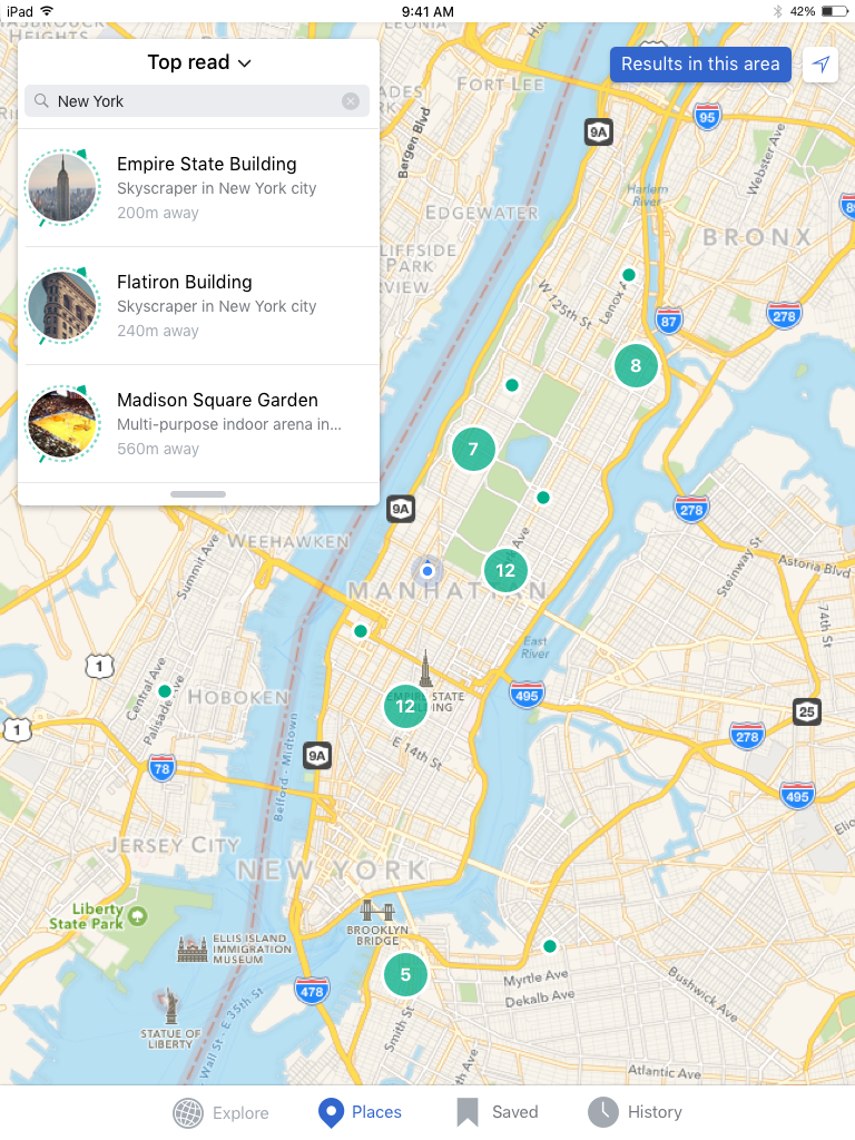
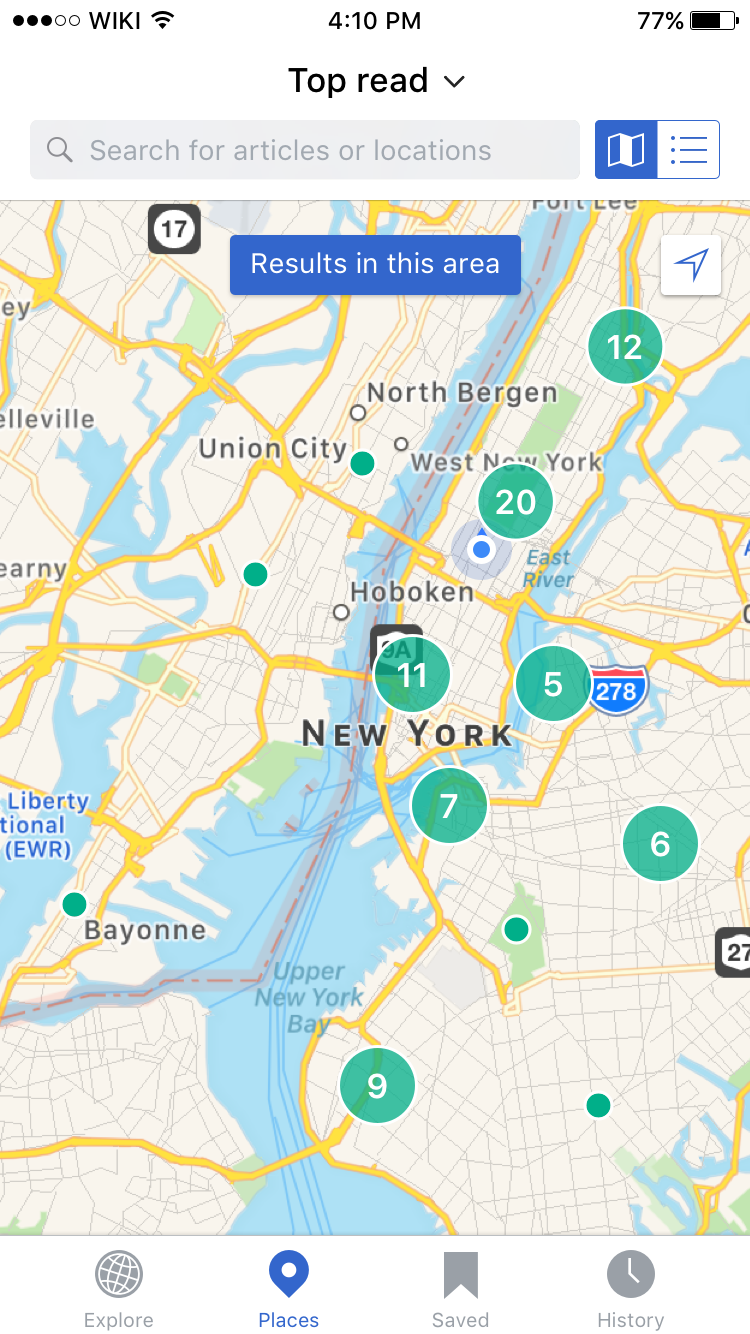
Finding 1
Reconsider placement, color and text of the 'search this area' button. Perhaps keep it in the same place but color it blue and change the text to 'view results in this area' it's not intuitive to users that by browsing they are performing a search
Proposed design solution
Inverse the colors on the 'Redo search' button and change text string to 'Results in this area'*⃣.
| iPad | iPhone |
 |  |
| Zeplin: https://zpl.io/1jdRDF | Zeplin: https://zpl.io/yOsjF |
*⃣ String differences for common languages are as follows:
| Language | Original string | Updated string | Character length difference |
| English | Search this area | Results in this area | +4 |
| German | Suche diesen Bereich | Ergebnisse in diesem Bereich | +8 |
| Japanese | このエリアを検索 | このエリアの結果 | 0 |
| French | Recherchez ce domaine | Résultats dans ce domaine | + 4 |
| Spanish | Buscar en esta área | Resultados en esta área | +4 |
Split finding 2 into: https://phabricator.wikimedia.org/T164076#3220925