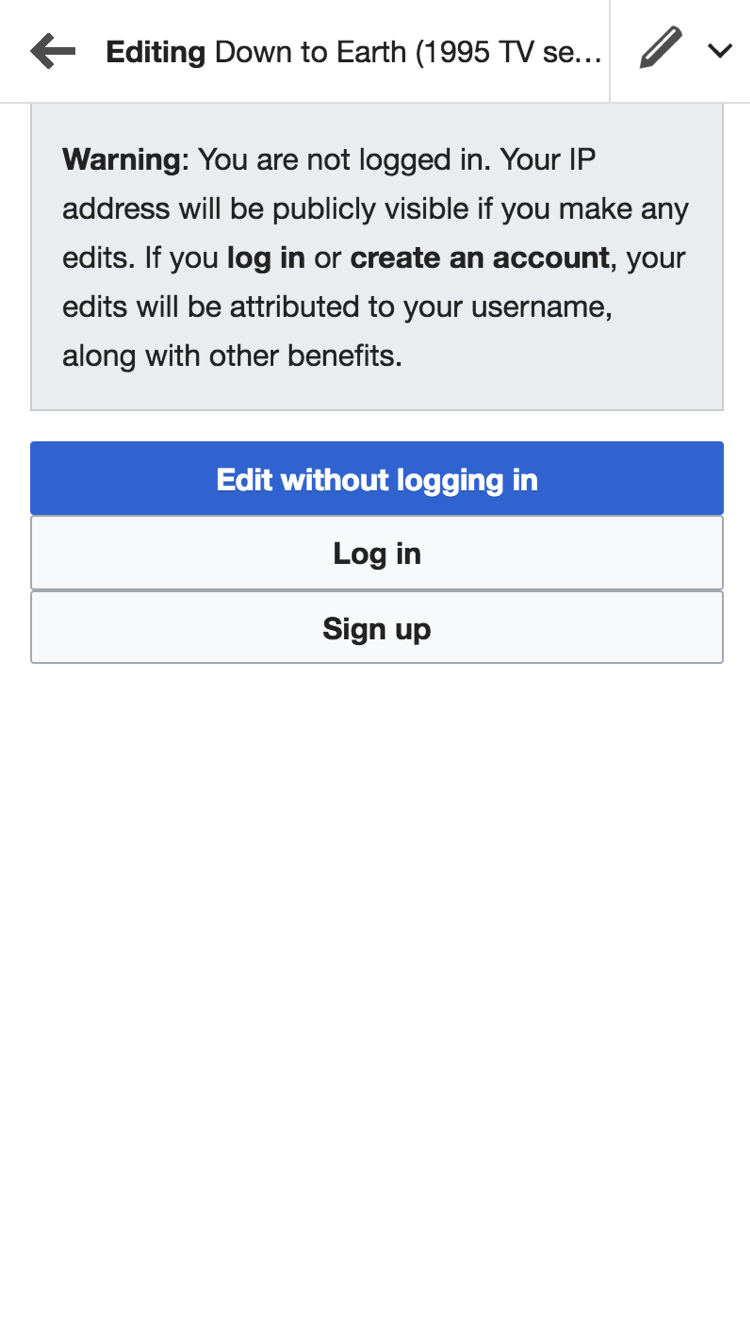
Anonymous editing warning screen has UI bugs
- Message is sticking the edges of the screen
- buttons sticking together
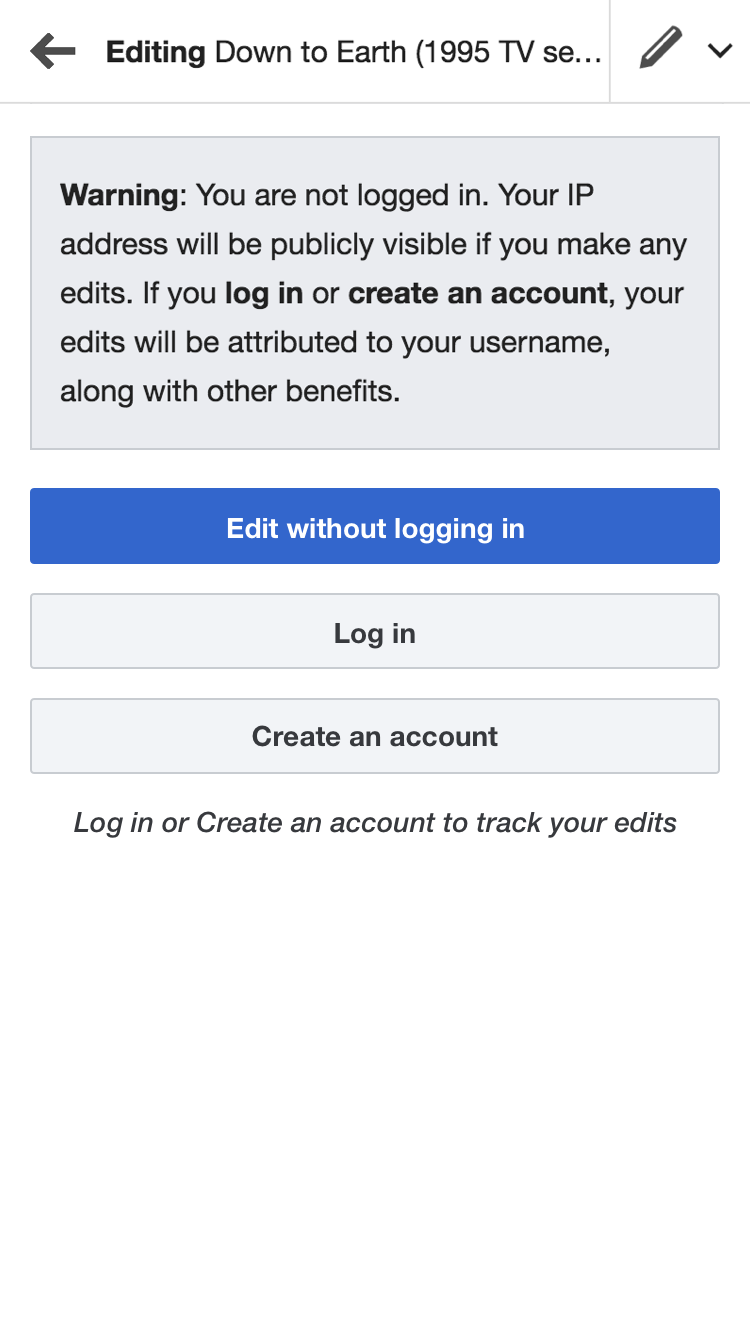
Proposal
- Improve the message to reflect the warning in a better way.
- use "warning" icon which has better recall
- Adding correct paddings around message and buttons
- Include benefit of logging in or creating account near the call to actions.
Mock
Before
After
Zeplin spec https://zpl.io/Z1eCptk