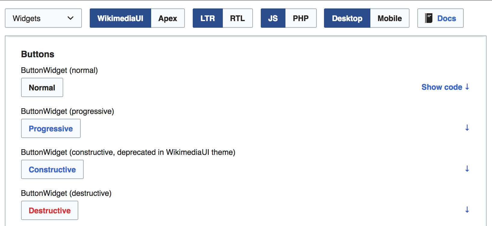
Currently the code generated for the widgets is hidden behind the obscure → button:
- Should we change this?
- To what?
| • Prtksxna | |
| May 31 2017, 6:49 PM |
| F8400599: image.png | |
| Jun 7 2017, 5:57 PM |
| F8399574: image.png | |
| Jun 7 2017, 2:50 PM |
| F8399612: image.png | |
| Jun 7 2017, 2:50 PM |
| F8222308: Screen Shot 2017-06-01 at 12.17.08 AM.png | |
| May 31 2017, 6:49 PM |
Currently the code generated for the widgets is hidden behind the obscure → button:
| Subject | Repo | Branch | Lines +/- | |
|---|---|---|---|---|
| demos: Indicate code toggle clearer | oojs/ui | master | +64 -27 |
| Status | Subtype | Assigned | Task | ||
|---|---|---|---|---|---|
| Open | None | T155473 Improve documentation of OOUI | |||
| Resolved | • Prtksxna | T165457 OOjs UI Demos: Show code used to generate widgets | |||
| Resolved | Volker_E | T166716 OOjs UI Demos: Make the generated code more discoverable |
Yes, we should. The button is not self-explaining and the functionality too important.
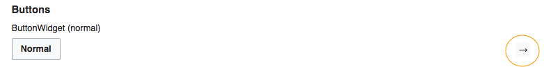
Early ideas are to turn this into a labelled-button
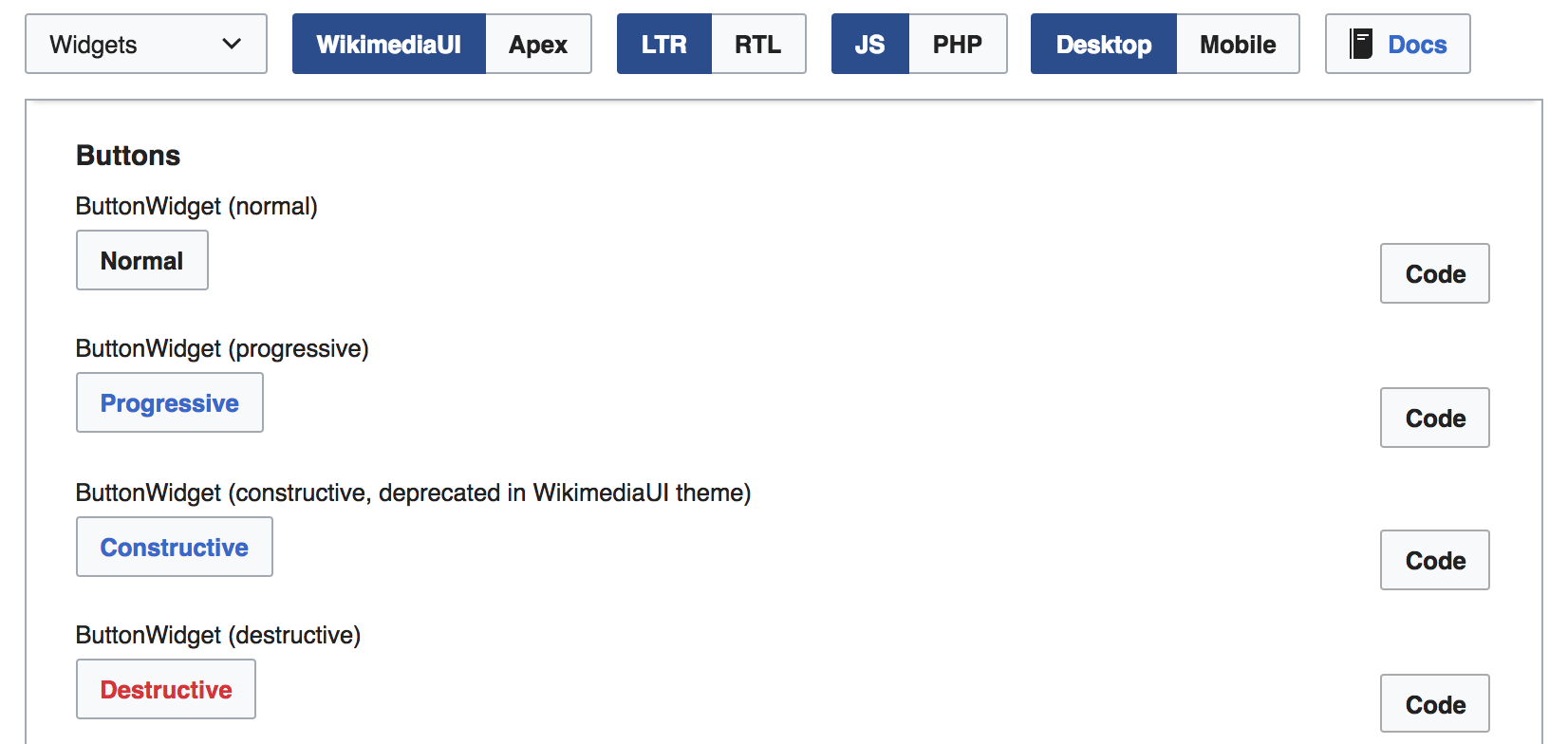
With a normal button style it's getting very crowded (here just with label “Code”, still):
I'm inclined to prefer a frameless inspired element:
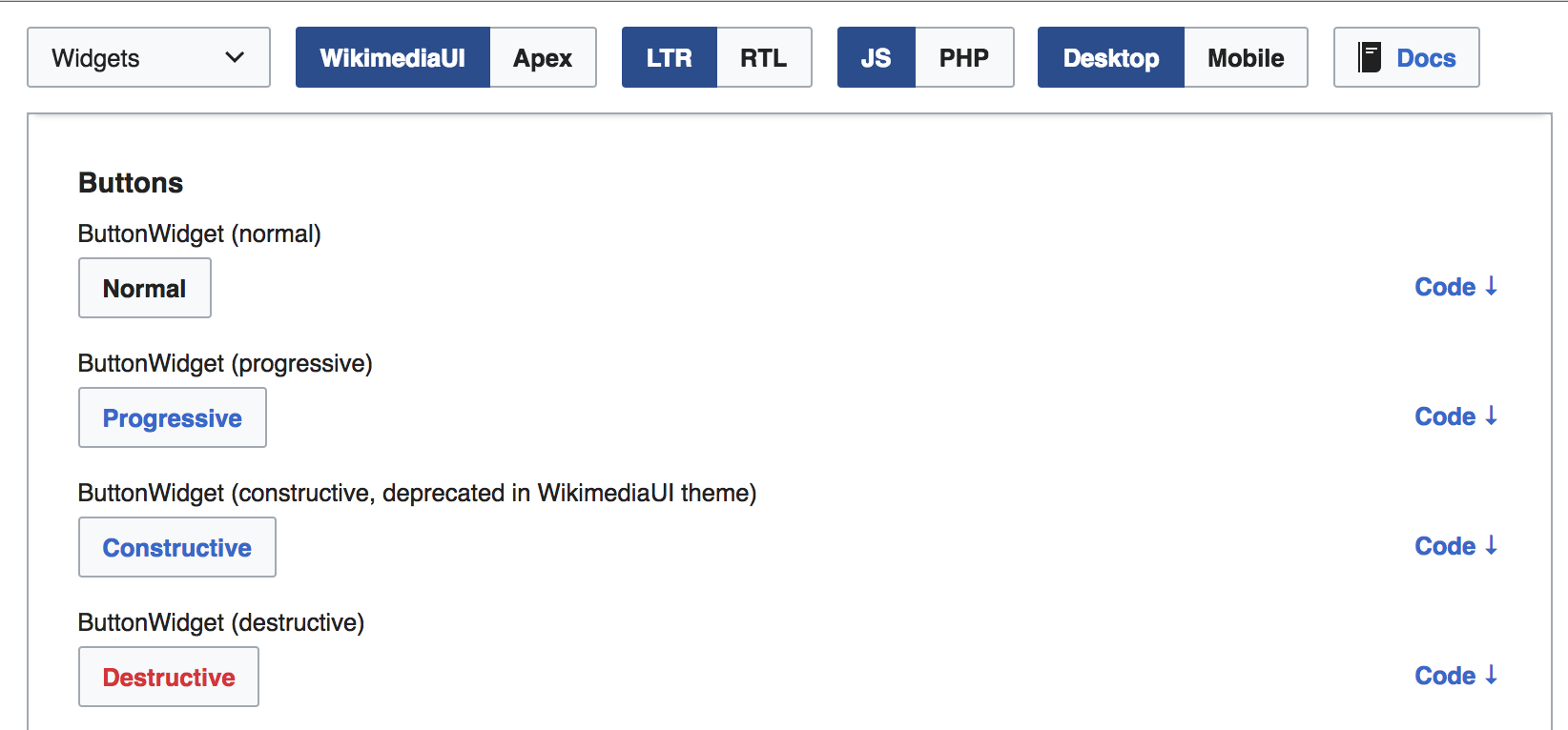
Still, pretty crowded. Probably going for first element featuring “Show code ↓” (or first per section) and for the rest we gonna show just the “↓” and full label on :hover/:active?
Change 357857 had a related patch set uploaded (by VolkerE; owner: VolkerE):
[oojs/ui@master] demos: Indicate code toggle clearer
Change 357857 merged by jenkins-bot:
[oojs/ui@master] demos: Indicate code toggle clearer