Comparative analysis of night / reading modes on iOS apps**: https://docs.google.com/presentation/d/1XdZeRqSFWnRNU0Uh-2P0CzcAXu2pIhMKdmsaiP6v1kk/edit?usp=sharing
Suggested design elements
Auto night mode toggle
Auto night mode based on environmental light conditions (like iBooks) automatically changes the reading theme to an appropriate setting (eg. dark mode when there is limited light). This could be toggled on and off by users in settings.
Image dimming toggle
Transparent black overlay on all images when the user has dark mode turned on. This could be toggled on and off by users in settings.
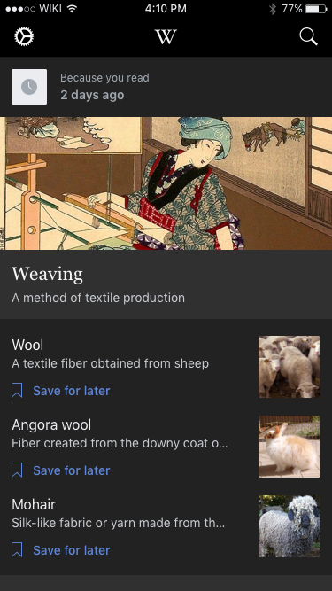
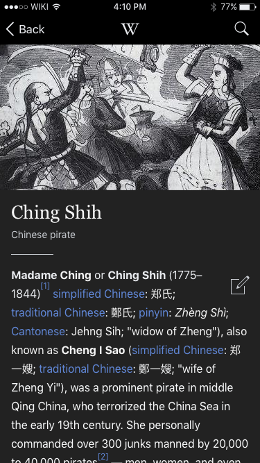
Night mode / reading themes applied on all app screens
Night mode and any other reading themes would be applied to all screens in the app, not just the reading view.
Adjust theme in reading theme and in settings
Allow users to adjust their reading theme and theme settings (auto night mode and image dimming) in their app settings. Additionally, allow users to switch between reading themes in the article view.
Stretch design elements
Brightness settings
A screen brightness slider with the same functionality of the brightness slider in the control center.
Reading themes
Themes are pre-set color combinations (text, links, backgrounds, chrome, etc). Reading themes were available on all of the iOS apps with night mode reviewed in the report above including Apple’s iBooks. Reading themes can help address reading comfort in a variety of reading situations. Creating themes in multiple colors that meet AAA accessibility standards will require additional design work and could potentially require a significant amount of development work.
Proposed color palette
Prototype https://wikimedia.invisionapp.com/share/6YCB5PV38#/240605346_Dark_Mode_-_Feed
 |  |
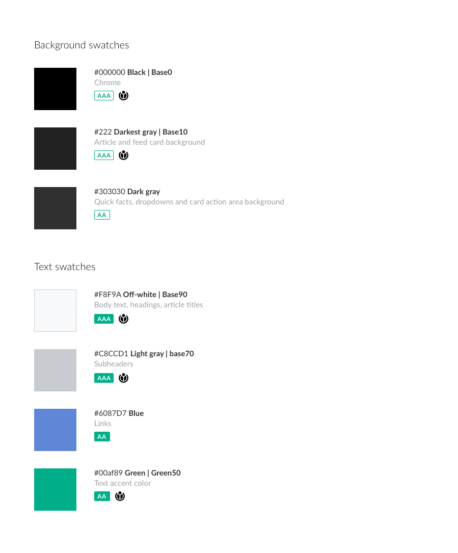
This color palette is built off of the WMF style guide and all color combinations utilized int he mocks above have WCAG conformance level of at least “AA,” with most having a "AAA" conformance level (layered background colors were not tested for WCAG conformance)
'Blue' was added as the WMF's Accent50 was not "AA" conformant on any of the dark backgrounds.
'Dark gray' was added as an additional dark background was needed for feed and article elements.
Preliminary reading controls
Prototype: https://wikimedia.invisionapp.com/share/NQC90AUSV#/239934092_01
(Colors used in the prototype were just for illustration purposes and do not match the colors used above)