Page MenuHomePhabricator

Assign different favicons to query.wikidata.org and test.wikidata.org
Closed, ResolvedPublic

Assigned To
None
Authored By
MisterSynergy
Jun 16 2017, 8:09 AM
Referenced Files
F10430656: Screenshot_20171025_171602.png
Oct 25 2017, 3:17 PM
F9794110: favicon.ico
Sep 25 2017, 10:21 AM
F9704937: screen.png
Sep 21 2017, 5:55 PM
F9694582: WD_Favicon_color_Query.ico
Sep 21 2017, 11:09 AM
F9626135: image.png
Sep 18 2017, 4:04 PM
F9554806: WD_Favicon_color_Query.svg
Sep 15 2017, 12:42 PM
F9531372: WD_Favicon_color_Query_black.png
Sep 14 2017, 2:26 PM
F9531261: WD_Favicon_color_Query_white.png
Sep 14 2017, 2:26 PM
Tokens
"Like" token, awarded by VIGNERON.

Description

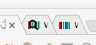
Wikidata Query Service and test.wikidata.org both use the same favion:

The file is however apparently the same. Since this continuously confused me in my browser tabs, I suggest to use different favicons. I do not have a preference which one to keep and which one to change.

Event Timeline

Restricted Application added a subscriber: Aklapper. · View Herald Transcript
Lydia_Pintscher subscribed.

The query service should get its own logo. The black and white one should continue to be used for test.wikidata.org.

Design team: can haz pretty logo plz?

This could be a pretty quick job if it hasn't been done already. My initial 2 ideas are the logo with a question mark or a magnifying glass. Here are 2 lazy, 10 second drafts. Would this be on the right track?

wikiquer2.png (734×924 px, 33 KB)

wikiquer1.png (728×710 px, 29 KB)

Well, there was the discussion on a Query Service Logo: T140577

Screenshot from 2016-07-18 09-42-32.png (392×405 px, 2 KB)

I like the magnifying glass one. Should be recognizable enough to word even when displayed in tiny size in the browser bar.

wikiquer2.png (734×924 px, 33 KB)

I like @Jan_Dittrich 's logo a lot since i feel like the query service deserves its own logo and that one makes a lot of sense and looks very nice.

If we do end up going with any of @James_Budday 's suggestions we should use the favicon logo in the background though since otherwise it looks to busy.

WD_Favicon_color.png (106×106 px, 584 B)

Either the one with the looking glass or the completely new one. What's the idea/meaning behind the completely new one?

@Lydia_Pintscher

it is "based on query (lines-horizontal) and visualization of results (bars-vertical)"

Alright. Both are fine from my side.

A month or two ago, the favicon for query.wikidata.org was set to the same as www.wikidata.org .. this made it highly confusing.

Please keep them different. The current color difference makes it easy to tell them apart.

Change 377665 had a related patch set uploaded (by Smalyshev; owner: Smalyshev):
[wikidata/query/gui@master] Change favicon to "magnifying glass" image

https://gerrit.wikimedia.org/r/377665

Change 377665 merged by jenkins-bot:
[wikidata/query/gui@master] Change favicon to "magnifying glass" image

https://gerrit.wikimedia.org/r/377665

Change 377912 had a related patch set uploaded (by Smalyshev; owner: Smalyshev):
[wikidata/query/gui@master] Change favicon to "magnifying glass" image

https://gerrit.wikimedia.org/r/377912

When I look at the one that is in https://gerrit.wikimedia.org/r/377912 I see a horizontal white line at about 2/3 of the height. Besides that, go ahead.
@Charlie_WMDE can you get us a fixed version?

I suggest using the actual favicon in the background as mentioned in a previous comment to keep blurryness to a minimum.

I also think, that it's better visible in white in favicon size.

WD_Favicon_color_Query_white_fav.png (16×16 px, 668 B)

WD_Favicon_color_Query_white.png (106×106 px, 2 KB)

If you prefer to stick to black I made an option with a bit of a white blur in the background which looks shit enlarged but in favicon size it makes the magnifying glass stand out a bit more which otherwise has a too low contrast with the dark colors of the logo.

WD_Favicon_color_Query_white_fav.png (16×16 px, 918 B)

WD_Favicon_color_Query_black.png (106×106 px, 9 KB)

Thanks a lot, Charlie! Let's go with the black one.

here's the svg in case that's needed

Sorry, but I would recommend the white version, because it is easier to see the difference than with black:

image.png (61×259 px, 5 KB)

Slightly meta:

For making an informed decision suggest the following:

  • Test the icon on a black, 50% gray and white background (to cover common tab background colors).
  • Creating a mock tab can be helpful to see the icon in context.
  • Please take care that the version that is visible in phabricator is actually 16x16px (I don't get the scaling rules, but we should find out). Favicons are very 90s like pixelart, basically ;-)

Most importantly:

  • Decide on mutually-agreed-upon criteria like:
    1. Being easy to recognize
    2. Being similar in style to the other Wikimedia logos
    3. Highlighting the connection to Wikidata

Would be my order of priority. But feel free to find another set.

What @Jonas did ("because it is easier to see the…") would be an example of discussing on such principles.

Sorry, but I would recommend the white version, because it is easier to see the difference than with black:

image.png (61×259 px, 5 KB)

Hey @Jonas that is not the favicon I suggested. It is harder to see because the Wikidata favicon isn't used and there is no white blur behind the black to separate it a bit more as you can see here

WD_Favicon_color_Query_white_fav.png (16×16 px, 918 B)

Looks like SVG support for icons is kinda spotty: https://en.wikipedia.org/wiki/Favicon#File_format_support

So PNG or ICO is probably the best option. @Charlie_WMDE could you point me to a final file that I should be using in the patch? Kinda confused among the multitude of options...

@Charlie_WMDE I don't think we can use SVG, due to limited support, and PNG is 220x200 - is that the size we should use for the icon? Typically icons are smaller...

Also, the PNG image seems to have pretty large margins, which makes the actual icon look very small.

@Charlie_WMDE @Hanna_Petruschat_WMDE : Let's give this a proper review and post our decision + file then.

Hi @Smalyshev,

the file is a rectangle and has no margins. The whitespace you see is put there by Phabricator to make it look nicer I guess. If you take a look at the file on commons you can see it better.

220x200 is not the size for a favicon. Favicons vary in size, depending on the device and browser used etc.

They are usually 16x16px but can go up to 64x64px and maybe even larger in other areas.

Here's the icon as an ICO in hopefully all the sizes that you'll need:

@Charlie_WMDE I've tried the ico file, it seems OK except for one issue which I'm not sure if it's ok or not: it has white (not transparent) background, which makes it look like white box, unlike wikidata icon.

screen.png (64×136 px, 4 KB)
Is it ok?

@Charlie_WMDE I've tried the ico file, it seems OK except for one issue which I'm not sure if it's ok or not: it has white (not transparent) background, which makes it look like white box, unlike wikidata icon.

screen.png (64×136 px, 4 KB)
Is it ok?

Hey @Smalyshev, you are right. sorry. I converted the wrong file.

Here's an updated version which should be transparent:

Change 377912 merged by jenkins-bot:
[wikidata/query/gui@master] Change favicon to "magnifying glass" image

https://gerrit.wikimedia.org/r/377912

Hey @Lydia_Pintscher,

I just realised that it's kinda strange that the Logo on the query page doesn't match the favicon icon.

Screenshot_20171025_171602.png (227×293 px, 20 KB)

I think it would be a good idea to have them be the same.

If the favicon was never intended to also function as a logo then maybe we should open a ticket for a Query Service Logo that can then have a matching favicon.