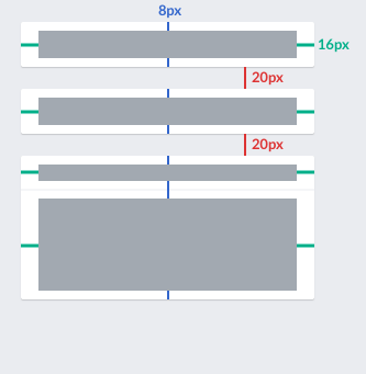
The general style for cards was captured in T158410 is not always consistently applied. In particular, vertical space is not always balanced and the dividing lines don't go from edge to edge as captured in the guidelines:
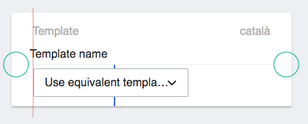
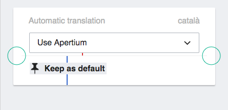
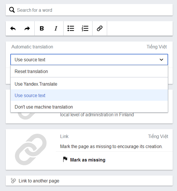
Some examples of cards form CX2 that need some polishing:
- Separator line not going from edge to edge (as indicated by the green circles).
- Space above and below the separator should be 8px to make the control below to be balanced in terms of vertical space.
- The "template name" is not aligned with the other labels as indicated by the red line.
- Separator line not going from edge to edge (as indicated by the green circles).
- Use standard distance modules (8px) as vertical separation for the drop-down (in red) and the "keep as default" action (in blue).


