This is the main product/design task for the MVP UI of submitting a reminder.
Issues related to displaying the reminder are tracked separately.
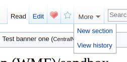
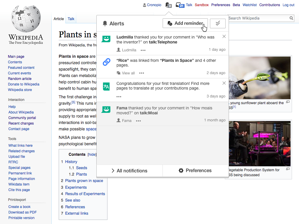
- Where should the "add reminder" button be? The simplest solution seems to be adding another tab to the screen next to the "star" (watchlist) menu
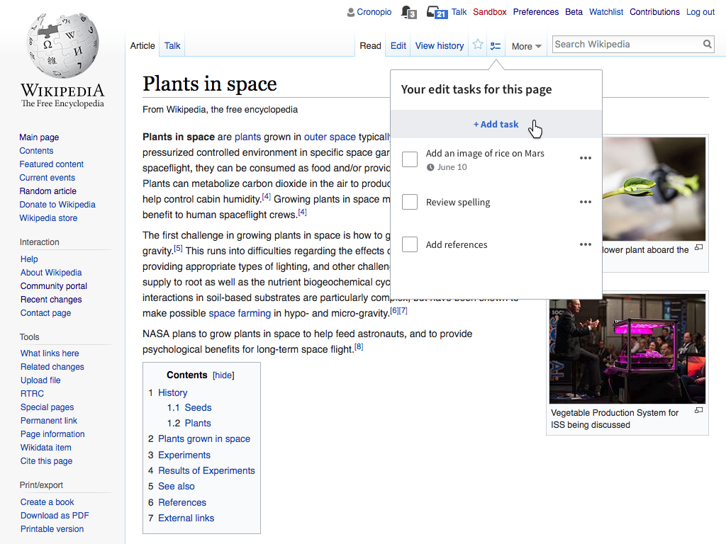
- For MVP, in More menu
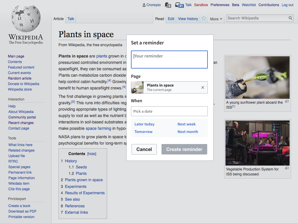
- What should there be in the menu?
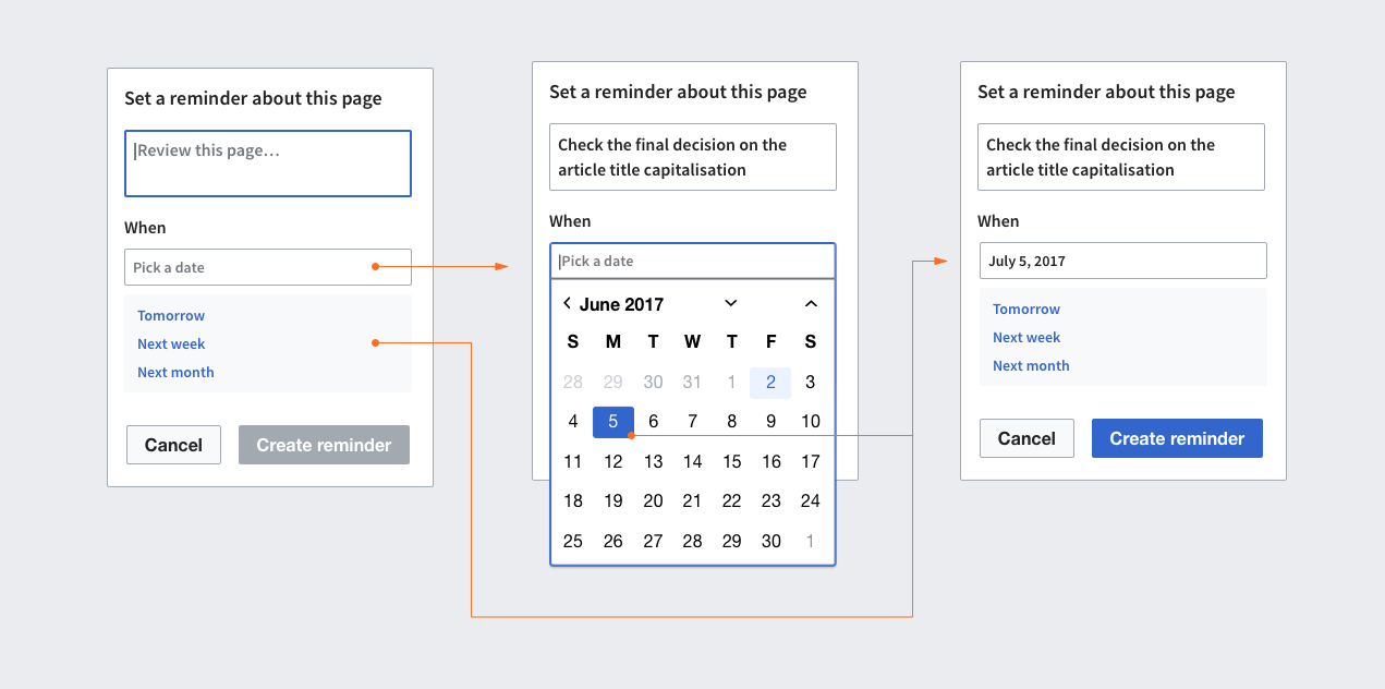
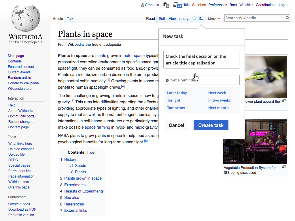
- Do we have a set range of options to choose from, or a free-text number with days?
- Related to the above, if we go with free-text number, do we validate? Do we have a range? Do we have a date-picker?
- The MVP should support an optional user-comment. We should limit the character-count to something sensible that appears in the notification.
- What does it look like if the article already has a reminder? We can mimic the behavior of the watchlist where the star is empty/full depending on whether it is used.
- Speaking of which, what happens if you click that interface when a notification was already set? In the MVP we don't do 'delete' reminder, do we allow for several reminders for the article? Or should we show the previous reminder you set up? And how will that look like (editable/ non-editable)?
- Do we open a popup under the button with the above details? Is it a screen-centered dialogue? (I personally prefer a popup, but we should discuss)