Page MenuHomePhabricator

CentralNotice device selector checkboxes look all weird
Closed, ResolvedPublic

Description

(technical term)

Screenshot 2017-06-26 20.54.34.png (646×1 px, 98 KB)

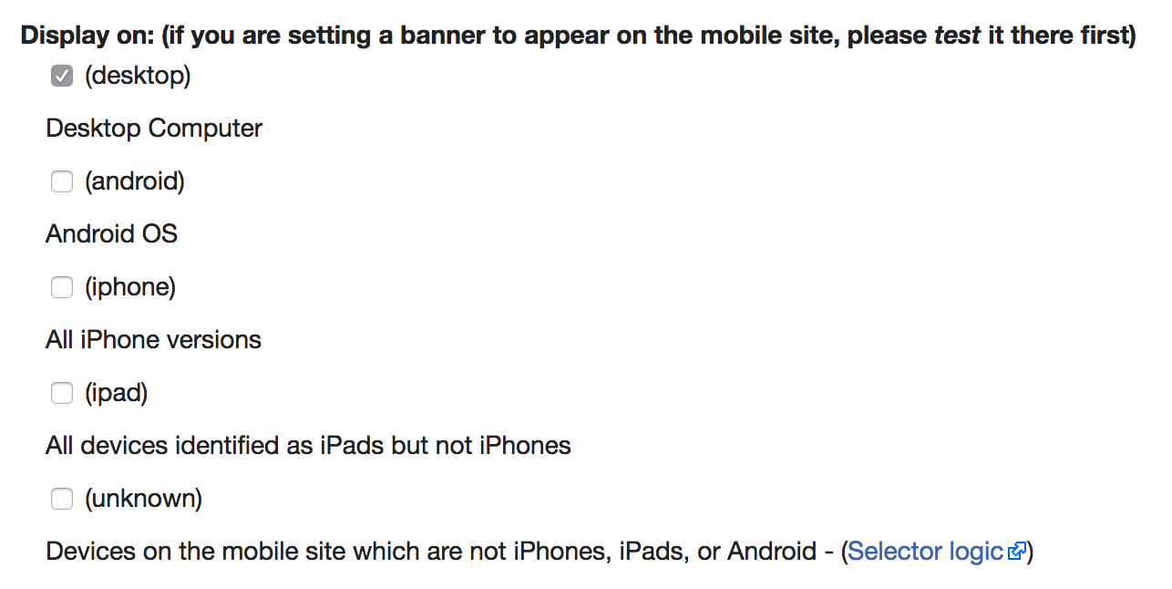
The labels all used to be on one line each, which was easier to read. Now part of the label seems to be wrapped in <div class="mw-parser-output"><p></p></div> which I guess has something to do with https://gerrit.wikimedia.org/r/#/c/350634/

Event Timeline

@AndyRussG Can you take a look at this one please? It's annoying since the labels now have full width, and people are accidentally clicking them and changing the device settings.

Pcoombe claimed this task.

This appears to have been fixed now.