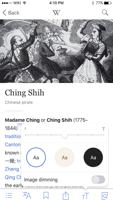
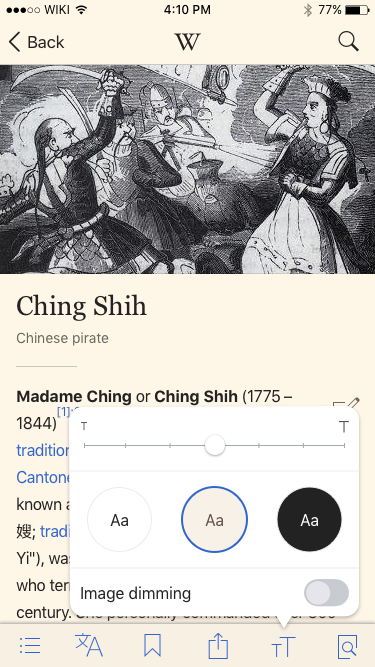
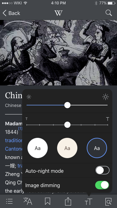
Designs
| Default | Sepia | Dark |
 |  |  |
| Zeplin: https://zpl.io/ADWNl | Zeplin: https://zpl.io/Z1J0VtV | Zeplin: https://zpl.io/83NMv |
Please check T169153 + T169154 for updated colors
Design details
- Slider color is defined by color palette
- Slide affects overall system brightness
- Platter on dark theme is #222
- Selected theme is outlined in the palette's blue link color
Testing criteria:
- Open any article in the app
- Tap on the "tT" icon
- Slide the brightness slider and ensure that the screen brightness is being adjusted
- Swipe up to reveal the phone's Control Center
- Slide the brightness slider in the Control Center and ensure that the brightness slider in the article controls matches the system slider
- Slide the font size slider and ensure that the font size in the article is being adjusted
- Tap on theme buttons and ensure that respective themes are being applied to the app
- Ensure that the bordered theme button corresponds to the current theme of the app
- Ensure that the "Dim images" switch is enabled only for the dark theme