Page MenuHomePhabricator

Introduce the New Filters to users upon beta graduation
Closed, ResolvedPublic

Description

When the New Filters graduate out of beta on RC page, we will:

  • Introduce the new filters to users getting them for the first time. This applies only to users that didn't have the beta feature enabled, but now will see the new feature since it become the default.
  • Provide a path to disable the new feature. We expect users to like the new filters, but providing them some flexibility to go back to the old system provides them an emergency exit to some issues (e.g., a specific gadget breaking the new tool), avoiding unnecessary stress.

We can use a similar pattern to the one we used to welcome users of the beta feature (T159010).

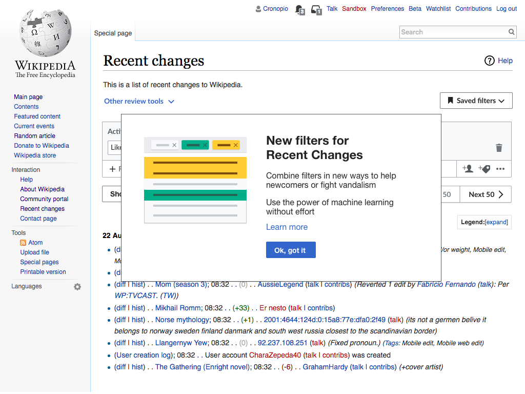
The Introduction Popover

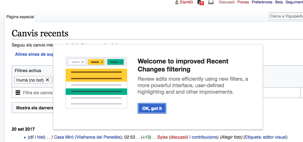
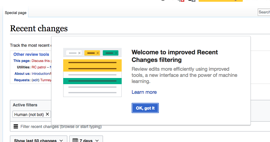
  • After graduation, when a user who was not previously opted in to the beta visits the RC page for the first time, a popover will appear introducing the new features.
  • The popover remains visible for 4 seconds, and then disappears.
  • The user can also dismiss the popover by 1) clicking the "OK, got it" button, 2) clicking a link to navigate away from the page 3) clicking the page anywhere outside the popover.
  • Once it is dismissed or disappears on its own, the Introduction should not be shown to that user on that wiki again.
  • Different messages are shown to ORES vs. non-ORES wikis (wording below).
  • A "Learn more" link is provided. The link opens a new tab/browser and goes to the RC Filters page on mediawiki.
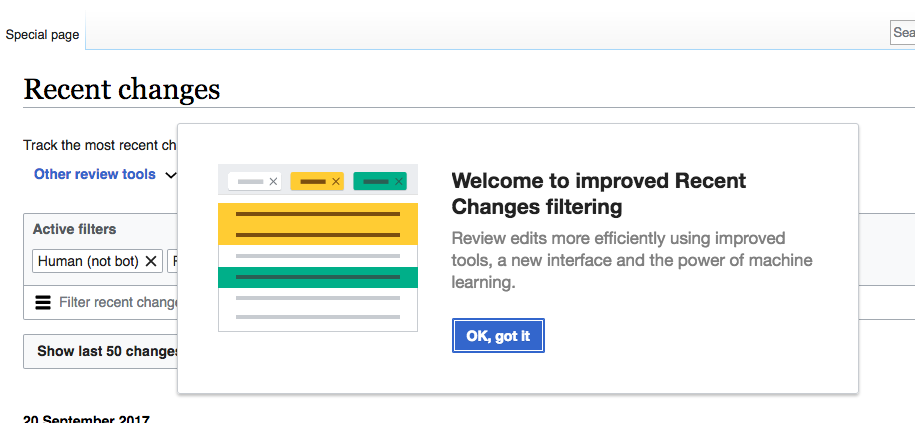
  • The design of the popover will be based on the one we showed to beta users in T159010. See the screenshot below for layout, but use the wording in the "Wording" section below.
    • The image used in the panel will be animated. A non-looping animated Gif for the animation is available at F5053416

RC-introduce-new-feature.png (768×1 px, 221 KB)

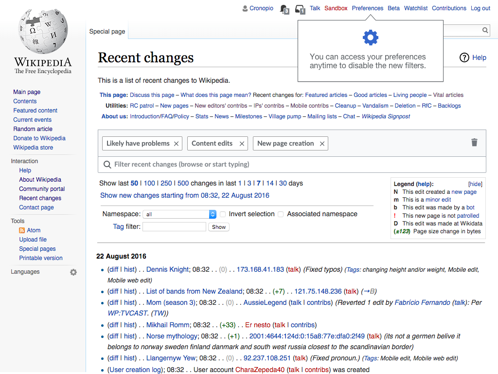
The preferences Notice

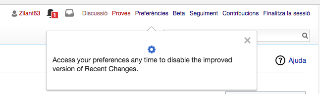
After the user dismisses the Introduction, another popover gives the user notice that the new features can be disabled.

  • The Notice appears below and points at the Preferences link in the top navigation.
  • If the user does nothing, the popover will vanish automatically after 3 seconds.
  • If the user clicks the popover, clicks the page off the popover or navigates to a different page, the popover disappears.
  • The Notice will not be repeated for that user on that wiki.

RC-point-to-preferences.png (768×1 px, 296 KB)

Wording for popovers

[INTRODUCTION, ORES VERSION]
Welcome to improved Recent Changes filtering
Review edits more efficiently using improved tools, a new interface and the power of machine learning.

[INTRODUCTION, NON-ORES]
Welcome to improved Recent Changes filtering
Review edits more efficiently using new filters, a more powerful interface, user-defined highlighting and and other improvements.

[NOTICE]
Access your preferences any time to disable the improved version of Recent Changes.

Implementation

For logged-in users, it should use preferences, as usual.
For anonymous users, it should use jquery.jStorage, with a TTL. I suggest a year.

Related Objects

Event Timeline

jmatazzoni renamed this task from Introduce the new filters to users once they are available by default to Introduce the New Filters to users upon beta graduation.Aug 18 2017, 9:40 PM
jmatazzoni removed jmatazzoni as the assignee of this task.
jmatazzoni updated the task description. (Show Details)
jmatazzoni added subscribers: Etonkovidova, Catrope.

@Pginer-WMF, I rewrote this to make it into a spec for developers and moved it to RFP. Please look it over to make sure it's correct. Also, if you need to provide any icons, etc (like the gear, perhaps?), please add them to the Description above. Thanks.

@Pginer-WMF, I rewrote this to make it into a spec for developers and moved it to RFP. Please look it over to make sure it's correct. Also, if you need to provide any icons, etc (like the gear, perhaps?), please add them to the Description above. Thanks.

The spec looks good.
One aspect missing is when this would be removed, since at some point the new filters would be the normal experience, but we can create a separate ticket for that if needed.

The cog icon is part of the standard set of icons, which I think can be adjusted to any color in code. In any case, if a specific blue version is needed, I added it below:

Should we make it a little more explanatory, so it's more thorough onboarding?

What about a few steps to the tour, pointing to different parts of the page and explaining interesting parts? See https://en.wikipedia.org/wiki/Special:AllPages?tour=test for an example tour that points to different parts.

Ideally it would be useful for both existing users switching UI, and new users signing up anytime in the future and using RC for the first time.

In T169613#3543417, @Mattflaschen-WMF wrote:

Should we make it a little more explanatory, so it's more thorough onboarding?

What about a few steps to the tour, pointing to different parts of the page and explaining interesting parts? See https://en.wikipedia.org/wiki/Special:AllPages?tour=test for an example tour that points to different parts.

That might be nice. I gather this type of tour is not that hard to do? Also, a question the tour system's capabilities: can one, for example, open up menus automatically to show where the Highlight button is?

@Pginer-WMF, what do you think? Worth the effort?

@Pginer-WMF, what do you think? Worth the effort?

In this context, I expect users to land to the Recent Changes page with a clear goal in mind (e.g., find vandalism) for which this tool is just an path to that goal. So I think it makes sense to keep information in context and keep distractions minimal. Otherwise they may look like obstacles getting in the way and result in the user blindly skipping.

I think it would make sense to point to the main filter entry point to invite users to discover that they can filter the page in ways that were not possible before. This is something we already considered in T150836 but only applied to the highlights (where we already show information about).

invite-to-search.png (768×1 px, 288 KB)

That might be nice. I gather this type of tour is not that hard to do? Also, a question the tour system's capabilities: can one, for example, open up menus automatically to show where the Highlight button is?

Correct. We might need to tweak the menu widget to make it toggle-able by code.

We can also make it so the GuidedTour automatically moves to the appropriate step when you use the normal UI to open and close the menu.

In this context, I expect users to land to the Recent Changes page with a clear goal in mind (e.g., find vandalism) for which this tool is just an path to that goal. So I think it makes sense to keep information in context and keep distractions minimal.

We should consider onboarding (not just power users switching to a new UI, but also new users who don't have any experience with RC). Not everyone knows what RC is, what it's used for, and how to use it.

Otherwise they may look like obstacles getting in the way and result in the user blindly skipping.

Skipping or exiting is not a problem (there's an X for a reason), as long as it's useful to a significant amount of users, and it's not shown repeatedly.

I think it would make sense to point to the main filter entry point to invite users to discover that they can filter the page in ways that were not possible before.

I agree, though I would suggest a tour guider, rather than a blue dot.

I'm also in favor of a guided tour, due to the number of powerful tools we now have with the filters.

I would advice to have it focusing to something positive, like identifying last revisions from newcomers. Have newcomers who discover RecentChanges for the first time who will see the tour is not a problem; the experience from the WikiMOOC has proven that newcomers tend to help each other to explore the wikis. For people interested by fighting vandalism, this combination will also be useful to identify last revisions made by newcomers. Plus I expect the wording to help users to change their mind and become helpers. :)

The final combination shown would be newcomers filtered + last revision highlighted. An extra step, to filter or highlight edits on article talk pages, is provided as an action people can take to see if anyone needs help.

Scenarii:


Start, centered on the page:

RecentChanges have been improved on your wiki!

Discover how filters and highlights can ease your Recent Changes work.

[Go for a tour] (blue button)
[I'm already aware of filters and highlights] -> (white button) Closes the tour
[Disable the new features] -> (simple link) Go to preferences


Step 1, attached to the browsing bar

Let's check newcomers most recent edits

This way, you will be able to help new users to make better edits.

Click on the bar and find the "newcomers" filter. You can browse this filter by typing"newcomers" in the bar.
[validation by action]


Step 2, open the dropdown menu and attach the tour pop-up to the Newcomers filter checkbox

Select the Newcomers filter

Click on the square, to select the checkbox.
Only edits by editors with fewer than 10 edits and 4 days of activity will be shown.
[validation by action]


Step 3, attached to the highlight button

Differentiate edits using highlighting

All edits are not the same. We are going to highlight some types of edits.

Click on the Highlight button and add a colored background to "Lastest revision" edits.
[validation by action]


Step 4, activated when a color is selected, attached to the first result of the list, closing browsing dropdown

You now filter edits

The results only display Newcomers edits (all edits) and highlight the last revisions.

[Let's see more filters!]↴


Step 5, attached on the namespace icon

Filter by namespace

Let's check if there is messages left on article talk pages. Open the advanced menu to filter namespaces.
[validation by action]


Step 6, attached on the filters dropdown

Filter or highlight

You can

  • select the filter to only see talk pages
  • highlight the results in a different color to surface talk pages.

[Got it, thank you for the tour!]

@jmatazzoni there are several suggestions in the discussion above, including a proposal for a longer tour by Benoit, is the ticket description still up to date with what we want or does it need to be updated?

In T169613#3569875, @SBisson wrote:

@jmatazzoni there are several suggestions in the discussion above, including a proposal for a longer tour by Benoit, is the ticket description still up to date with what we want or does it need to be updated?

A tour is a good idea but we are not creating a more involved tour at this time. @Trizek-WMF, please move the Tour discussion to a separate ticket. This ticket is up to date.

Change 375097 had a related patch set uploaded (by Mooeypoo; owner: Mooeypoo):
[mediawiki/extensions/WikimediaMessages@master] [wip] RCFilters: Add introduction tour when RCFilters comes out of beta

https://gerrit.wikimedia.org/r/375097

In general, I think we should be cautious about using non-standard widgets, including non-standard tour steps (e.g. removing the X, etc.). However, I don't object as long as it's a reasonable UI.

I think the last step should have the standard X button or the default checkmark button to close it. Not everyone knows you can click to close.

@Pginer-WMF Do you have a copy of the gear icon in the proper size/color? I couldn't find it (I was sure we used it before, but I guess I was wrong?)

The entire tour is implemented in the commit above, except for the blue gear image which I am missing. I've self -1'ed until I get an answer about it (whether to proceed without, or if you can, upload the image)

@Pginer-WMF, I rewrote this to make it into a spec for developers and moved it to RFP. Please look it over to make sure it's correct. Also, if you need to provide any icons, etc (like the gear, perhaps?), please add them to the Description above. Thanks.

The spec looks good.
One aspect missing is when this would be removed, since at some point the new filters would be the normal experience, but we can create a separate ticket for that if needed.

The cog icon is part of the standard set of icons, which I think can be adjusted to any color in code. In any case, if a specific blue version is needed, I added it below:

I don't know how I missed this.
Implementing.

@jmatazzoni question/clarification; as @Mattflaschen-WMF pointed out in review, the current code will only work in Special:RecentChanges. I could make it work in all other pages (Watchlist and RelatedChanges) but the language of the tour is specific to "RecentChanges".

I am going to keep this as-is for now; if you want this tour to also be the same behavior for Watchlist or RecentChanges (this also applies to the "invite to the beta feature") then let's create a child task and make sure we have adequate wording for the tour displaying on the other pages.

Change 375097 merged by jenkins-bot:
[mediawiki/extensions/WikimediaMessages@master] RCFilters: Add introduction tour when RCFilters comes out of beta

https://gerrit.wikimedia.org/r/375097

In T169613#3593044, @Mooeypoo wrote:

@jmatazzoni question/clarification; as @Mattflaschen-WMF pointed out in review, the current code will only work in Special:RecentChanges. I could make it work in all other pages (Watchlist and RelatedChanges) but the language of the tour is specific to "RecentChanges".

I am going to keep this as-is for now; if you want this tour to also be the same behavior for Watchlist or RecentChanges (this also applies to the "invite to the beta feature") then let's create a child task and make sure we have adequate wording for the tour displaying on the other pages.

@Mooeypoo, will what you've done work on Related Changes? That's the only other place we'll want this .No need for Watchlist. Thanks.

Not if we don't enable it there -- and the problem of the copy remains. The copy says "recent changes". Should it change for the related changes page, or stay the same?

In T169613#3601122, @Mooeypoo wrote:

Not if we don't enable it there -- and the problem of the copy remains. The copy says "recent changes". Should it change for the related changes page, or stay the same?

Go ahead and enable on Related Changes. If it's easy to update the language so that it says "Welcome to improved Related Changes filtering" go ahead and do so. If it causes problems, I think it's OK to think of this as a flavor of Recent Changes. Thanks.

@Mooeypoo The guided tour is persistent - appears again for the same user when a user does not dismiss it via "Got it', but clicking anywhere on the page
The guided tour re-appears when

  • a user refreshes the page
  • a user enters in the Search box the page and navigates to it; the guided tour will be displayed on that page.
  • when a user logs out

Easy to reproduce - just ' Restore all default settings (in all sections)', and the above behavior will be present.

Re-checked the specs in betalabs (after two issues have been fixed T169613: Introduce the New Filters to users upon beta graduation and T167262: Server-launched guided tour can show on the wrong page if the user navigates away before full page load).

The screenshots with the popup warning for ORES-enabled wiki and non-ORES enabled wikis:

Screen Shot 2017-09-19 at 6.07.45 PM.png (423×915 px, 64 KB)

Screen Shot 2017-09-19 at 6.07.24 PM.png (461×984 px, 97 KB)

And the second step in the popup display:

Screen Shot 2017-09-19 at 6.10.26 PM.png (190×646 px, 31 KB)

The two issues are remained not addressed:
(1) The 'Learn more' link is missing.

A "Learn more" link is provided. The link opens a new tab/browser and goes to the RC Filters page on mediawiki.

(2) A really minor issue: 'Restore all default settings' option will bring back the pop up.

The Notice will not be repeated for that user on that wiki.

QA Recommendation: Product should weigh in

Please add the Learn More link, marked with a red triangle in the description. (Unless there is some reason why this is difficult?) I'd like it to open a new tab or window, if possible. Moving back to In Dev.

Change 379448 had a related patch set uploaded (by Mooeypoo; owner: Mooeypoo):
[mediawiki/extensions/WikimediaMessages@master] RCFilters: Add 'learn more' link to guided tour introducing rcfilters

https://gerrit.wikimedia.org/r/379448

Change 379466 had a related patch set uploaded (by Mattflaschen; owner: Mattflaschen):
[mediawiki/extensions/GuidedTour@master] Simplify link logging for target=_blank

https://gerrit.wikimedia.org/r/379466

Change 379448 merged by jenkins-bot:
[mediawiki/extensions/WikimediaMessages@master] RCFilters: Add 'learn more' link to guided tour introducing rcfilters

https://gerrit.wikimedia.org/r/379448

Change 379466 merged by jenkins-bot:
[mediawiki/extensions/GuidedTour@master] Fix link logging for target=_blank

https://gerrit.wikimedia.org/r/379466

Checked in betalabs - 'Learn more' link is added and the link redirects to https://www.mediawiki.org/wiki/Edit_Review_Improvements/New_filters_for_edit_review as per the spec.

@Pginer-WMF - the font contrast is OK?
Chrome 55

Screen Shot 2017-09-26 at 12.02.21 PM.png (486×923 px, 85 KB)

Safari 10
Screen Shot 2017-09-26 at 12.04.23 PM.png (469×891 px, 65 KB)

@Pginer-WMF - the font contrast is OK?

The main paragraph seems too light for our accessibility standards.
We can use Base10 (#222) to use the same color as the heading and just rely on the font weight contrast. That would make the result closet to the mockup in the description.

Reopening to change the color of the main paragraph. See above.

I see Elena created a subtask for this, T176887. So closing again.