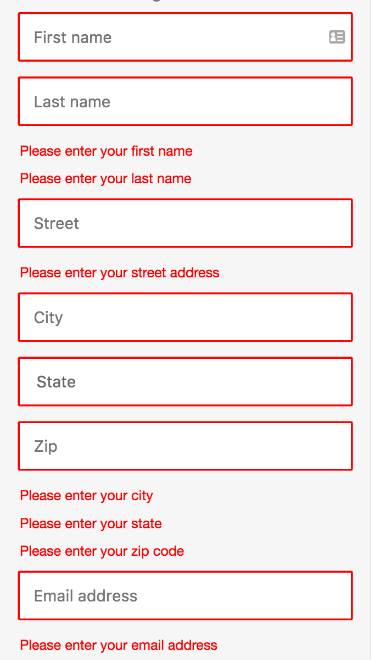
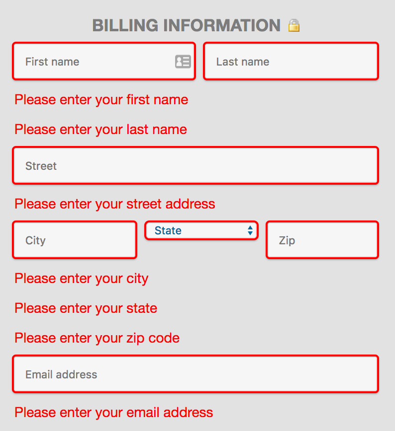
The way we do fields and errors currently means they end up ordered strangely on mobile, see images.
@schoenbaechler says
Probably the best way to handle this is to always occupy full width and display the corresponding error message right below the input. If that is not possible, we could alternatively output a list (<ul>) of the errors below all inputs.
I don't think we can have the inputs always occupy full width, as that would make the form very long for some countries.
Desktop:
Mobile: