Page MenuHomePhabricator

Should we indicate to users that visual diffs are in beta?
Closed, ResolvedPublic0 Estimated Story Points

Description

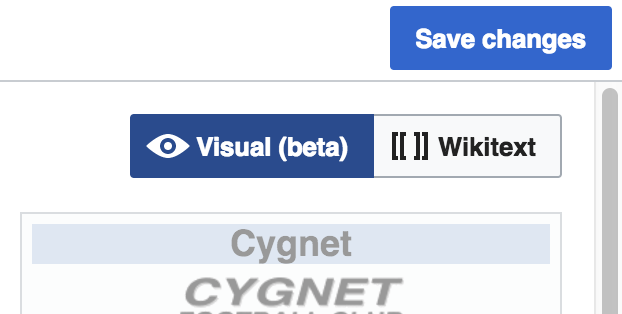
Visual diffs in VisualEditor are early in their lifecycle and evolving over time. I've been considering this feature as being in beta, as it's going to change a lot more. We don't indicate that to users anywhere in the interface, though. Should we indicate this to users somehow, so they know they can expect imperfections, and changes over time?

I think something fairly subtle would do fine. Quick and dirty mockup to illustrate the kind of thing I'm thinking of:

Screen Shot 2017-07-10 at 15.42.57.png (314×622 px, 33 KB)

Event Timeline

@Pginer-WMF, your thoughts would be welcome.

I think it makes sense to communicate the beta status. This could help to (a) show it's something new (making users curious to give it a try) and (b) keep people open to accept some glitches that may happen (assuming it is not final). Some possible solutions:

  • Indicate "(beta)" as text in the label, as you illustrated.
  • Indicate it's new visually (a star-like icon has been used in the past next to the label), and include clarifying text as part of the panel when the beta feature option is selected.

I'd recommend the former unless further clarifications are actually needed.

Communicating something is in beta can also help people feel invited to participate in the process, but if that is among our goals we may want to provide a more clear way to participate: provide feedback, report directly a sub-optimal diff, or learn more about the visual diffs in general. In any case, we need to consider that users are in the middle of confirming a transaction so keeping options minimal and non-intrusive seems a must here.

I think the most important part is to provide a way for users to leave feedback - such a feature would make it obvious that there are known issues and that the feature is under active development.

Good points. Making feedback buttons prominent in Wikimedia products generally backfires as we end up with far more feedback than we can respond to. I assume the feedback button within VisualEditor is a little buried for the same reason. What do you suggest? Another quick and dirty idea: maybe we could show a feedback button if you hover over the selector for visual diff mode.

Deskana added a project: Design.
Deskana moved this task from To Triage to TR1: Releases on the VisualEditor board.

Good points. Making feedback buttons prominent in Wikimedia products generally backfires as we end up with far more feedback than we can respond to. I assume the feedback button within VisualEditor is a little buried for the same reason. What do you suggest? Another quick and dirty idea: maybe we could show a feedback button if you hover over the selector for visual diff mode.

I guess the volume of feedback depends on how prominent the entry point for feedback is. In this case if the feedback option is provided at the end of a specific sequence of steps (save changes > review your changes> visual > report feedback), I don't expect the feedback to be too much to handle. If that is still a concern, deploying the feedback entry point gradually to different wikis can help to keep the volume under control.

In terms of how to (a) announce the feature is in beta and (b) provide an entry point for feedback, I explored some possible general directions (since both aspects are independent, more combinations may be possible):

beta-label-and-bottom-link.png (768×1 px, 310 KB)

  • "Beta" label in the selector to set the expectations (new + possibly incomplete)
  • Feedback link at the bottom of the panel, after viewing the diff when the need for reporting may appear. the indication of opening in a new window/tab helps to assure the user that the work the user is in the middle of saving won't be lost by engaging in the reporting activity.

Beta-icon-and-direct-report.png (768×1 px, 309 KB)

  • Icon to visually communicate the feature is new, and (when the "visual" tab is selected) a text to clarify and provide further information about it with a general link.
  • Action to directly report problematic diffs. This is has the advantage of not taking the user out of the current context (one click and the issue is reported) although it limits the options of feedback to provide (unless an alternative path is also provided, as it happens with the general "learn more" link above).

Beta-explicit-explanation.png (768×1 px, 309 KB)

  • No signal in the tab.
  • More detailed explanation upfront if we think a more clear clarification is needed.

Another general aspect to consider if we want to explicitly signal the feature as "beta" is to consider when to remove such signal. Since we probably don't want to keep the beta indicator for too long to keep it relevant.

@Pginer-WMF Thanks for the mockups! I think the first mockup is the most suitable. I prefer the copy from the second, since I think "Report incorrect display" focusses the feedback more. We should keep the interaction the same as the first mockup though (link, open feedback page).

If there are no objections or further suggestions, I'll consider the question resolved and plan to close this task tomorrow. I'll file a follow-up task for implementation.

Longer rationale:

The logo used in the second isn't used anywhere else to my knowledge, so going for the simple labelling of it as "beta" is probably best. A one-click report is ideal, but there are data flow problems: we don't presently have a pipeline for that to transmit useful information to us, and it might have to do some creepy things to do so like send us a copy of the diff which the user might not expect and isn't entirely consistent with our privacy policy.

The copy in the third mockup subtly implies that other areas of the product are not works in progress, which isn't true since we're generally agile in our development. I think that's quite a pedantic argument though; most users won't care about that, and the fact is that this area of the software is more likely to change much more than others. That could maybe be fixed with copy changes. It does provide the best explanation of what's happening, but I think it's probably better to keep it simple.

@Pginer-WMF Thanks for the mockups! I think the first mockup is the most suitable. I prefer the copy from the second, since I think "Report incorrect display" focusses the feedback more. We should keep the interaction the same as the first mockup though (link, open feedback page).
If there are no objections or further suggestions, I'll consider the question resolved and plan to close this task tomorrow. I'll file a follow-up task for implementation.

Sounds good to me. I created an updated mockup in case it's needed as a reference to be added to the ticket description:

beta-label-and-bottom-link-report.png (768×1 px, 310 KB)

The logo used in the second isn't used anywhere else to my knowledge, so going for the simple labelling of it as "beta" is probably best. A one-click report is ideal, but there are data flow problems: we don't presently have a pipeline for that to transmit useful information to us, and it might have to do some creepy things to do so like send us a copy of the diff which the user might not expect and isn't entirely consistent with our privacy policy.

I used a placeholder icon trying to pick from the existing ones in the repo, but we still need to come with a good icon to represent the "new feature" concept. There are many possible options but not a clear winer yet (we used to have a circle with a kind of burst inside that was removed from the repo, a rocket was considered at some point, a gift box is also used by some products...).

Deskana claimed this task.

We've decided what we're doing, so closing as resolved. Follow-up task for implementation is T170665: Inform users inside the editor that visual diffs are in beta .

Deskana set the point value for this task to 0.Jul 14 2017, 9:55 AM

I used a placeholder icon trying to pick from the existing ones in the repo, but we still need to come with a good icon to represent the "new feature" concept. There are many possible options but not a clear winer yet (we used to have a circle with a kind of burst inside that was removed from the repo, a rocket was considered at some point, a gift box is also used by some products...).

Just noting that BetaFeatures uses the lower case beta - β (may not be suited for i18n)