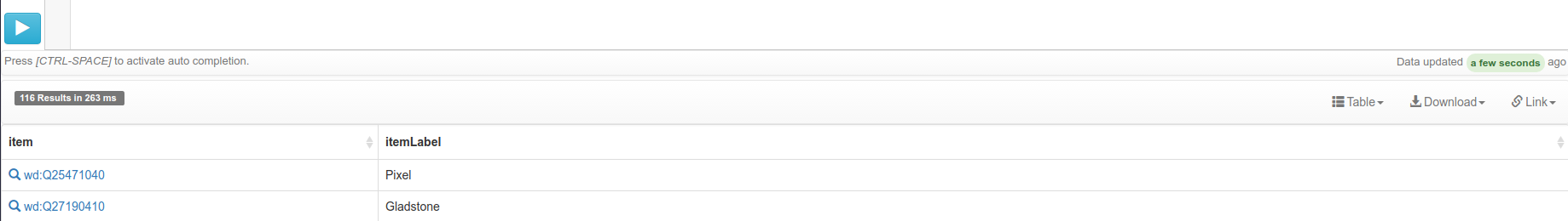
As a user Result Views help me to explore the data, but finding the button or documentation can be a challenge.
We should improve visibility of the button and documentation.
As a result we expect increasement of views in this Grafana statistic.
| • Jonas | |
| Jul 14 2017, 8:36 AM |
| F8791913: image.png | |
| Jul 18 2017, 10:50 AM |
| F8750835: image.png | |
| Jul 14 2017, 8:36 AM |
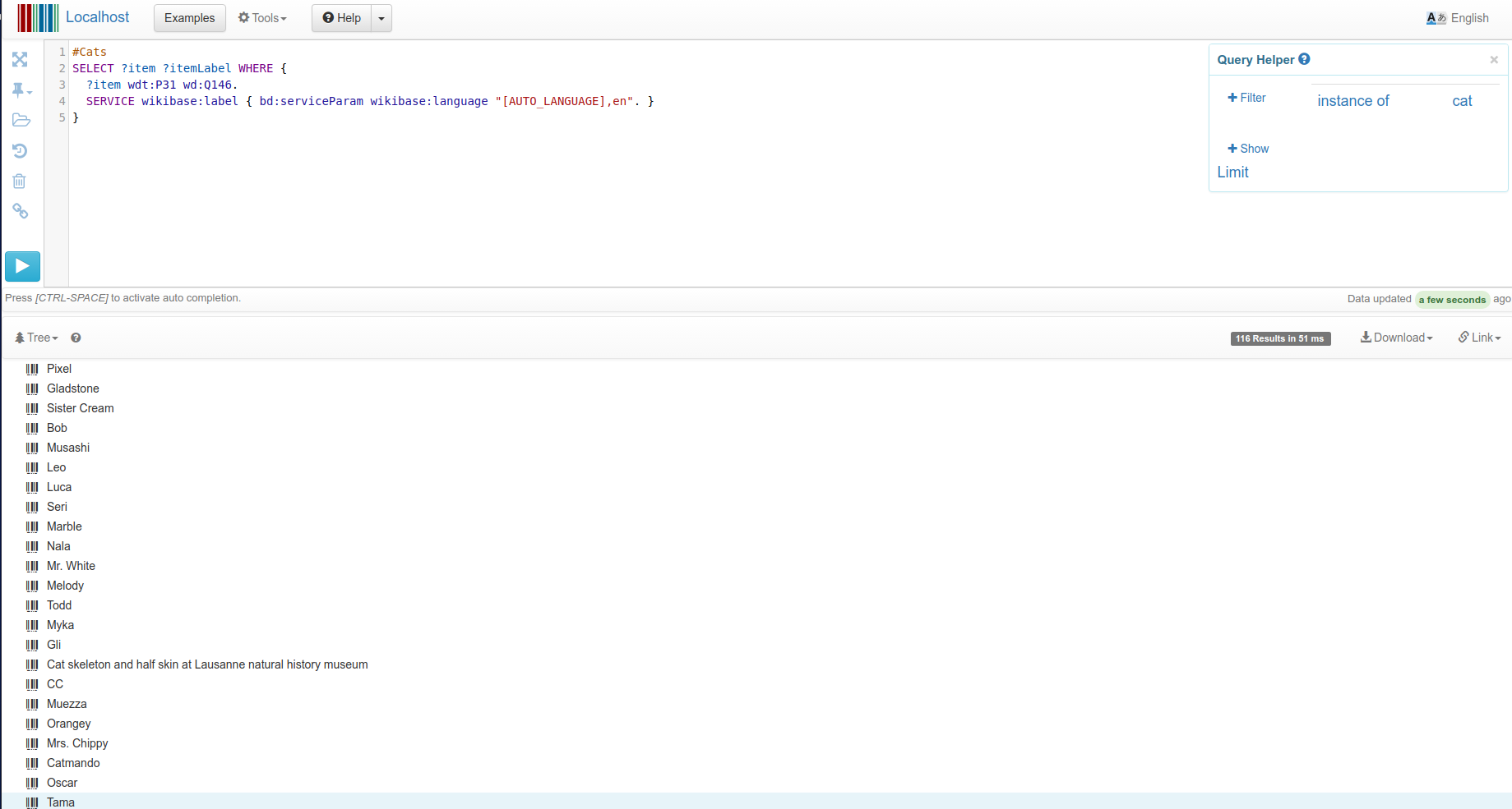
As a user Result Views help me to explore the data, but finding the button or documentation can be a challenge.
We should improve visibility of the button and documentation.
As a result we expect increasement of views in this Grafana statistic.
| Subject | Repo | Branch | Lines +/- | |
|---|---|---|---|---|
| Make Result View more prominent and add help link | wikidata/query/gui | master | +21 -11 |
Change 365050 had a related patch set uploaded (by Jonas Kress (WMDE); owner: Jonas Kress (WMDE)):
[wikidata/query/gui@master] Make Result View more prominent and add help link
I like moving the display button to the left, and the help link too, but why can’t the query total (x results in y ms) also stay there, after the help button? I think that’s also an important bit of information.
but finding the button or documentation can be a challenge.
Which button is meant here? The one executing the query?
I find the icon-only buttons on the left very problematic. This is typically considered a dark pattern.
I agree with @thiemowmde (though I would say it is "just" an antipattern, a "dark-" would indicate a bad intent, which I don't assume at all here). But I assume the icon-only-bar on the left is not part of that ticket, and it is more about the view changing button mid-left on top of the result view.
Change 365050 merged by jenkins-bot:
[wikidata/query/gui@master] Make Result View more prominent and add help link