Page MenuHomePhabricator

Thumbnails used in the new table views style are kinda small
Closed, ResolvedPublic

Description

Design details:

  • Thumbnails should be 40x40
  • Add back HR on:
    • Saved Tab
    • History Tab
    • Search Results
    • Detail views that utilize table view (eg. Top Articles, Because you read, etc)
  • Utilize border color for HR

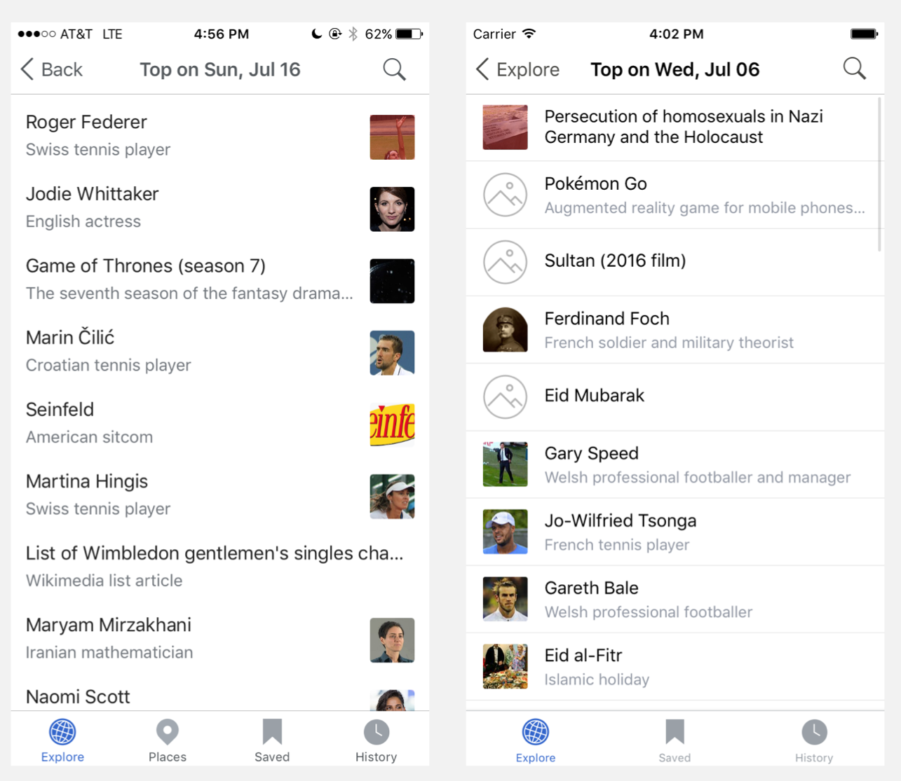
The new table view style used on Saved, Places, etc is a big improvement from the old style, especially not needing placeholder images. However, I find the thumbnails much less useable/effective because they are pretty small, and its hard to see any detail. I'd suggest we consider using the same size as we use on "Top Read", as those seem slightly larger.

This is particularly noticeable on larger devices (Plus and iPad).

Event Timeline

@JMinor I spoke too soon perhaps!

It looks like we are using the same sized thumbnails (40x40) as we have always used. I think it's the lack of horizontal rules and the switching of the thumbnail location from left to right which is potentially making it harder to relate the images to the search result / list item.

Screen Shot 2017-07-17 at 5.02.32 PM.png (1×1 px, 464 KB)

Screenshot of current Top read detail screen on left, Screenshot of old Top read detail screen (from simulator) on right
Red box on top of the thumbnails for the top two articles is the same 40px box

Additionally it seems as though we've been using a 40x40 image on iPad as well.


I'd propose that we change this ticket to be to re-instate horizontal rules on detail views, search, saved and history.
Additionally open to the idea of updating the list views for iPad to accommodate larger thumbnails than on iPhones.

I'm open to experimenting with a larger (like Because you read) image, but would like to see if adding the horizontal rules back clears up most of our legibility issues.

cmadeo updated the task description. (Show Details)

@JoeWalsh This looks good! Thank you for adding the horizontal dividers back in.
Would it be possible to have a standard minimum cell height? Currently when an article does not have a thumbnail or a Wikidata description it appears smaller than the other article cells, if this will cause too many issues with dynamic text it's okay to skip for now though.

Thank you!

@cmadeo we could have a minimum cell height, but it'd be easiest if it were uniform across the app (even cells in the explore feed). If that's fine I can make the minimum cell height the same size as the minimum height with an image.

@JoeWalsh, that sounds reasonable to me. Thanks!

ABorbaWMF subscribed.

Tested on iPad Pro with iOS 10.3.3 and iPhone 7+ with iOS 10.3.3 on App 5.6.0 (1189)

Looks good