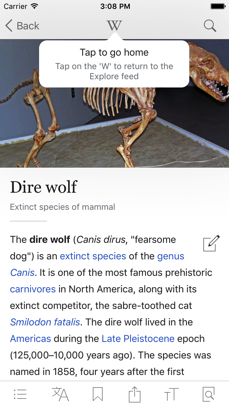
Currently the app uses a custom popover background arrow (pointed). With the new reading themes, this would require a custom class for each theme since UIPopoverPresentationController takes a custom class and doesn't allow access to changing a given instance's properties (like the background color).
I'm proposing that we utilize the built-in popover background arrow (rounded) which can have any background color applied.
Before:
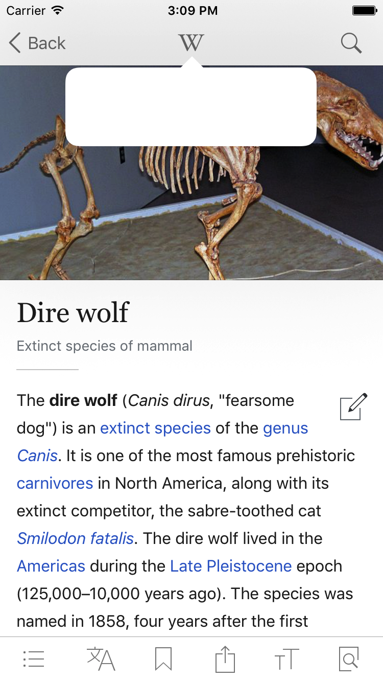
After: