Page MenuHomePhabricator

Simplify the 'Previously viewed changes' marker on Live Update and View Newest Changes
Closed, ResolvedPublic

Description

The = Previously Viewed Changes marker appears with both the Live Update (T167743) and View Newest Changes (T163426) features. We will simplify the marker for both features in the following ways:

  • Use only the line as a separator, without any text.
  • Show the line initially in blue and make it fade to grey. Makes the separation more visible initially and connects it with the active elements (in blue) that trigger the updates.
  • Don't make the line interactive. There is no way to actively remove the line.

You can check this video illustrating the approach.

(P5863 captures the CSS override with the specific animation timing and colors used for the prototype)

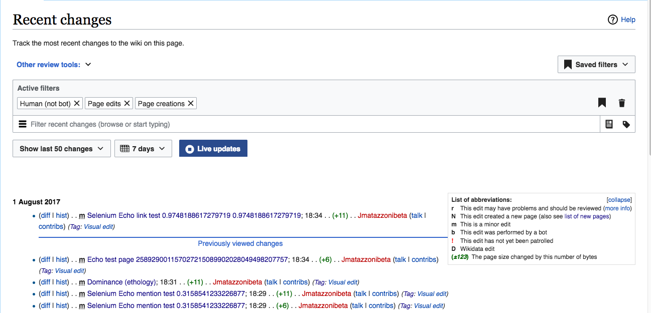
  • Small display issue: Also, in the current implementation (screenshot below), the marker is touching the List of Abbreviations box. We should probably adjust that, though it's not critical.

Screen Shot 2017-08-01 at 11.35.05 AM.png (625×1 px, 161 KB)

Event Timeline

A [hide] link on the marker is possibly an idea.

I don't think it will be obvious to have to turn the live mode off and on again to have the marker back. Have a marker between each batch of new updates would be easier to action and more understandable.

The 'Previously viewed changes' marker was intended to work with the "view newest changes" option (T163426). I'd not show the separator for Live Updates and I'd expect to disappear as soon as Live Updates are on.

For Live Updates it does not make sense to have a clickable moving target, so simply showing a line that fades away may work better as a separator if needed. In any case, I'd like to observe how live updates work in real scenarios to identify if a separator or highlighting new edits is actually needed.

Based on my tests I noticed that for high volume wikis changes seem to appear all at once after the refresh period so it seems that activity jumps form no edits to lots of edits every few seconds,. Achieving a much fluent loading of edits (as suggested in T167743#3492569) may make the live updating list easier to track without additional signals.

(Note that I've not been able to test the described status since the beta didn't had changes to be live updated, and live updates in production didn't show the separator).

I think I agree that for live update, whether or not we stream the results in slowly or by bursts, the old-vs-new marker is not that useful and may be more of a distraction since it keeps moving.

About clicking the marker to hide it, I still don't know what is productive about it. I think the marker is useful to every user, at least initially, to make sense of what just happened after clicking "Show new changes". It may be less valuable in some cases or to some users but I don't know if it deserves to be configurable, sticky, per-session with the complexity that comes with it.

Many tools (irc clients, hangout) now come with this kind of separator to help you understand where you were in a timeline of events. They are easy to use or to ignore. I have never felt the need to turn them off but maybe that's just me not being a tough customer.

If we're concerned about real estate, it could probably be ~50% smaller while staying readable. Maybe even just a dotted line, combined with the animation on new results, would allow the user to connect the dots (pun intended).

In T172213#3493912, @SBisson wrote:

About clicking the marker to hide it, I still don't know what is productive about it. I think the marker is useful to every user, at least initially, to make sense of what just happened after clicking

I tend to agree. So, a couple of points.

  1. As described in T167743, I've reversed course and now LIKE this element for both View Newest Changes AND Live Update. (Please read my longish note on this there if you haven't.)
  2. Theoretically, we could bifurcate the design and have one marker for View Newest and a simpler one for Live Update. But I think these functions are very similar, and the marker does the same thing in both, so having the same marker for both is a win for users.
  3. @Pginer-WMF I'd like to see a design where the phrase "Previously viewed changes" is not a link. Any number of approaches could work. If you think hiding is important, then we can include a specific "hide" link. Or we can have a design with no link and see if users complain.
jmatazzoni renamed this task from Tweaks to 'Previously viewed changes' marker of Live Update to Tweaks to 'Previously viewed changes' marker of Live Update and View Newest Changes.Aug 4 2017, 9:35 PM
jmatazzoni updated the task description. (Show Details)

@Pginer-WMF , I just realized another problem with letting users turn off the Previously Viewed Changes marker. In Live Update, the marker could be turned off for the duration of the LU session, then come back on when the user turns LU on the next time. But what about View Newest? If you turn it off and it comes back next time, that's annoying. But otherwise, when would it come back?

Another good reason just to skip that functionality.

If we want to unify both, I'd try to simplify the indicators. I've been trying some approaches on top of the current tools, and I think the following approach could work:

  • Use only the line as a separator, without any text. The connection between elements appearing and the line separating the rest seems clear enough.
  • Show the line initially in blue and make it fade to grey. Makes the separation more visible initially and connects it with the active elements (in blue) that trigger the updates.
  • Don't make the line interactive. There is no way to actively remove the line.

You can check this video illustrating the approach.

(P5863 captures the CSS override with the specific animation timing and colors used for the prototype)

That looks good to me @Pginer-WMF. I'll move this ticket to RFP today.

jmatazzoni renamed this task from Tweaks to 'Previously viewed changes' marker of Live Update and View Newest Changes to Simplify the 'Previously viewed changes' marker on Live Update and View Newest Changes.Aug 7 2017, 7:09 PM
jmatazzoni removed Pginer-WMF as the assignee of this task.
jmatazzoni updated the task description. (Show Details)

Change 370553 had a related patch set uploaded (by Sbisson; owner: Sbisson):
[mediawiki/core@master] RCFilters: tweak old changes indicator

https://gerrit.wikimedia.org/r/370553

Change 370553 merged by jenkins-bot:
[mediawiki/core@master] RCFilters: tweak old changes indicator

https://gerrit.wikimedia.org/r/370553

@jmatazzoni Could you please to edit the specs on T163426: Add 'View Newest Changes' option into the Integrated Filters? The outdates specs are marked with the red triangle.

Checked in betalabs - the marker line behaves as per the specs.

QA Recommendation: Resolve