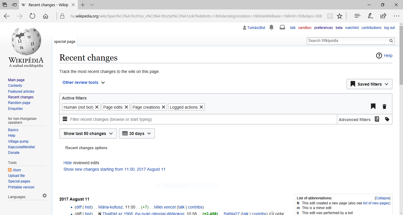
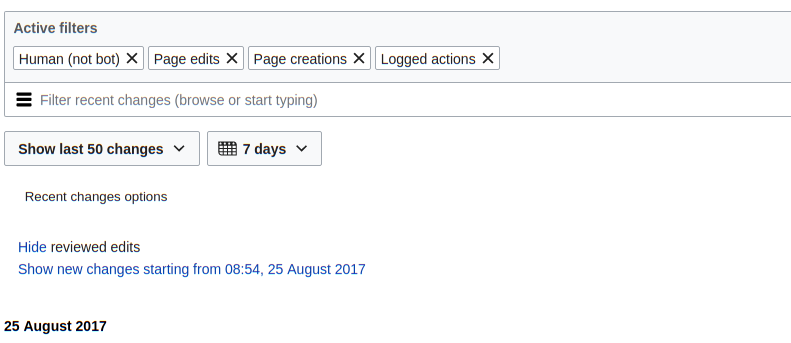
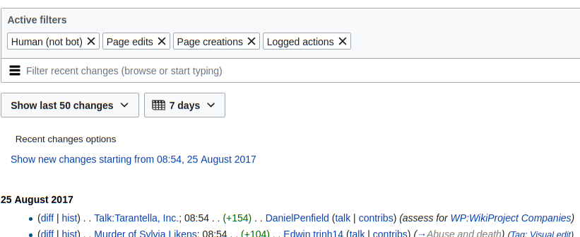
As you can see on the picture, there are big blank and empty spaces while using New filters for edit preview. The problem is that this is not aesthetically and I have to scroll down unnecessarily. Please try to fix it.
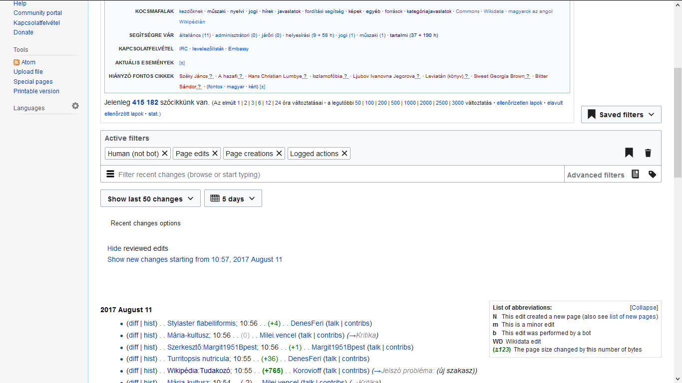
A personal problem: MediaWiki:Recentchangestext is a very useful tool but since the latest update it doesn't appear as default. I've read about it on the gadget's talk page, so I get why it is collapsible, but I'd prefer if it was like the old. Its current positions is not optimal (as you can see on the first picture), it should be in the centre of the page as it was (or it's width should be as long as the page's).
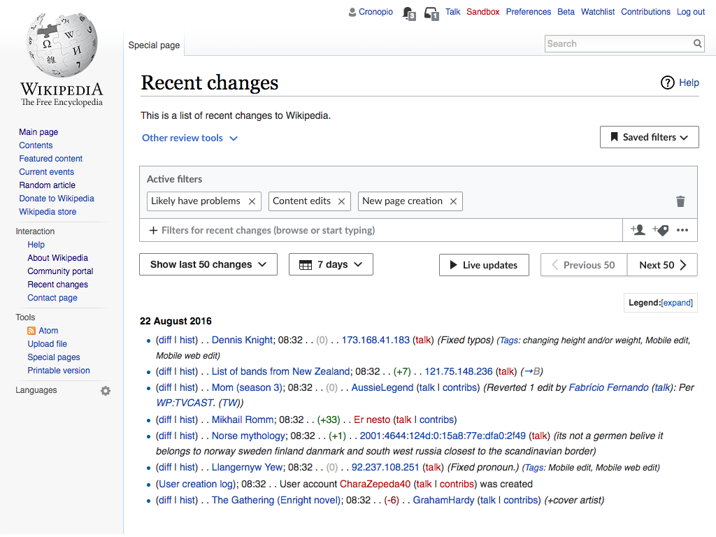
Firefox:
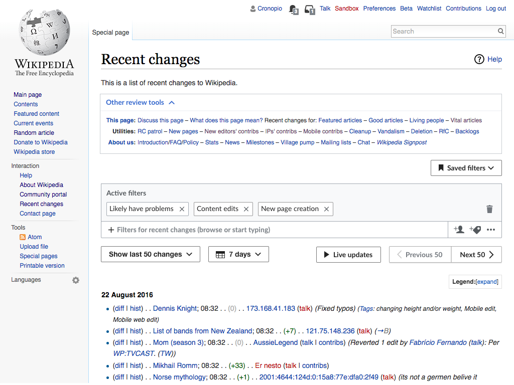
Edge: