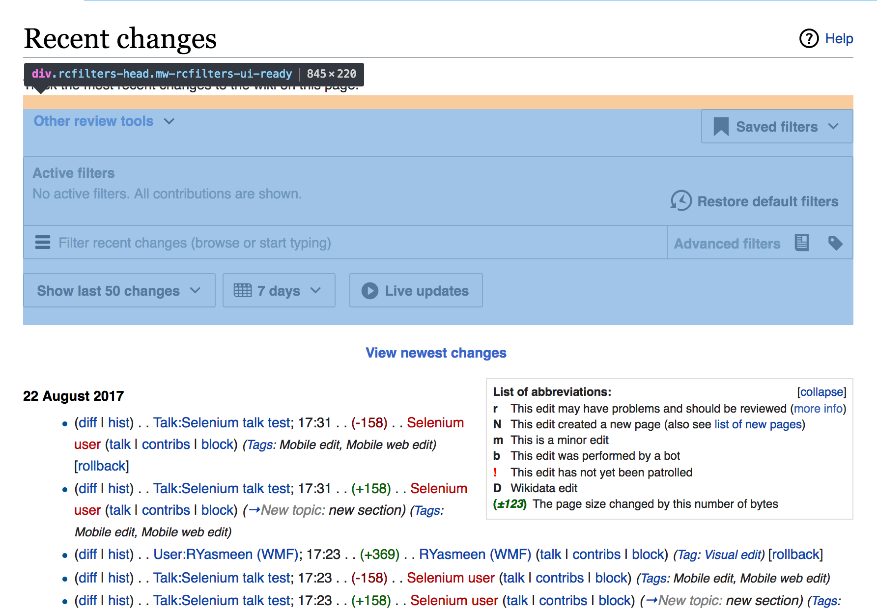
Whitespace is good for delineation, but the amount of whitespace between the controls and edits seems excessive.

Thanks Dan. A number of users are complaining about this as well. Please see Pau's suggestions for where space can be removed, below.
| • Deskana | |
| Aug 13 2017, 4:21 PM |
| F9174647: Screen Shot 2017-08-25 at 12.28.18 PM.png | |
| Aug 25 2017, 7:55 PM |
| F9174670: Screen Shot 2017-08-25 at 12.52.22 PM.png | |
| Aug 25 2017, 7:55 PM |
| F9174661: Screen Shot 2017-08-25 at 12.52.12 PM.png | |
| Aug 25 2017, 7:55 PM |
| F9150617: Screen Shot 2017-08-22 at 20.13.41.png | |
| Aug 22 2017, 6:28 PM |
| F9150616: Screen Shot 2017-08-22 at 20.13.36.png | |
| Aug 22 2017, 6:28 PM |
| F9061582: Screen Shot 2017-08-13 at 12.20.11.png | |
| Aug 13 2017, 4:21 PM |
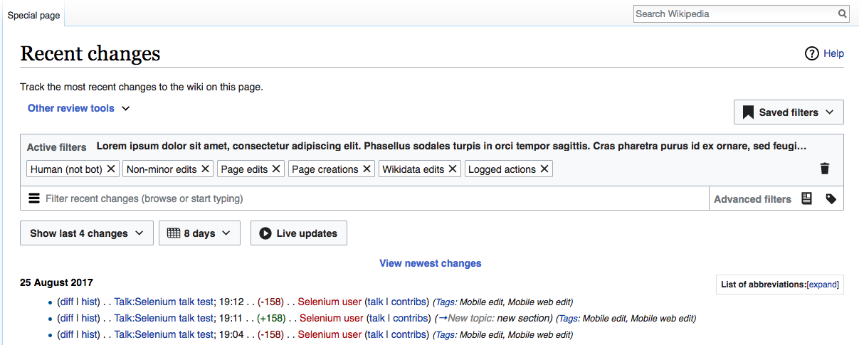
Whitespace is good for delineation, but the amount of whitespace between the controls and edits seems excessive.
Thanks Dan. A number of users are complaining about this as well. Please see Pau's suggestions for where space can be removed, below.
| Subject | Repo | Branch | Lines +/- | |
|---|---|---|---|---|
| RCFilters: Minimize vertical space | mediawiki/core | master | +7 -4 |
@Pginer-WMF I think Dan is looking at the space where View Newest Changes is meant to go. He's right it looks weirder empty, of course. But can you look at the design and see if this can be tightened up a bit, even when View Newest is in action? Thanks.
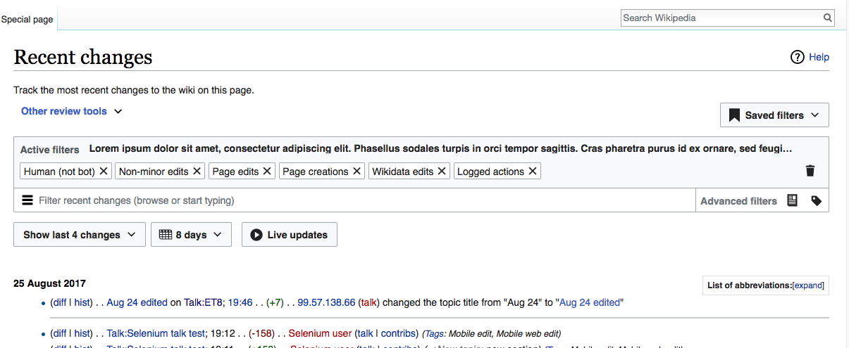
There is definitely more space than required by the designs. We reserve the space for the "newest changes" label in order to avoid content to jump when those appear, but currently there is unexpected extra space in two places:

Change 373160 had a related patch set uploaded (by Mooeypoo; owner: Mooeypoo):
[mediawiki/core@master] RCFilters: Minimize vertical space
I made the spaces smaller, removed the top margin (it was there to separate from the community list, but that list goes into the box anyways now) and I reduced the top margin/padding of the first heading of the results, so it's a little less spacey.
I think that with the "show new changes", the button itself has padding, so I think the wrapper can just not have padding at all? But I wasn't sure when I looked at it, it did seem a tad squished. We can maybe remove just the bottom padding/margin from it? @Pginer-WMF let me know if you want that fixed. Otherwise, the commit above implements the other request, and should improve things at least slightly.
Removing the bottom margin (and reducing the top one to be closer to 8px) is what I proposed in T173265#3542334
The frameless button has internal padding and external margins. The button is frameless most of the time but when it gets focus a border around it appears and we don't want that to bee too close to the button label (what would happen if the padding is reduced too much) or to other elements (what would happen if top margin is eliminated completely).
If the distance still seems too much after the change, we can consider reducing the internal padding a bit too, but I'd try to avoid overriding standard components as the first approach.
Okay, I misunderstood - I thought you meant reducing both top/bottom margins to 4px. Fixing the patch now. We can go over it again after it's merged and you could see it in beta.
Change 373160 merged by jenkins-bot:
[mediawiki/core@master] RCFilters: Minimize vertical space
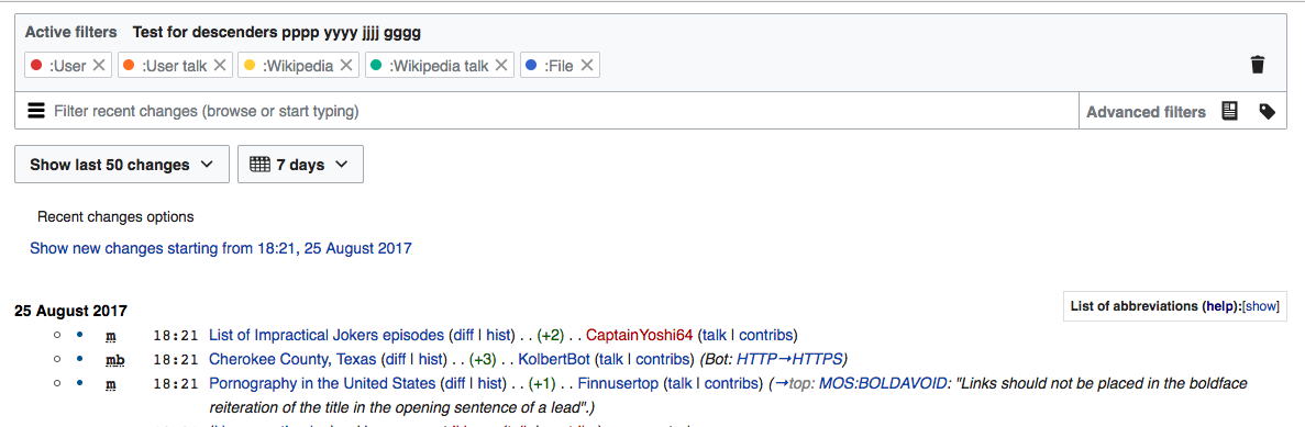
Checked in betalabs - the white space is smaller, and also it's already smaller in wmf.15.
betalabs
betalabs without "View newest changes":
wmf.15
QA Recommendation: Resolve