Page MenuHomePhabricator

House number validation in address forms
Closed, ResolvedPublic3 Estimated Story Points

Description

As a user,
I want to receive a visual notification when I forgot to enter the house number in the respective address field,
so that I can be confident that the address details I provided are complete.

Acceptance Criteria:

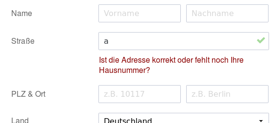
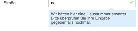
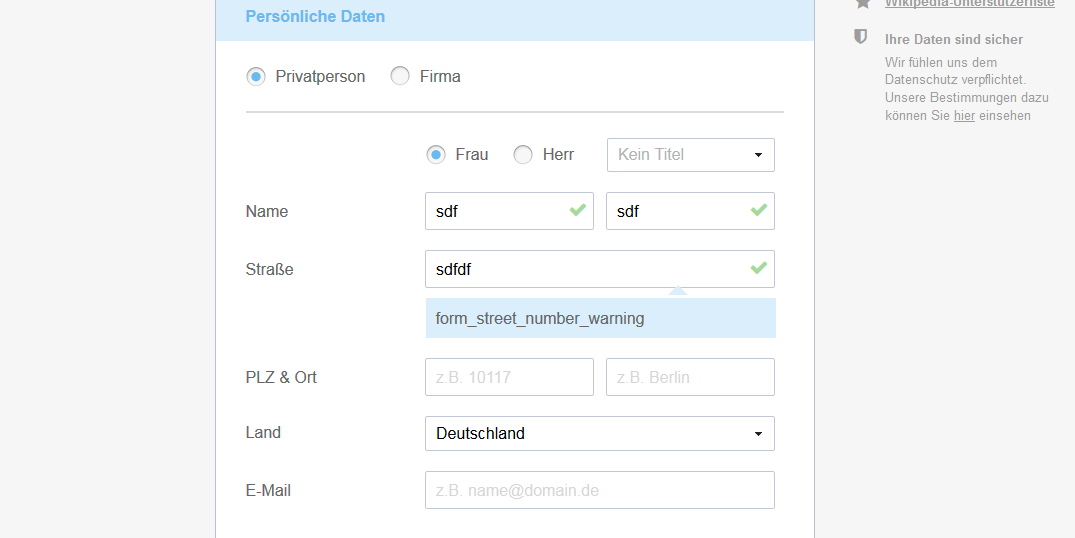
  • When there is no numeral at all in the street field, a notice saying "Ist die Adresse korrekt oder fehlt noch Ihre Hausnummer?" is displayed.
  • The form can still be submitted and the application does not return an error.

Background:

  • Missing house numbers are a common reason for an address not being complete and thus donation receipts not being delivered to donors.
  • The numeral does not necessarily have to be at the end of the given value, so that, for instance, the following cases do not raise a notice:
    • Some Street 12a
    • Tannenweg 12, bei Jochen
  • related issue on GH
  • apparently we do have https://jqueryui.com/tooltip/#custom-style available already

Event Timeline

@kai.nissen when can we expect to have this one the list?

@Jan_Dittrich

  • When do you propose do we show this? While typing? When leaving the form field?
  • Currently we have a binary validation feedback. Should we introduce a third state for fields in a so-so state (e.g. blue question mark instead of green check mark)?

@Pablo-WMDE:

When do you propose do we show this?

When leaving the field.

Currently we have a binary validation feedback. Should we introduce a third state for fields in a so-so state (e.g. blue question mark instead of green check mark)?

Yes, OK, Warning, Error is a standard thing. I would try to do this with touching self made icons/symbols as few as possible. A question mark sounds fine, I would ideally not color it, because that makes UIs quickly look like confetti (even though the intent is good)

I was looking at what stuff to modify to tackle this task and then it occurred to me this might conflict with the new layout work. Does it? I don't want to implement this now for the old layout and then have to re-implement it for the new one before the first stuff even gets deployed.

Missing house numbers are one of the main reasons for donation receipts not being delivered to our donors. This should be finished when this year's fundraising campaign starts. Since we will be testing both designs against each other, the additional validation should be available in both skins.

@wmde-fundraising-tech we need this feature in a couple of days when the campaign starts (most likely on Thursday). I hope this is still doable.

I looked at this and there's generally no feedback on why a field is failing in your form. I think this issue, and some other UI issues I found should be addressed in a separate ticket. Who can I talk to about this or should I just file one? @kai.nissen

Regarding the address issue, I was going to suggest to have two fields for the name and number separately, but after some research I can not find any evidence that this is better practice than one field. So in this case it's best to just add the text to the bottom of the field with a warning sign inside the field.

I would recommend this sign to be an exclamation mark and not a question mark since this would either suggest an explanation on click (because we're already using that symbol for the help texts) or that the input form is somehow confused which is just a weird thing to do.

The sentence is also not phrased in the best way IMO. It would be best to just simply inform them, that the number is missing. The text could be something like: Wir hätten hier eine Hausnummer erwartet. Bitte überprüfen Sie Ihre Eingabe gegebenfalls nochmal. Not saying that's perfect. But it's clearer and more direct than asking questions. @JeroenDeDauw is this helpful for you?

Pinging @Hanna_Petruschat_WMDE and @Jan_Dittrich for your 2 cents.

image.png (253×554 px, 13 KB)

I would suggest to not make the text red or bold but rather just a dark gray.

@kai.nissen The title says "address forms" - is it correct to assume that this should be implemented for both, donation and membership form?

/cc @gabriel-wmde @JeroenDeDauw

on the original mockup from @Jan_Dittrich we do not have this error message vibe: https://github.com/wmde/fundraising/issues/1269. I rather have it more like that.

I do not know what you mean with "error message vibe" and the link you shared unfortunately doesn't work for me. Do I need some sort of permission to see it or is it just broken?

@Charlie_WMDE You need to be member of the "UX" group on GitHub to see it. ping @JeroenDeDauw

The "error message vibe" is that the text still looks too much like an error message and can be made to be looking like a tooltip. Like this:

Bildschirmfoto 2017-11-07 um 15.52.10.png (127×554 px, 20 KB)

I'm working on this now.

I agree. That's why I suggested to not have it be red or bold :)

Anyway, if @JeroenDeDauw is already adding me, could you also add @Hanna_Petruschat_WMDE while you're at it?

This can now be tested on https://test-spenden-2.wikimedia.de/

We'll roll out this version with the next deployment, further design changes can be incorporated later.

on FF private modus. layout of arrow and error message are wrong

house validation error.PNG (538×1 px, 24 KB)

@kai.nissen

Can't reproduce this ↑ (FF 56, Ubuntu 16.04, private and normal mode look fine)

Kai and me fixed it yesterday while remembering school grammar class