Page MenuHomePhabricator

Tweak UI for main filtering entry point
Open, Needs TriagePublic

Description

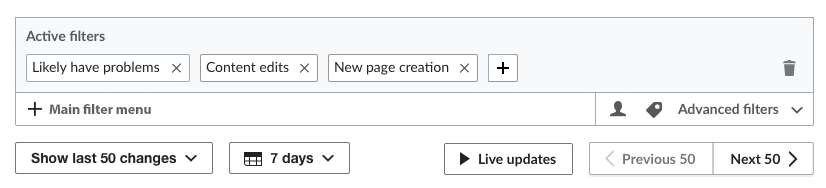
We've continued to get a small but persistent amount of feedback that the main entry point for the New Filters UI is unclear. To address that, we'd like to make a couple of tiny changes, illustrated in the screenshot below. The new UI text and icon will appear on all New Filters pages, including RC page, Watchlist and Related Changes:

  • Change the hamburger icon currently shown in the main search bar to a plus sign.
  • Change the search bar instruction text from "Filter recent changes (browse or start typing)" to "Main filter menu"
  • Adjust the font style of both the main entry point placeholder and the advanced filters label to use "bold" as font-weight and Base20 (#54595D) as text color.
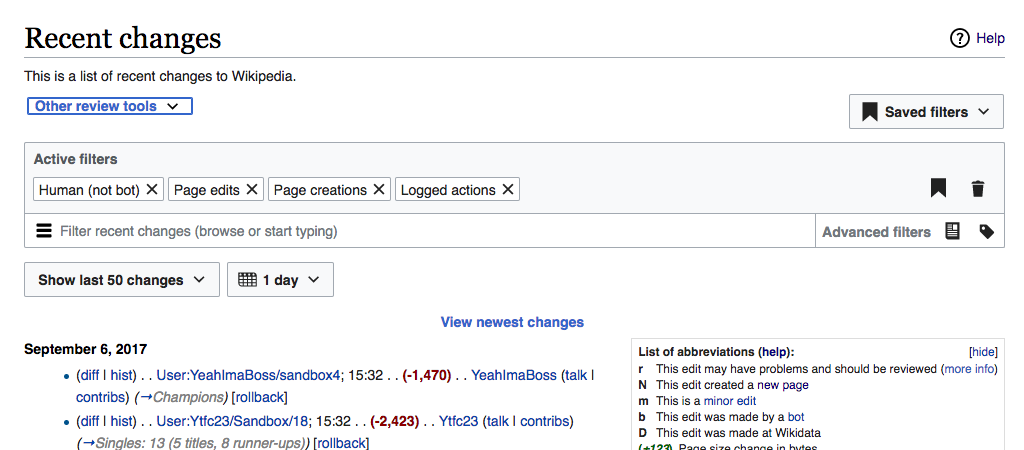
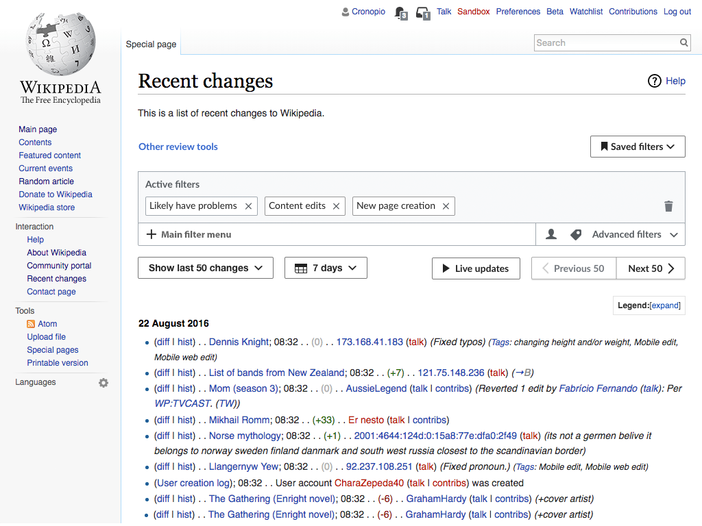
Old UINew UI
Screen Shot 2017-09-06 at 3.33.15 PM.png (450×1 px, 111 KB)
Untitled-5.png (768×1 px, 283 KB)

Event Timeline

@Pginer-WMF, you may need to clarify the desired font for the instruction text in the search bar. The intention, I believe, is that it be at the same level as the Advanced Filters label, but not sure what that should be for both. Go ahead and add that info to the Description.

Also, while I at first liked the word "add" next to the plus sign, since this UI appears on multiple pages, I didn't want to use the text "Add filters for recent changes," which would introduce a need to customize this element everywhere. After studying some alternatives wth Carolyn, we felt "Main filter menu" was a good choice because it has the advantage of clarifying the difference between this area and the Advanced Filters menu. Also "Main" reinforces the idea of this being a central focus. See what you think. I also considered:

  • Add filters
  • Add filters here
  • Add filters to refine results
  • Add filters (browse menu or search)

@Pginer-WMF, you may need to clarify the desired font for the instruction text in the search bar. The intention, I believe, is that it be at the same level as the Advanced Filters label, but not sure what that should be for both. Go ahead and add that info to the Description.

I added an item about the font adjustment.

Also, while I at first liked the word "add" next to the plus sign, since this UI appears on multiple pages, I didn't want to use the text "Add filters for recent changes," which would introduce a need to customize this element everywhere. After studying some alternatives wth Carolyn, we felt "Main filter menu" was a good choice because it has the advantage of clarifying the difference between this area and the Advanced Filters menu. Also "Main" reinforces the idea of this being a central focus. See what you think. I also considered:

  • Add filters
  • Add filters here
  • Add filters to refine results
  • Add filters (browse menu or search)

I think it is more effective to connect with the user need of adding a new filter directly, rather than talking about menus which are just a means to their goal. I think "Add filters" seems the clearest and simplest way to communicate that if we wan to to avoid the "Recent Changes" part.

If we want to go into the direction of "Main filter menu", than it i better to keep the hamburger menu and not mix concepts. But I don't think users are interested in menus and buttons per se, but what they can achieve with them.

What about the idea of a + like on browsers? It is pretty clear that clicking on the + will allow you to add something.

Capture d’écran_2017-09-07_14-52-58.png (188×826 px, 39 KB)

Click on the + opens the panel. (The + should be in dark grey, with no background or border.)
We can then have the hamburger button back for the panel, as a second way to explore the list of filters.

What about the idea of a + like on browsers? It is pretty clear that clicking on the + will allow you to add something.

That is he current proposal (check the mockup labelled as "New UI" in the description). To use "+" for the main entry point. What we are discussing is which should be the label next to it. In my comment above I was defending that if we follow the "add" metaphor, it makes sense for the label to be about adding.

On my screenshot, the plus is after all active filters, not on the field below. :)

Change 378698 had a related patch set uploaded (by Petar.petkovic; owner: Petar.petkovic):
[mediawiki/core@master] Tweak UI for main filtering entry point

https://gerrit.wikimedia.org/r/378698

Change 378698 merged by jenkins-bot:
[mediawiki/core@master] Tweak UI for main filtering entry point

https://gerrit.wikimedia.org/r/378698

Shoot. I apologize for the inconvenience. This task should not be done. We are still debating the best language. I thought I moved this back to Design column, but I see I did not. (Also, I had it listed as a blocker; my bad.) @Petar.petkovic, can you please make sure this does not happen.

Change 378949 had a related patch set uploaded (by Petar.petkovic; owner: Petar.petkovic):
[mediawiki/core@master] WIP: Tweak UI for main filtering entry point

https://gerrit.wikimedia.org/r/378949

Checked - the fix was successfully reverted. The ticket is back Product/Design work on Collab-Team-Q1-Jul-Sep-201 workboard. I have removed the ticket from QA column.

I have changed the advanced filters label to use bold font weight and #54595D color in T172733: [monobook] 'Advanced filters' label (color #ccc) has low contrast. The patch for this ticket is rebased and changed after that.

Any further comments/discussions about search bar placeholder text?

Change 378949 abandoned by Petar.petkovic:
WIP: Tweak UI for main filtering entry point

Reason:
No agreement on exact specs.

https://gerrit.wikimedia.org/r/378949