Page MenuHomePhabricator

OOUI: Support Responsive Toolbars
Open, MediumPublic

Assigned To
None
Authored By
Volker_E
Sep 14 2017, 7:43 PM
Referenced Files
F10644534: b3a732fe-efbf-42e7-8b1b-8f18feb215b2.jpg
Nov 6 2017, 4:34 PM
F10644535: 2017-11-06.jpg
Nov 6 2017, 4:34 PM
F10563444: Page 1.png
Nov 2 2017, 5:06 AM
F10428865: Page 2.png
Oct 25 2017, 12:31 PM
F10428864: Page 1.png
Oct 25 2017, 12:31 PM
F10426771: photo6016832596094331320.jpg
Oct 25 2017, 11:31 AM
F10427040: photo6016832596094331321.jpg
Oct 25 2017, 11:31 AM
F10426852: photo6016832596094331312.jpg
Oct 25 2017, 11:31 AM

Description

Problem statement:
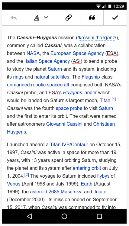
With current toolbar system, toolbars under a certain viewport size are running into usability limitations (exemplified product: Visual Editor < 900px T92315). Given the already in-place usage of toolbars in VE, Flow, MobileFrontend and upcoming Content Translation, we need to ensure decent behavior and user experience independent from viewport.

Design limitations:

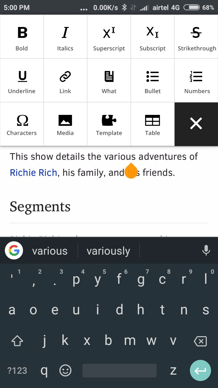
  • Below 900px single toolbar wraps into two lines
  • Below 375px toolbar wraps into three lines (iPhone 5) and only second one is separated with top border, third one not
  • We need to ensure minimum tap size on tools, so we can't shrink tools infinitely
iPhone 5 320pxiPhone 6 375px
T175953 Responsive Toolbars iPhone 5 320px – OOjs UI Demos 2017-09-14.png (694×644 px, 47 KB)
T175953 Responsive Toolbars iPhone 6 375px – OOjs UI Demos 2017-09-14.png (690×754 px, 49 KB)

Proposed result:
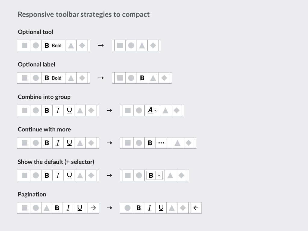
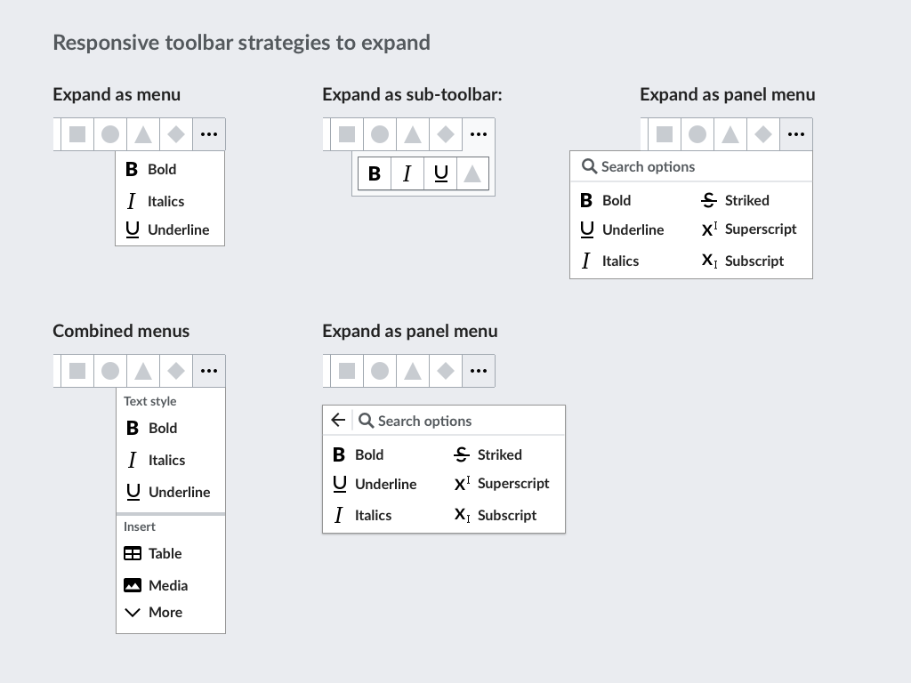
Wrapped toolbars do oppose the impression as toolbar and should be avoided.

  • Focus on a sufficient tool availability on small viewports without wrapping.
  • Possibly enable configuration option (?) for icon+label combination on wider screens, see also T95233

Possible ways to accomplish:

  • Reduce “Publish changes”/“Save changes” to “Publish”/“Save”
    • There's a lot of possible issues around this specific way, a.o. i18n problems and general confusion, see T131132 for broad discussion
  • Remove certain tools on smaller viewport
    • Flow does provide only 4 tools for instance: basic styling, link, mention user and switch editors
  • Concatenate certain tools under one on smaller viewports
  • Remove labels and go for icon only treatment of tools
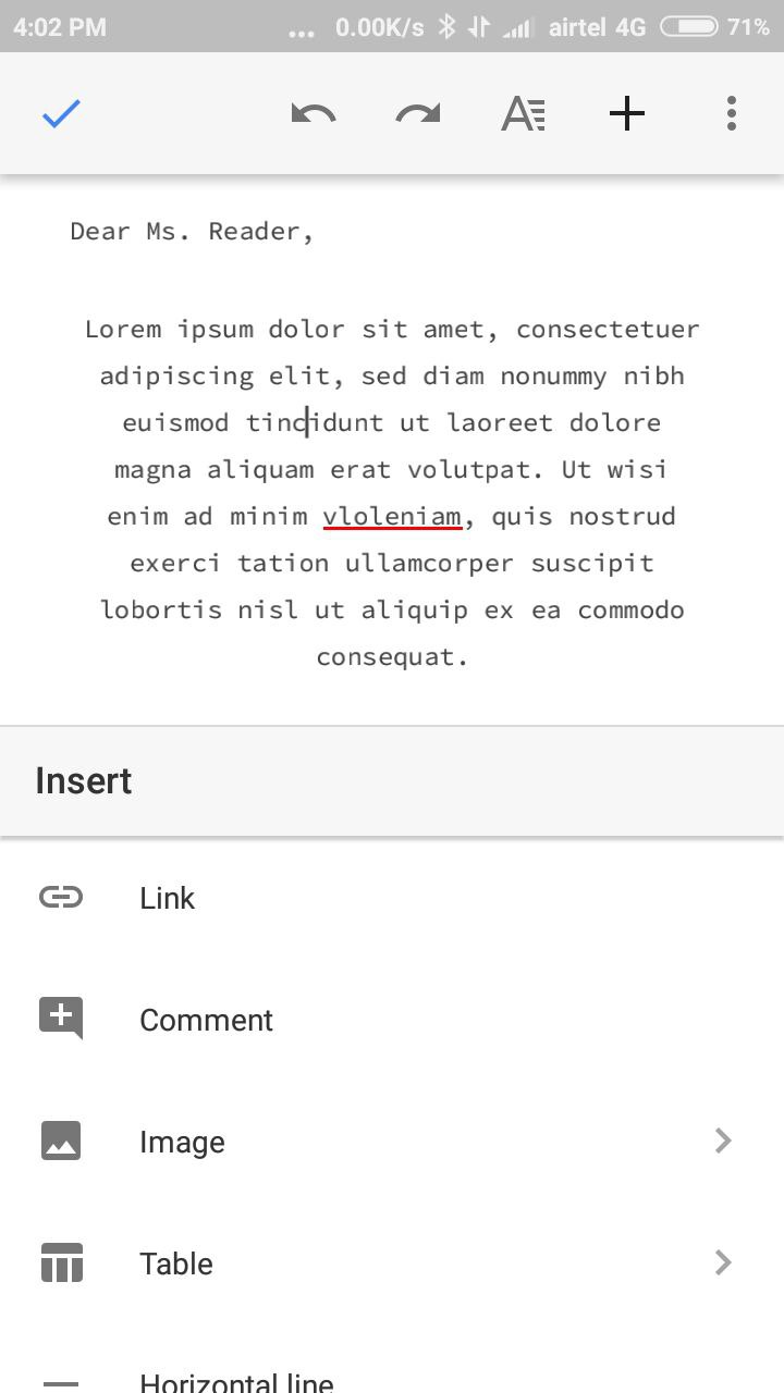
Flow in Sept 2017:

T175953 Responsive Toolbars Flow 338px – 2017-09-14.png (396×676 px, 31 KB)

User research will be needed in the process. Also previous user testing findings could be of use.

Event Timeline

Volker_E updated the task description. (Show Details)

Thanks for capturing this issue @Volker_E. As you indicated there are several strategies to make toolbars fit better in a restricted space. I tried to explore several options on how to both compact options when there is little room, as well as for options to expand them:

resp-tools-compact.png (768×1 px, 58 KB)

resp-tools-expand.png (768×1 px, 75 KB)

We may select a few of these strategies. Some may be applied automatically, and others can be applied based on the specifications of the creators of each toolbar. For example, marking a label as optional can result in the label being removed when there is little room for the toolbar.

VE Mobile is currently using context-sensitive toolbars, similar to Google Docs mobile, such that when the document is not focused you see navigation and document-level tools:

image.png (741×424 px, 128 KB)

When the document is focused, you get editing tools, and also an extra 'done' tool that de-focuses the surface and returns to the document-level tools (this can also be achieved by hiding the keyboard, but many users won't think to use this tool):

image.png (748×427 px, 128 KB)

Another trick GDocs mobile uses is an additional bottom toolbar - but last time we checked that wasn't possible to implement reliably across Android and iOS.

Google Docs (Android app)Microsoft Word (Android app)Evernote (Android app)Notion (Mobile web)Mi calculator (Android app)
Android appAndroid appAndroid appMobile web on ChromeAndroid app
Bottom toolbar for formatting, top toolbar for overall document actions. A simple expanded panel at the bottom with more actions.Bottom toolbar which expands into a panel. The panel has a dropdown to change contexts like Image, Text, Highlight etcBottom sliding toolbar for formatting. Top toolbar is for the document.This was a clunky experience. Formatting in notion is done through the idea of blocks, so you need to type a / to get a list of blocks. There were context menus too, but I couldn't really get them to work, or align to the edit I was making.Not really a toolbar but an interesting way to do the expanded panel idea that @Pginer-WMF shared. Showing an full screen list of tools in a scrollable grid might make it easy to access and tap the tools but will take away from the context in which the edit is being made.
photo6016832596094331320.jpg (1×720 px, 56 KB)
photo6016832596094331311.jpg (1×720 px, 58 KB)
photo5442917415072671765.jpg (1×720 px, 50 KB)
photo5440705373771245667.jpg (1×720 px, 55 KB)
photo6016832596094331317.jpg (1×720 px, 37 KB)
photo6016832596094331319.jpg (1×720 px, 74 KB)
photo6016832596094331312.jpg (1×720 px, 58 KB)
photo5442917415072671766.jpg (1×720 px, 50 KB)
photo5440705373771245668.jpg (1×720 px, 68 KB)
photo6016832596094331321.jpg (1×720 px, 40 KB)
photo6016832596094331313.jpg (1×720 px, 68 KB)

VE Mobile is currently using context-sensitive toolbars, similar to Google Docs mobile, such that when the document is not focused you see navigation and document-level tools

Could we show a different context menu if text is selected? Is this useful/possible?

Example with expanded panel as scrollable grid

Page 2.png (1×720 px, 314 KB)
Page 1.png (1×720 px, 257 KB)

"temlplate" :)

In which direction is it scrollable ?

"temlplate" :)

Oops! Fixed.

In which direction is it scrollable ?

I did not think this through 😛

@Pginer-WMF What is the difference between the two Expand as panel menus in F9621720?

On scrollable with mobile: Please remember that nesting the same direction directly inside views is often a difficult touch UI interaction. So if you have a vertical scrolling page, you generally shouldn't put vertical scrolling elements in it, but horizontal scrolling. Nesting of scrolling in the same direction is generally bad (by default Android didn't even support it until recently I think).

On scrollable with mobile: Please remember that nesting the same direction directly inside views is often a difficult touch UI interaction. So if you have a vertical scrolling page, you generally shouldn't put vertical scrolling elements in it, but horizontal scrolling. Nesting of scrolling in the same direction is generally bad (by default Android didn't even support it until recently I think).

Interesting! Thanks for the tip

I am working on some prototypes for this, issues like this and others should surface once we can test these ideas.

VE Mobile is currently using context-sensitive toolbars, similar to Google Docs mobile, such that when the document is not focused you see navigation and document-level tools

Could we show a different context menu if text is selected? Is this useful/possible?

Yes, although you should note that most of our text tools are currently available on empty selections too (e.g. bold/italic will make what you type next bold, link will insert a new link with text equal to the link target). That said having them available on empty selections is probably not critical.

Another trick GDocs mobile uses is an additional bottom toolbar - but last time we checked that wasn't possible to implement reliably across Android and iOS.

To clarify: I meant a bottom toolbar that is visible when the keyboard is open. When the keyboard is closed it is fairly easy to attach a bottom toolbar.

Also the last time we checked was probably over a year ago, and these APIs change quite frequently, so it might be worth looking into again.

@Pginer-WMF What is the difference between the two Expand as panel menus in F9621720?

The difference was about keeping the options in context or as a separate dialog/panel/view. One approach keeps the context connected and the user in-place, while the other requires navigation but allows the separate view to make better use of space.

Another trick GDocs mobile uses is an additional bottom toolbar - but last time we checked that wasn't possible to implement reliably across Android and iOS.

To clarify: I meant a bottom toolbar that is visible when the keyboard is open. When the keyboard is closed it is fairly easy to attach a bottom toolbar.

Also the last time we checked was probably over a year ago, and these APIs change quite frequently, so it might be worth looking into again.

Being able to use the bottom area that the keyboard occupies when the user does not need to input text seems a good approach to keep the focus on content (the viewport is not moving, jumping or covered by other elements). So I think that could be a good approach to explore independently on the position of their main entry points. For example, the list of items to insert can be shown as a card at the bottom that replaces the keyboard, even if the toolbar with the action to insert is shown on top.

Having said that, the approach would benefit from having the controls at the bottom of the viewport, closer where the menus show. I did a test of bottom placement but unfortunatelly it worked only well on Android but not iOS. I hope that now it is possible to support and, in any case, it would be good to prototype to verify the idea is a good one for when it becomes technically possible.

Having said that, the approach would benefit from having the controls at the bottom of the viewport, closer where the menus show. I did a test of bottom placement but unfortunatelly it worked only well on Android but not iOS. I hope that now it is possible to support and, in any case, it would be good to prototype to verify the idea is a good one for when it becomes technically possible.

Sadly it seems that, as Ed said, we cannot put things at the bottom of the viewport, because for browser security reasons we're not told whether or not the keyboard is shown:

Works without keyboardHidden with
b3a732fe-efbf-42e7-8b1b-8f18feb215b2.jpg (512×288 px, 34 KB)
2017-11-06.jpg (512×288 px, 43 KB)

I have been working on some prototypes to test the options we are coming up with. They are responsive, so do see them on both desktop and mobile to changes. Unfortunately, some of them will need to be refreshed if you just resized your window as they rely on JavaScript (and I am lazy).

Let us keep the discussion about the options here on Phabricator, but use Github issues to point out errors in the implementation of the ideas or if more prototypes need to be made.

Sadly it seems that, as Ed said, we cannot put things at the bottom of the viewport, because for browser security reasons we're not told whether or not the keyboard is shown:

<aside>
I think in iOS the keyboard opens on top of the webpage, whereas in Android the keyboard forces the window to shrink (triggering a resize event too (T162127)). So while there is no API for keyboard visibility on either, at least on Android position:fixed;bottom:0; suffices.
</aside>

I have been working on some prototypes to test the options we are coming up with.

I am sorry the prototypes weren't actually working when I posted that message. @Pginer-WMF pointed it out to me on Hangouts, and I have fixed it now. Sorry for the confusion.

We should go with the hardest use case as demo foundation – 320px.
Some of the prototypes seem not to be laid out for that.

We should go with the hardest use case as demo foundation – 320px.
Some of the prototypes seem not to be laid out for that.

Thanks for taking a look! Yes the prototypes might have issues. BTW - Did you refresh the page after coming to that size?

Could you please list the prototypes that were broken at 320 and would better communicate the concept if they weren't?

Volker_E renamed this task from OOjs UI: Support Responsive Toolbars to OOUI: Support Responsive Toolbars.Dec 20 2017, 1:43 AM
Volker_E lowered the priority of this task from High to Medium.Feb 2 2018, 1:49 AM
Volker_E moved this task from Next-up to Backlog on the OOUI board.