Page MenuHomePhabricator

Dropdowns are inconsistently styled in recent changes
Closed, DeclinedPublic

Description

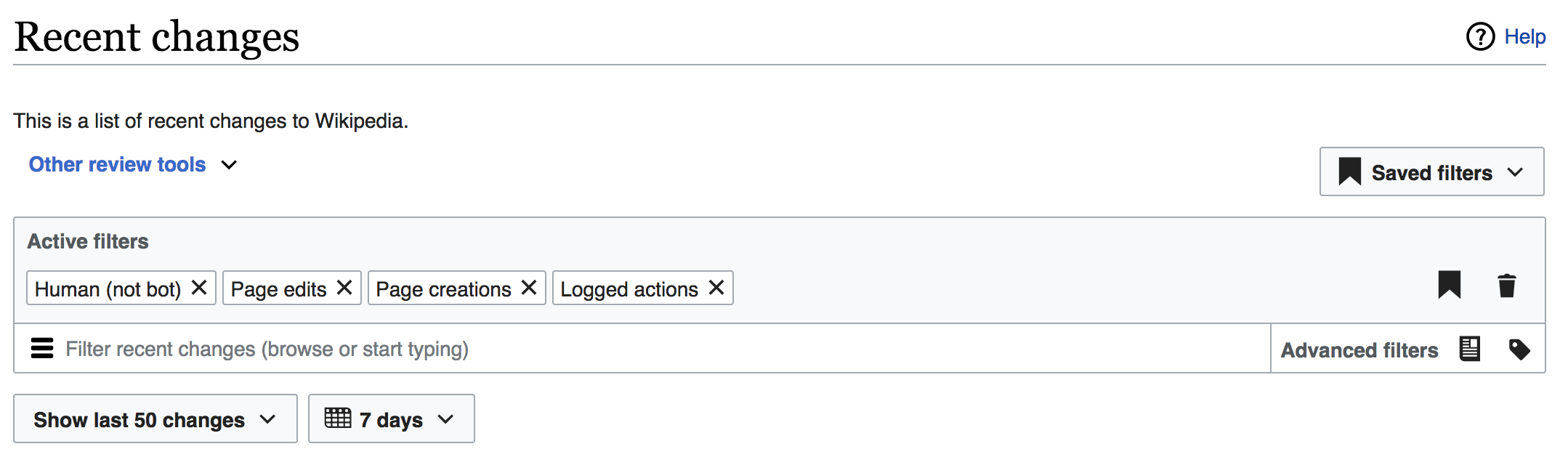
At the top of the page under "This is a list of recent changes to Wikipedia." there a dropdown titled "Other review tools". This dropdown is half styled as a link (due to its colour) and half styled as a dropdown (due to the carat next to it). In contrast, the dropdown almost immediately to the right of it, and all the other dropdowns on the page, are styled completely differently. It is unclear why this is the case. It also appears misaligned too far to the right relative to the elements above and below it; I'm guessing this is a quirk of the UI component used for the dropdown.

I think the "Other review tools." dropdown should have its link colouring removed so that it uses the same text colour as all the other dropdowns in the page.

Screen Shot 2017-10-06 at 12.29.58.png (640×2 px, 116 KB)

Event Timeline

Restricted Application added a subscriber: Aklapper. · View Herald Transcript

I'm going to let @Pginer-WMF answer your questions.

We are using two different controls that have some aspects in common. The "other review tools" is an expandable area, while the "saved filters" is a more conventional drop-down menu.

The "other review tools" is basically a set of links that drive users away from the current tool to do other activities. While the "saved filters" is a control to quickly focus on a set of filters for the main purpose of the tool.

We wanted to de-emphasise the ways to go away (while still being discoverable for those interested) with respect to the tools that are used regularly. This made us consider de-emphasising the access to "other review tools". In the same way that primary buttons, regular buttons, and frameless buttons provide different prominence levels for buttons; in this case styling the "other review tools" as a link presents it as an extension of the introduction text above it (e.g., "This is recent changes, but if you want to do something else here you have more tools").

In terms of the visual style I agree with several of the points, and I think the following adjustments can help:

  • The separation between the label and the chevron should be reduced.
  • The chevron should be using the same color as the label (blue).

I'd be ok to explore making both label and the chevron to be black, but being a frameless component we need to make sue it still communicates it is interactive. But I don't think that presenting it as a link-like element would cause much problem.

I agree with the idea of de-emphasising it, but that seems at odds with the fact that it's a different colour from pretty much all of the controls, and it's also prominently displayed at the top left of the panel. When I look at pages, I look at the top left first, and it's right there. It's the first thing I notice.

It's a good point that my original suggestion isn't ideal for the reasons you mentioned about it then being unclear that it can be interacted with. That'd probably make things worse.

I wonder if it'd be better to change it to use the standard control styling, but put it somewhere else, such as at the bottom right of the panel (e.g. horizontally aligned with "Show last X changes" and "X days", and right-aligned with the filters box. That seems like it'd deemphasise it better.

I agree with the idea of de-emphasising it, but that seems at odds with the fact that it's a different colour from pretty much all of the controls, and it's also prominently displayed at the top left of the panel. When I look at pages, I look at the top left first, and it's right there. It's the first thing I notice.

Backwards compatibility had also an influence on the current placement. We were replacing a big area of links that was prominently distracting from the main purpose of the page, but we wanted to make sure that users looking for them could still find the new entry point. So we kept it at the same place. I think it makes perfect sense to look for alternative placements after a period of stabilisation (some communities are reviewing the links provided in the panel since it grew to include all kinds of links over time, and we are still making adjustments to the placement of some of the main controls).

I wonder if it'd be better to change it to use the standard control styling, but put it somewhere else, such as at the bottom right of the panel (e.g. horizontally aligned with "Show last X changes" and "X days", and right-aligned with the filters box. That seems like it'd deemphasise it better.

Another aspect we want to avoid is giving the impression that the options provided in the panel are affecting the Recent Changes results as the rest of the controls that are visually connected with the panel. For example the "Other review tools" box has a "New pages" link that leads you to a different tool, unlike the "New pages" filter from the main filter panel.
In order to differentiate the "Other review tools" from the Recent Changes tools we have explored two alternative placements in the past: (a) integrating it with the introductory text, showing the "Other review tools" link right after the "This is a list of recent changes to Wikipedia." text without showing in a new line (and maybe just styled as a link, without the chevron), and (b) as a floating box similar and next to the "list of abbreviations".

This is a fascinating discussion but I'm going to move for closure. Dan, we can't move the links at page top, much as we'd like to. They belong to the various communities who are very attached to them (despite our research showing that these links do not earn their place at the top of the page, in terms of the number of clicks they get, which is predictably small).

@Pginer-WMF, if you'd like to make the changes you suggest above, please spell them out in the description and put this in Snack box. Or close this and let's press on.

This is a fascinating discussion but I'm going to move for closure. Dan, we can't move the links at page top, much as we'd like to. They belong to the various communities who are very attached to them (despite our research showing that these links do not earn their place at the top of the page, in terms of the number of clicks they get, which is predictably small).

Sure. Thanks for considering. :-)

JTannerWMF subscribed.

Rita believes based on reviewing comments from Pau et al, think we can decline.