This ticket will be a running tracking ticket for all design work related to the Interaction Timeline project.
Queued features to wire
For T179607: Interaction Timeline V1
- Reducing whitespace
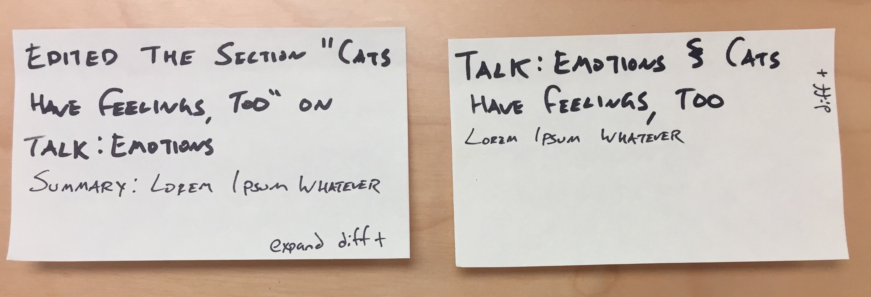
- Making the ‘edit boxes’ space efficient (§ = section)
- Surfacing the diffs in-line (potentially multiple wireframes to show a few options)
- How to keep diffs space efficient?
- Suggestions: shortened diff "information with a ...." and a box to expand to read entire diff, scroll-y box diff, and entire diff (which we currently have)
- How to keep diffs space efficient?
- 'Interaction Summary' box at the top
- Loading indicator
- Error messages
- Annotated wireframes for information density — T180090
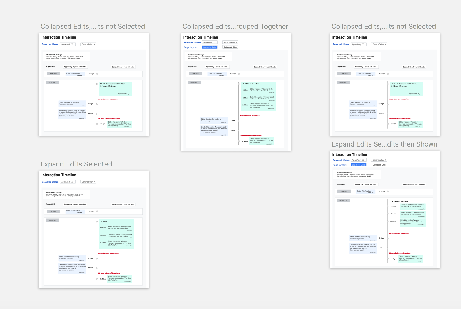
- Bundling multiple successive edits by the same user — T181566
-
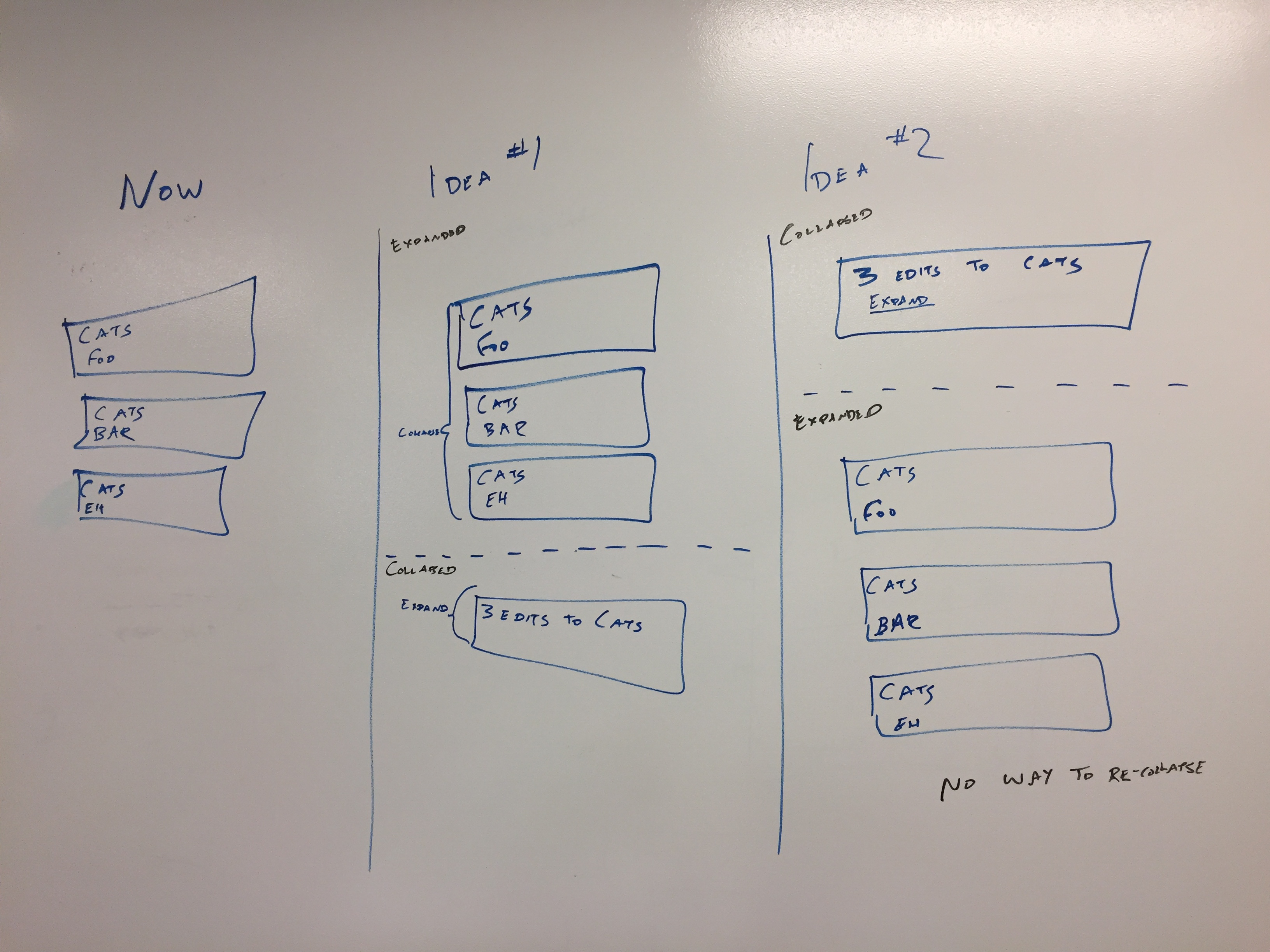
Collapsing edits on a day— T181648