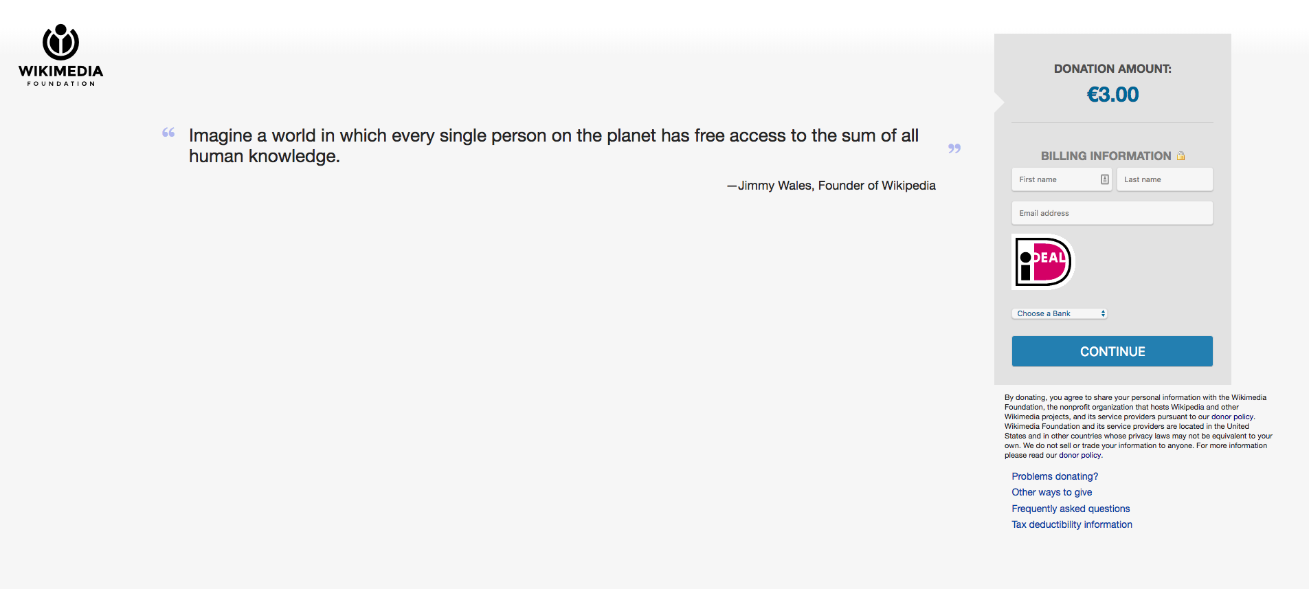
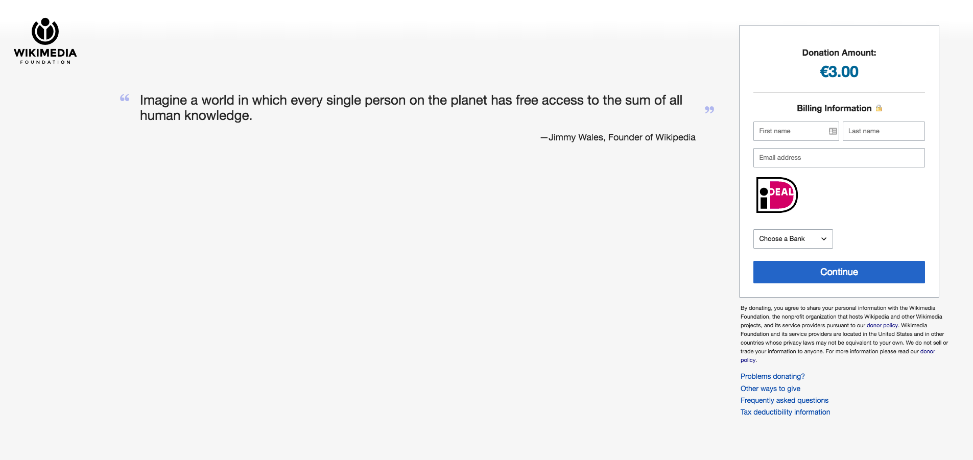
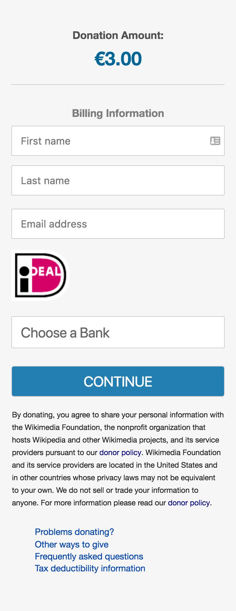
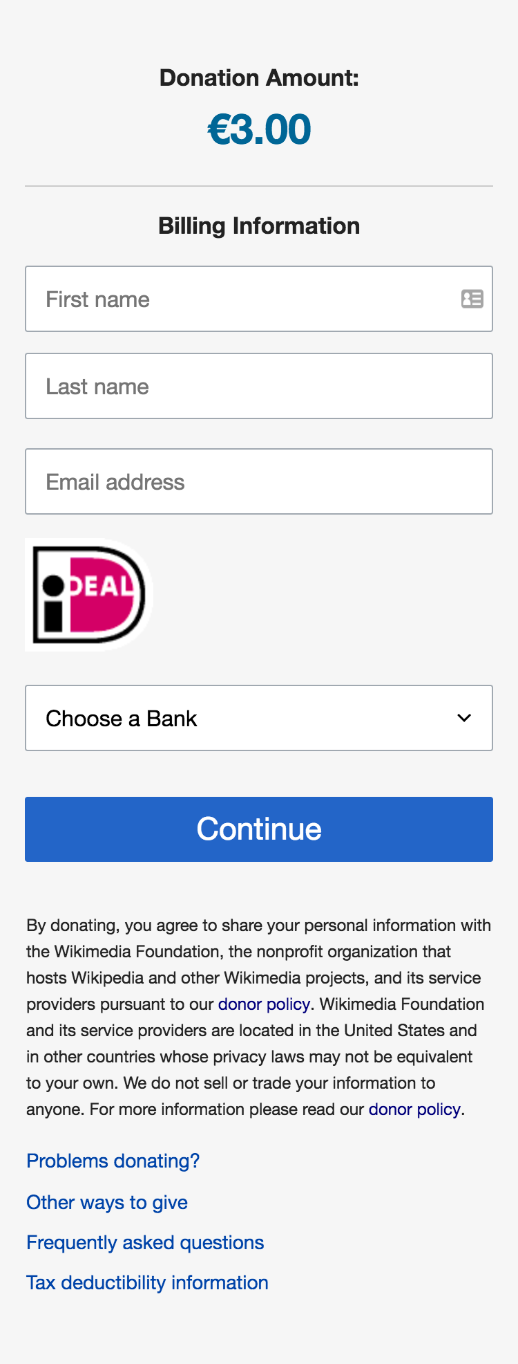
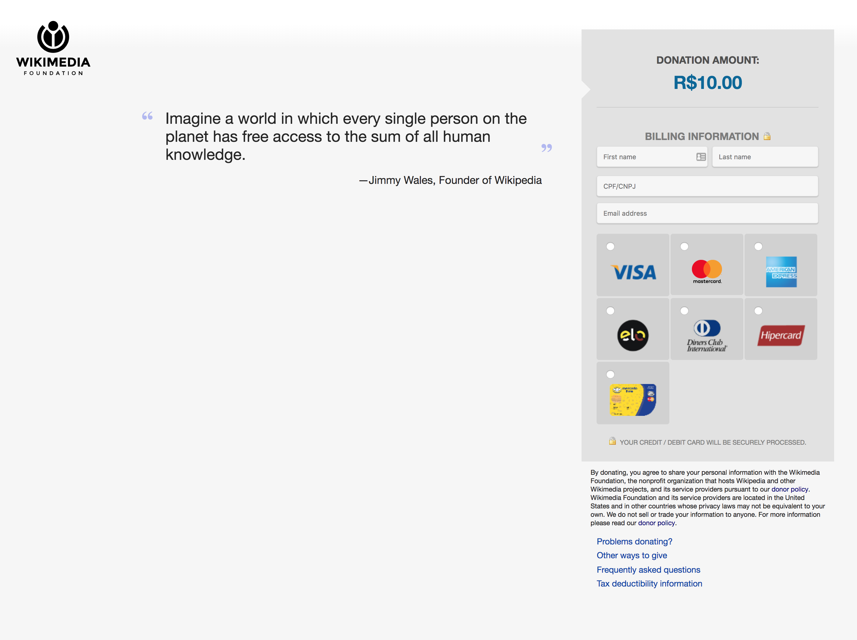
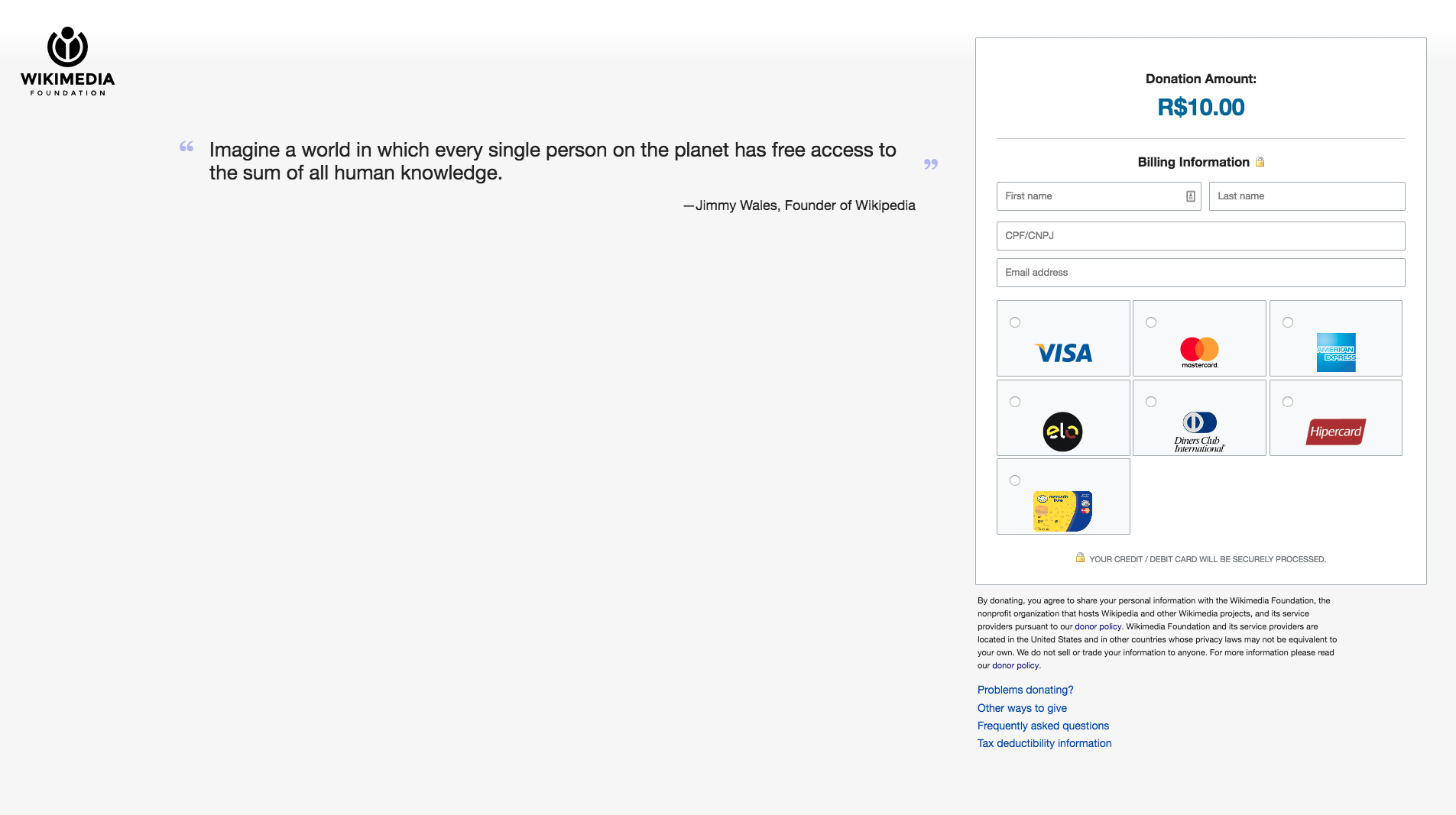
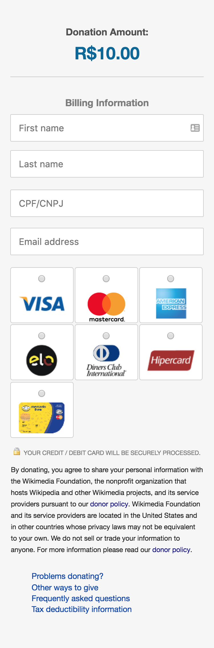
There are various inconsistencies and problems with the current payments form styles. This is an attempt to make them more consistent:
- between desktop and mobile devices (currently they are very different)
- inside and outside the vendor iframes
- with the https://donate.wikimedia.org/ landing pages used for emails
- with OOUI form styles
and fix a few other issues:
- make <select> styling match other fields
- ensure card logos are correctly scaled within buttons
- make continue/pay button more prominent
Screenshots taken with Chrome, but testing in Firefox, IE, and Safari (desktop and mobile) gave similar results.
| Current | New | |
| Ingenico desktop | 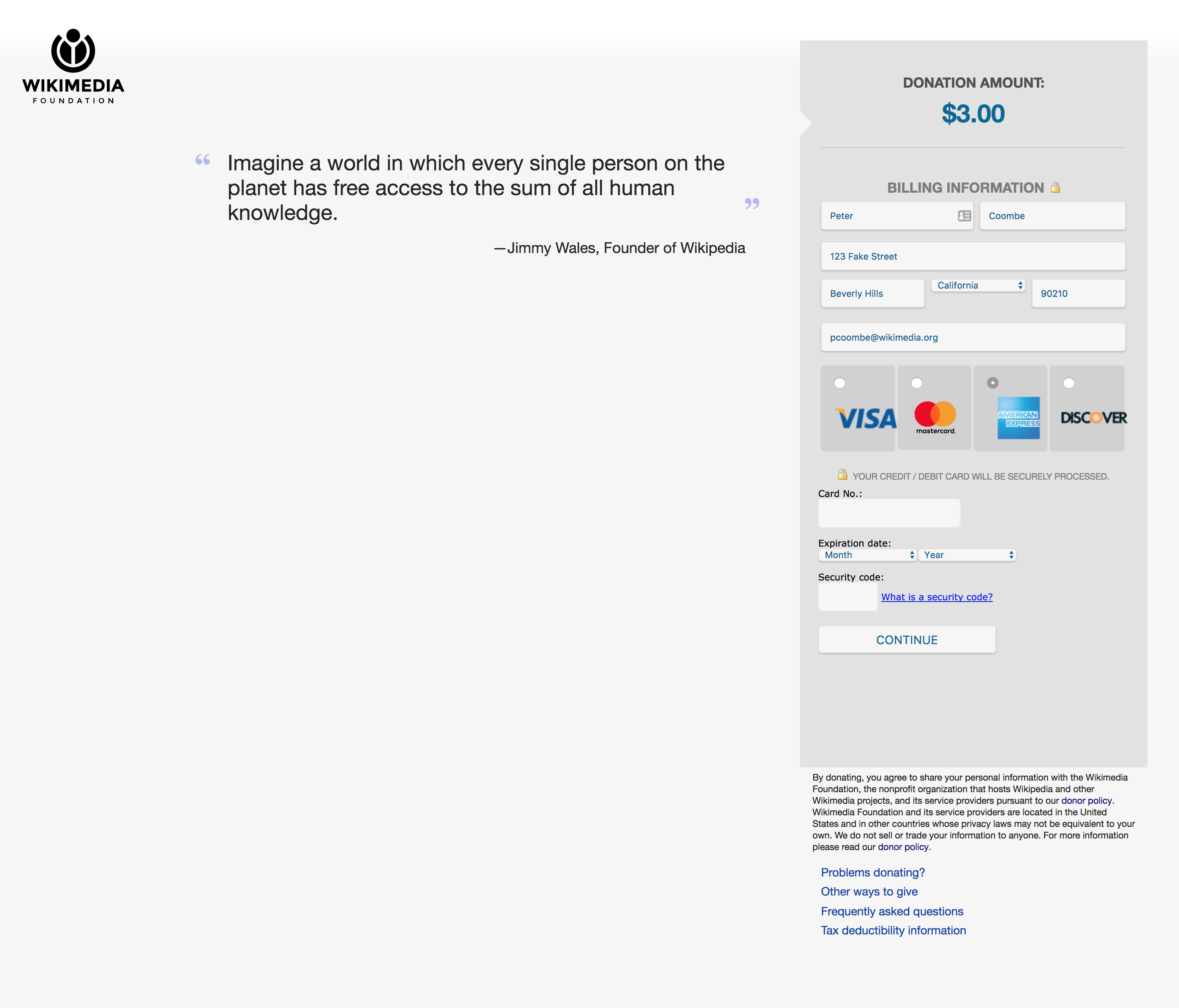 |  |
| Ingenico mobile | 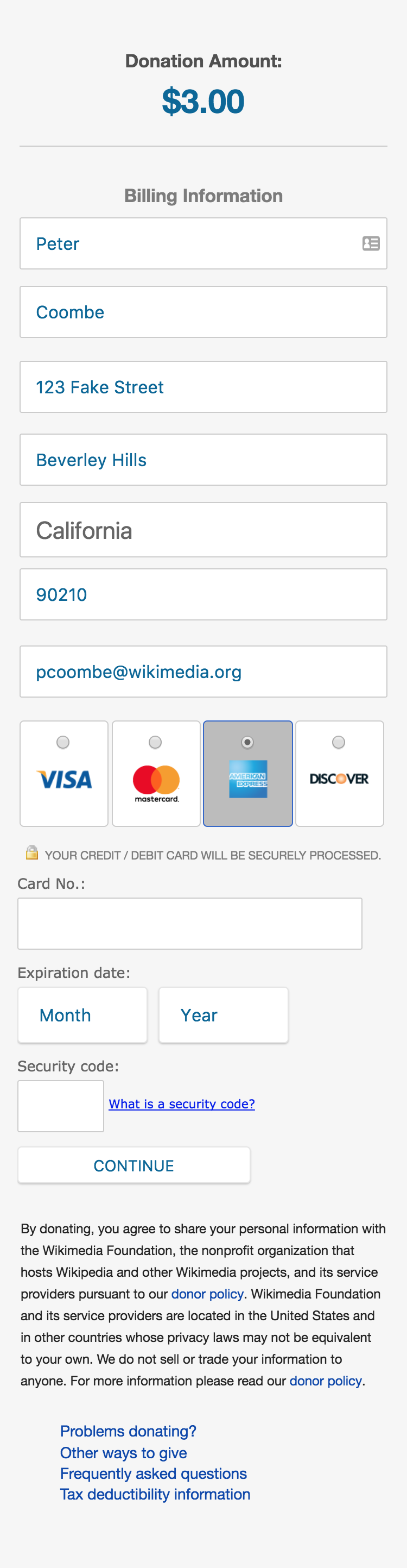 |  |
| Adyen desktop | 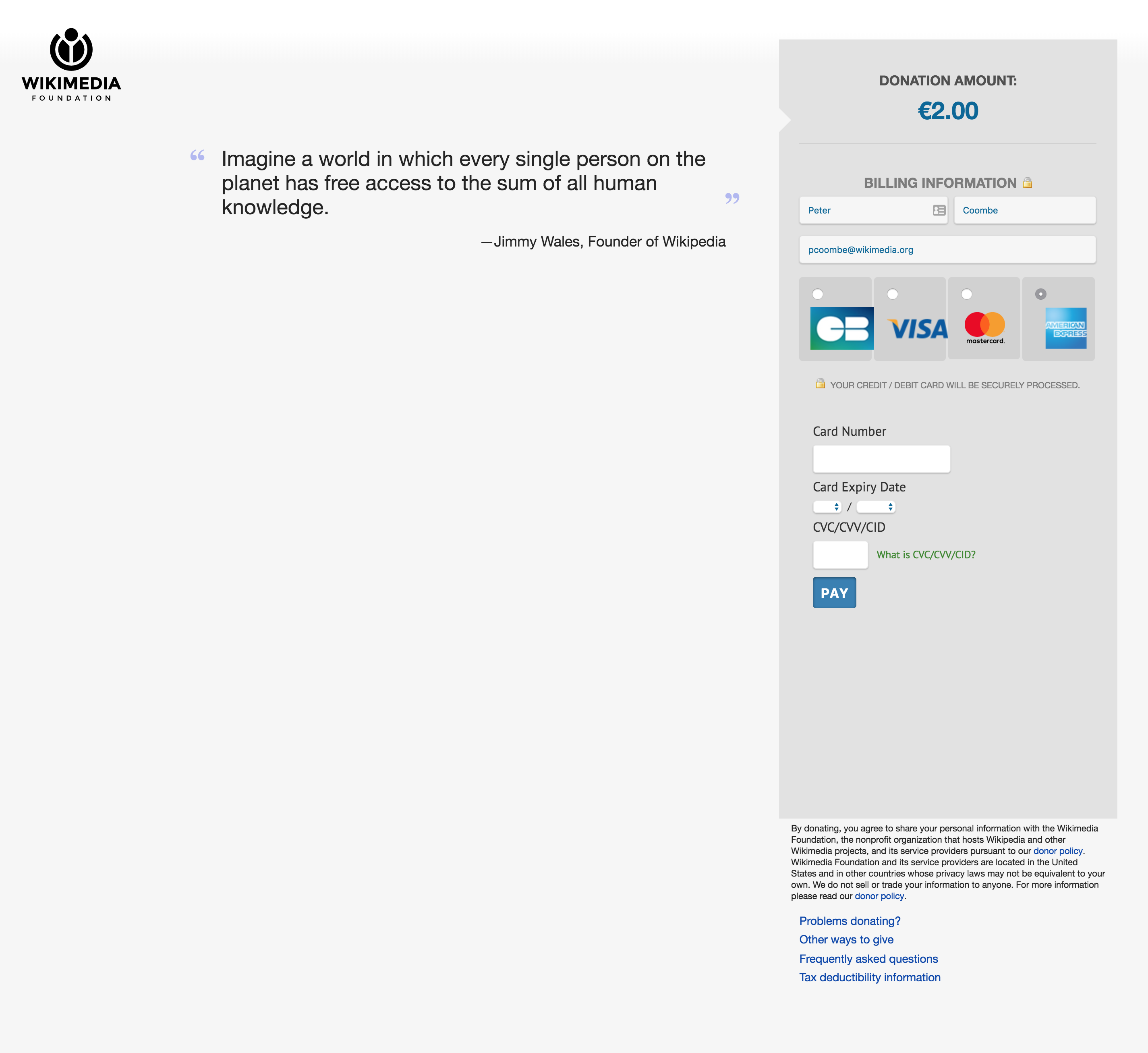 |  |
| Adyen mobile |  | 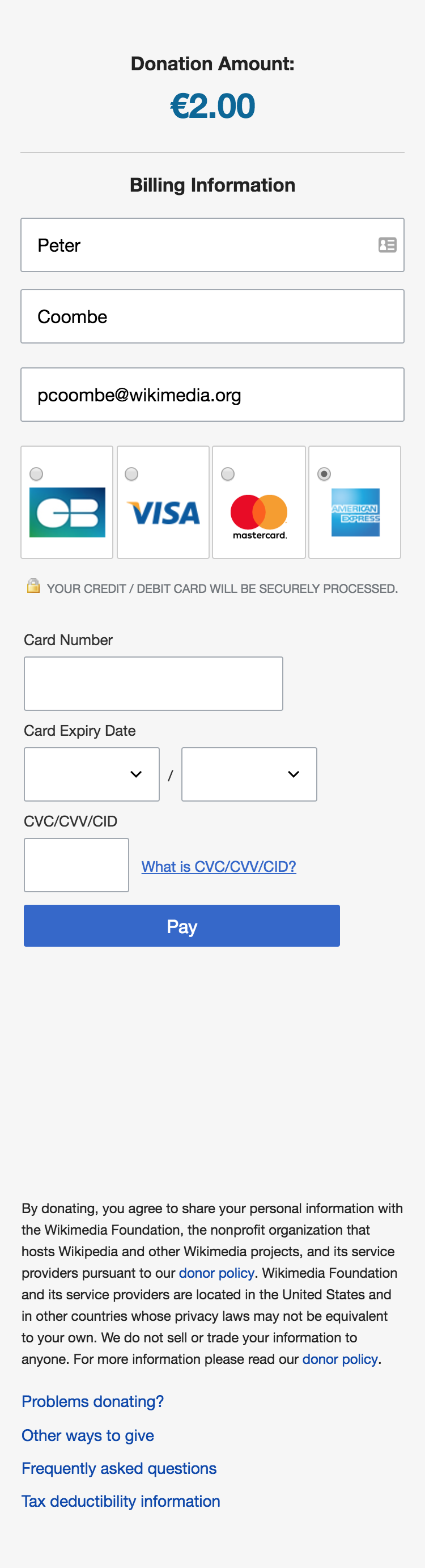 |
Unfortunately it's not possible to give these a fair A/B test, since we can't test the styles within the iframes. I think the best move is to rollout the changes either before or during Big English, and then just keep a close eye on conversion rates before and after.
Can members of fr-online please take a look at these and add any feedback?