Mock
selected, with user input
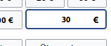
compare non-selected style (other, predefined amount selected) – style is remaining almost the same:
Specs and interactions
- The "Wunschbetrag" field should, if clicked, get the highlighted frame. To not look too much *not* like an input field, I suggest border: 2px solid #2a4b8d; and border-radius: 4px; . That highlight-frame should not be at any other element when "Wunschbetrag" has it (there can only be one highlighted field or button, so the highlighting behavior of the input field is just like the ones of the radio-button-ish elements around it, but with an added focus on the text field, allowing input.)
- The text input font should match the other fonts on the buttons, bold and black,
- The amount should have an € sign behind it (the € can be there continuously or only after the something is put in the field)