Page MenuHomePhabricator

Banner 29 - redesign
Closed, ResolvedPublic

Description

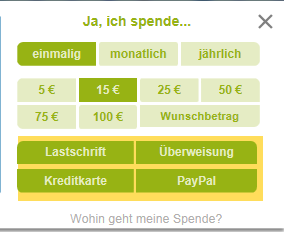
  • CTRL: VAR of T182108
  • VAR: redesign as provided with additonal n days in progress bar, without extra button and repositioning of bank account underneath copy and interval buttons

Start: 07.12


Campaign: C17_WMDE_Test29

bannersetuppreview
B17WMDE_29_171208_ctrlmetadewiki
B17WMDE_29_171208_varmetadewiki

Some layout issues to be solved 12.12.

Event Timeline

tmletzko updated the task description. (Show Details)
  • the font size is quite different. Can we have copy font identical? I guess this would create "more identical" height
  • the copy should be identical: instead of "Jetzt sind Sie gefragt" please use " Einmal im Jahr sind Sie in Deutschland gefragt."
  • on VAR the "Wunschbetrag" is loo long as label on smaller viewports. We should switch to "anderer". Ideally, only on smaller viewports with the form below the copy
  • on IE and FF the payment channel / donate function does not work. If I click it looks like this (error message)

redesign banner does not work.PNG (232×284 px, 8 KB)

started on 2017-12-08 at 18:15 CET

ended on 20178-12-10 at 11:30 CET

Hi! Thanks for implementing the banner. Although the overall look'n'feel is quite good already, I do have some requests and suggestions concerning the layout:

a) Since Times New Roman is awfull, please provide a wider range alternative antiqua fonts:

#WMDE_Banner .infobox__text {
    font-family: 'Merriweather', 'Linux Libertine', 'Linux Libertine O', Georgia, 'Bitstream Charter', serif;
    font-size: 1.16em;
    line-height: 1.3em;
    /* usw. */
}

b1) The sans-serif text should default to "Lato"
b2) The banner desperately needs a bit more white-space at the bottom. And the box-shadow should either be removed or a lot softer

#WMDE_Banner .banner {
    /* usw. */

    font-family: 'Lato', Arial, sans-serif;

    /* Auf jeden Fall */
    padding-bottom: 0.75em;

    /* Box-Shadow raus. Oder zumindest abmildern:
	-webkit-box-shadow: 0 3px .6em rgba(60, 60, 60, .4);
	box-shadow: 0 3px .6em rgba(60, 60, 60, .4); */

}

c) Please use the same border-radius for all the edges of the donation indicator and for all round edges through-out the Banner

.progress_bar__donation_fill {
    border-radius: .4em;
    /* usw. */
}

d) There are round edges at wrong positions in the desktop-view of the payment methods.

e) We need to reduce the margins on smaller viewports to save height:

@media screen and (max-width:900px) {
    #WMDE_Banner .infobox, #WMDE_Banner .form {
        margin: .2em 2.5em;
    }
}

f) In general: We should disable the sticky-mode for view-port sizes, where the Banner fills out most of the screen, to reenable people to use Wikipedia:

/* Fixed für Größen ausschalten in denen der Banner mehr als die Hälfte des ViewPorts einnimmt. */ 

@media screen and (max-width:900px) and (max-height:900px), screen and (max-height:600px) {
    #WMDE_Banner {
        position: absolute;
    }
}

g) No text-wrap inside the progress-bar:

.progress_bar__donation_remaining, .progress_bar__donation_text {
    /* usw. */
    white-space: nowrap;
}

h) More font-weight for the important infos in the footer

#WMDE_Banner .footer__importantinfo {
    font-weight: 800;
}

i) "Spendenkonto Wikimedia Foerdergesellschaft" should have the same mixed-case text-style and no extraspaces

j) A bit more margin for the footer-blocks:

#WMDE_Banner .footer__item {
    white-space: nowrap;
    margin-right: 1.2em;
}

k) I think it's better to use the sans-serif fonts (see above) for the label "Jimmy Wales, Wikipedia-Gründer"

So long. Feel free to contact me in case of any questions: +49 611 30 66 60

// Martin

Thank you for taking the time and proposing improvements. We will re-test the design with the red-white one we had until the beginning of December. While creating the banners for it, I took the opportunity to incorporate the proposed changes. @MartinK, @tmletzko The changes can be previewed in a test banner. Please also see my comments below.

a) Since Times New Roman is awfull, please provide a wider range alternative antiqua fonts:

I added the list of fonts, but did not change the font size.

b1) The sans-serif text should default to "Lato"

As I understand "Lato" is a typeface that is not shipped on any operating system by default. I changed it in the preview banner, but see no actual reason to deploy that change.

d) There are round edges at wrong positions in the desktop-view of the payment methods.

As this seemed quite important to me, this has already been fixed in an earlier release of the banner.

f) In general: We should disable the sticky-mode for view-port sizes, where the Banner fills out most of the screen, to reenable people to use Wikipedia:

Not sure about that. This change has potential to drastically reduce the visibility of the banner. I trust the users to close the banner if they don't want to interact with it rather than accept it to be there and work their way around it to use Wikipedia.

k) I think it's better to use the sans-serif fonts (see above) for the label "Jimmy Wales, Wikipedia-Gründer"

Also not so sure. We'd have a serif and a sans-serif typeface in a single line. To me, this doesn't look good.

@kai.nissen thanks for the fast reaction!
I just rechecked it. Here are my comments:

a) etc.) Something seems to be wrong with the font-sizes. According to the layout there should only be to font sizes: 14px for the big and 11em for all the small texts.
In the current version of the banner the big text is 18.2px (way to big), the barometer is 12.6px, the bank data 12.3167px, teh buttons 11.9667px and "Ja ich spende" 14px (which is correct).

I therefore recommend to remove all font-sizes and put the base-fonts-size for the banner to 11px and define only the big text and "Ja ich spende" as 1.28em. This should fix most of the proportional issues.

And, sorry I used the wrong fonts. Please use these:

font-family: 'Source Sans', 'Linux Libertine', 'Linux Libertine O', Georgia, Bitstream Charter, serif;

e) The margin of teh form fits on small sizes, but margin of blue box still is way to big. I recon to use the breakpoint-CSS above.

f) According to our official fundraising principle no. 2 the banner shouldn't be visible in most of this viewport sizes anyway. Considering this, making it scroll-able surely is less invasive.
https://de.wikipedia.org/wiki/Wikipedia:Fundraiser-Portal/Prinzipien_der_Bannerkampagne

By the way: The script hideing the banner, when it blocks the whole viewport, is not working at the moment. Why?

k) Since "- Jimmy Wales, Wikipedia-Gründer" is the source of this Quote and not the quote itself, I think it is good to use the other typeface here. But not the italic but the normal font-style please! In addition I would recommend to prevent line-wraps here:

white-space: nowrap;

And one additional point:
l) The input prompt in the "anderer" input-field should align left. And "anderer" should be just a placeholder-text, that disappears as soon as the input-field gets the focus.

@MartinK
Thanks again for your recommendations and sorry for my delayed reply. We already applied some of it to the banner code.

The hiding functionality for smaller viewports has been in place during the entire campaign and will be untill the end of it. Banners won't appear/disappear when resizing the window, though. The measuring and comparing of the viewport and banner height is being done once when the banner loads. Maybe you tried to make it disappear by resizing?

Jepp. I tested that via resizing and I think, that we should implement it in a way that it works when resizing, since it is quite common to resizes the browser while reading and comparing another document.
I've already seen a banner with some of the changes applied.

The most serious problem left are the margins (e) that lead to long columns of extreme lengths and smaller viewport sizes. I would really appreciate it, if you fix that.

P.S.: How are the banners doing in general? I just saw, that Hanna's christmas-tree-banner is live now - which shurely is the right timing.
What's the status of the testimonial banner?

kai.nissen removed kai.nissen as the assignee of this task.

The main reason we decided to determine whether to display the banner or not when the banner is loaded, is to be able to not record a banner impression in case the viewport is too small. If we show or hide the banner on resize, the numbers would become fuzzy.

By the way, banners can still be closed by clicking the X button if one decides to not interact with the banner.